Updates:
- (March 7, 2013) The examples on this page were missing due to a migration issue when upgrading my blogging software. Thanks to James Wages for pointing this out.
- (August 11, 2012) The
skew()transform no longer works in Firefox, due to not being in the CSS3 specification anymore. Developers must use theskewX()andskewY()functions instead. The examples in cssSandaper, as well as this documentation, have been updated to reflect this change in the spec. Thanks to Pablo, who gave a bug report on the cube example below that led me to find out about this. - (June 29th, 2011): cssSandpaper has been updated to support CSS3 text-shadows in IE.
- (August 28th, 2010) cssSandpaper now supports HSL/HSLA colors.
- (May 6th, 2010): cssSandpaper has been updated to support RGBA gradients.
- (April 6, 2010): Please see the follow up article on Cross Browser CSS3 Animation which explores scripting CSS3 properties.
The CSS transform property allows developers to rotate, scale, and skew blocks of HTML via CSS. Although you can do the same thing with images in Photoshop or The GIMP, using CSS transforms allows developers to do the same thing with any HTML markup and allows users to select the text within the transformed object.
When I first saw sites using transform, I looked at the underlying code and tried to produce pages using transform in all browsers. Although Firefox, Opera and Webkit based browser support it via vendor-specific prefixes (using -moz-transform, -o-transform and -webkit-transform respectively) Internet Explorer doesn’t support it at all. I didn’t like that, so I took out my JavaScript whip, beat Explorer into submission and made it do my bidding (but not without getting a few mental bruises of my own).
Before I start talking about the details of my solution, let’s take a look at a few examples of it in action. The following code has been tested with Firefox 3.5, Safari 4, Chrome 4, Internet Explorer 6 and higher.
- Rotations Example
- Skew Example
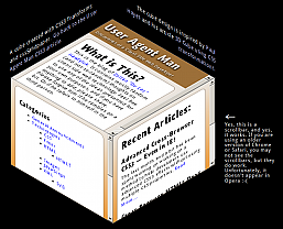
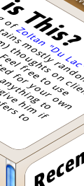
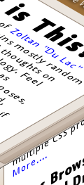
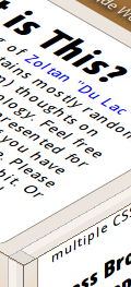
- Cube Example, using rotates and skews
- Another example that looks like a CSS3 version of a Geocities page.
(The examples also work on my copy of Opera 10.5, although I have seen it fail on other installations – I will update this post when I find out why).
cssSandpaper to the Rescue
I saw the design potential of using CSS transforms and was frustrated at Explorer’s lack of support. I originally tried a non-JavaScript solution which involved creating CSS rules that combine transform with an IE technology that does something similar: the DXImageTransform.Microsoft.Matrix CSS filter.
I then, to steal a phrase from Russel Peters, started to Hurt Real Bad:
- the syntax of
transformis very obvious:
#myObject {
   transform: rotate(40deg) scale(2.0);
}
but the IE filter code is quite intimidating:
#myObject {
   filter: progid:DXImageTransform.Microsoft.Matrix(sizingMethod='auto expand',
        M11=1.5320888862379554, M12=-1.2855752193730787,
        M21=1.2855752193730796, M22=1.5320888862379558);
}
The scary numbers that the
DXImageTransform.Microsoft.Matrixfilter uses requires knowledge of matrix and vector mathematics. Even though there is a great Wikipedia article on the subject, even the mathematically gifted wouldn’t want to do the calculations to do a simple rotate in CSS (I would like to note here that even though I have a university degree in Mathematics, I hate doing arithmetic inside my head. If you don’t believe me, watch me figure out a tip at a restaurant sometime. I’m not kidding). - although it is possible to have a list of transformations using
transform, theDXImageTransform.Microsoft.Matrixfilter only allows one transform matrix. In order to implement multiple transforms using one filter, a designer would have to convert all the transforms into matrices and multiply them together. Again, as ugly as I am when I first wake up in the morning. - when rotating, skewing, or doing any other transformations on objects using the
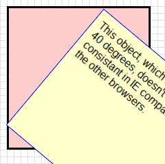
transformproperty, the center of the object remains fixed. However, theMatrixfilter doesn’t keep the centre of the transformed object fixed, as seen by the illustration below:
Rotate using CSS transform Rotate using IE Filter 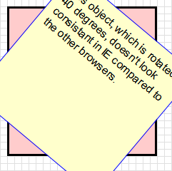
I was about to give up on my endeavor until I read Weston Ruter’s clever CSS Gradients in Canvas article, which implements gradients in older versions Firefox and Opera. What I really liked was how he used the CSS from a web page to place the canvas gradients in the page (as opposed to using CSS classes to indicate where the gradients should go). I then thought it would be a great idea to do the same with CSS transforms – why not have JavaScript find out which objects are transformed by reading the style sheets containing the transform rules, and if the browser is Internet Explorer, apply the Matrix filter, while translating the image so that the center is maintained. How hard could it be …….. right?
After a few obsessive months of coding, coffee drinking and Asprin popping (as well angrily asking myself on several occasions why the &@$! I would wanted to do this in the first place), I created cssSandpaper.js, a library that implements transform (and some other CSS3 properties) as consistently as possible in all browsers. It uses many ideas from Ruter’s gradient script, as well as sylvester.js, James Coglan’s brilliant matrix and vector math library.
The code is currently in a beta stage, but I think that it’s in good enough shape that developers can start to play around with these really cool effects today and have it work in almost any browser.
Browser Differences
After I finished cssSandpaper and played around with transforms, I found some slight differences in the way browsers handled them:
- If you transform an object with scrollbars, it is possible to scroll the object in most browsers in most cases. However, in the cube page I mocked up, I noticed the following behaviour:
- the left facing side of the cube isn’t easily accessible in IE.
- the scrollbars don’t appear at all in Opera.
- the scrollbars are not quite clear in Chrome for Windows, although one can still scroll the sides if you can guess where they are.
- Firefox 3.5 for Mac puts the scrollbars in strange places (this has been fixed 3.6).
- In Internet Explorer, the text is selectable but sometimes it takes a few tries to figure out how to do it (try selecting text with IE in my cube mockup and you’ll see what I mean).
- When selecting text within Firefox, the text tends to jump around ever so slightly for some odd reason (this is quite a subtle effect that it is probably not noticeable in most instances).
- It looks like Internet Explorer takes the block of HTML, converts it to an image and then does the transform (I’m not sure .. I’m guessing). As a result, the text in certain situations will look a little blurry, especially if scaling is involved.
As to be expected, the rendering of the transformed text in the other browsers slightly differs:
Using cssSandpaper
After downloading the archive you must put the following tags into the head of your document after all of your style sheet declarations (this is to ensure the JavaScripts will run after the style sheets are loaded):
<script type="text/javascript" src="path/to/js/cssQuery-p.js"></script>
<script type="text/javascript" src="path/to/js/jcoglan.com/sylvester.js"></script>
<script type="text/javascript" src="path/to/js/cssSandpaper.js"></script>
You can then use the transform property in your web pages. Note that since the specification for the transform property is finalized by the W3C, I decided to use the vendor-specific prefix -sand- before each CSS3 property it supports.
The following is a description of how to use transform, as well as two other CSS3 properties that cssSandpaper supports, box-shadow and gradient.
Go to the cssSandpaper documentation to download the latest version.
-sand-transform
Description
Transforms allow developers to rotate, scale, and skew blocks of HTML via CSS.
Syntax
#container {
   -sand-transform:  <function-list>;
}
where <function-list> can be a space separated list of the following functions:
| Function | Purpose |
|---|---|
rotate(angle) |
Rotates HTML elements. angle can be in degrees (e.g. rotate(30deg)) or radians rotate(1.3rad) |
scale(sx[, sy]) |
Scales HTML elements. sx and sy are numbers, where 1 represents the original size, 2 represents twice the size, etc. Note that if sy isn’t specified, it is assumed to be equal to sx. Similar functions are scaleX(sx) and scaleY(sy). |
skewX(ax), and skewY(ay) |
These functions skew the object around the x and y axes by the specified angles in degrees or radians.Note: the skew(ax, ay) function, which used to work in browsers that support CSS3 Transforms natively is no longer part of the W3C CSS3 spec and is no longer supported by Firefox. |
matrix(a, c, b, d, tx, ty) |
Applies a 2D transformation matrix comprised of the specified six values. If you aren’t familiar with linear algebra and matrix arithmetic, this function will be hard to understand. For further information, you may want to read Wikipedia’s Transformation Matrix article, although if you are mathematically challenged, you may run away from your computer screaming.
If you are familiar with matrix multiplication, note that c and b are reversed. This follows the way Firefox has implemented this method (i believe WebKit based browsers reverse these numbers). |
Note: non-Explorer browsers support the translate function as well. I have not been able to find a way to make this work IE at this time, due to a technical issue with the IE’s Matrix filter property (for those who want details, I use sizingMethod='auto expand' when using the Matrix filter which doesn’t support translations, and using sizingMethod=’crop’ is not suitable to emulate the transform property). For this reason, the tx and ty values of the matrix() function are not supported as well.
Examples
-sand-box-shadow
Description
box-shadow allows us to take a block level element and put a shadow underneath. There can optionally set a blur factor to give a warmer effect to the shadow.
Syntax
#container {
   -sand-box-shadow: <horizontal-offset> <vertical-offset> <blur-radius>
;
}
Note that in IE, the blur-radius is not supported, due to a lack of support in IE’s DropShadow filter.
Examples
-sand-gradient
Description
Gradients are gradual blends of color, and can be linear or radial:
Syntax
#container {
   background-image: -sand-gradient(<type>, <start-point>, <end-point>, <color-stop1>, <color-stop2>, ..., <color-stopN>)
}
The type can be linear and gradient, although Internet Explorer doesn’t support radial gradients at this time, due to limitations in IE’s gradient filter. Internet Explorer also only supports simple linear gradients (i.e. only horizontal and vertical and only two colours).
A more detailed explanation can be found in the section regarding gradients of the W3C’s working draft of CSS Image Values Module Level 3
Examples
Other Known Issues
- Currently, when a users changes the font-size in IE, the layout gets a little messed up. This will be fixed in a future release.
- Scripting in IE cannot be done via the usual
obj.style.transform. There is, however, an alternative way of scripting the cssSandpaper supported properties which will be outlined in a future blog post (I don’t mean to keep anyone in suspense … it’s just that I feel like I’ve spent too much time on this post and I want to get at least this part out the door :-) ). - Opera 10.5 sort of works. It works on my copy, but not on another copy I’ve seen. I don’t know why yet, but I will find out soon and post and update when I do.
- Weston Ruter’s gradient script has more features. I will incorporate them in a future release.
Future Work
cssSandpaper will eventually be about more than just transforms – I would like to be able to support other advanced CSS topics (maybe even animations, if it is possible). It probably has a few bugs in it – I would really appreciate anyone letting me know if you find any (my e-mail address is at the top left part of the page).
If anyone would like to get contribute code or do testing, I would love the help too. :-)
Acknowledgments
I would like to thank Weston Ruter for his CSS Gradients in Canvas script, since I stole many of his ideas with his permission (I will be implementing more of the advanced features of his script in a future release of CSS3Sandpaper). I would also like to thank James Coglan for building Sylvester so I didn’t have to.
Downloads
Go to the cssSandpaper documentation to download the latest version.
 @zoltandulac
 @zoltandulac
 Zoltan Hawryluk





127 responses so far
1 Weston Ruter
// Mar 8, 2010 at 8:53 pm
Thanks for the kind words and kudos! Great work!
2 zoltan
// Mar 9, 2010 at 1:55 am
@Weston: I don’t think I would have written this if it weren’t for your article. Much appreciated!
3 Levi
// Mar 9, 2010 at 3:00 am
Fantastic work! Can’t wait to try it out! :)
4 Ryan McGrath
// Mar 9, 2010 at 3:10 am
This is one hell of an impressive post. Major kudos to you; if you’re ever in the DC area, hit me up, I owe you a beer.
5 Michel
// Mar 9, 2010 at 4:37 am
Great work!
I am amazed how things in the HTML/CSS area progress… The cube looks absolutely amazing in my browser (FF 3.6) and works in IE6, indeed! And I can select text and click on links!
5 years from now, where will be Flash, and various graphics editors (Illustrator, Fireworks, Photoshop)? Will we need them for Web design at all, or shall we use HTML and CSS and JS for everything? Rotate, transform, drop-shadows, gradients, rounded corners… 5 years ago all of this was possible with Fireworks and Photoshop only, and just remember, how complex and difficult was to simply apply some rounded corners to tabs in a navigation block (Sliding Doors anyone?) — you had to have various images, then apply some complex html/css to make this all work!
But soon, we’ll be able to do it without any image editor, and with as simple as possible code!
Thanks for the inspiring article and demos! :)
6 Danny
// Mar 9, 2010 at 4:53 am
Fantastic work, this has saved me a lot of time on a project – thank you!
7 kl
// Mar 9, 2010 at 5:54 am
Wow, Opera’s rendering is the best (crisp antialiasing, not blocky, not blurry!)
8 RyanC
// Mar 9, 2010 at 6:54 am
EXCELLENT work, this is really impressive stuff.
Would it be at all feasible to add support for Firefox 3.0.x? I realize the appropriate CSS3 transforms aren’t available there, but it still has a non-insignificant market share (reportedly 6.5% for Feb2010, per w3schools); is there a way to fake it through SVG/canvas/some other technology?
11 Samuli Hakoniemi
// Mar 9, 2010 at 8:39 am
Hi. Great work done!
I have similar kind of process ongoing and I wrote an article about it couple of months ago “Cross-browser Rotation Transformation with CSS” (http://samuli.hakoniemi.net/cross-browser-rotation-transformation-with-css/)
I’m currently at stage, where rotation, scaling, opacity (+rgba) and some other issues are solved, and I’m moving towards transitions. The purpose is to publish first version during March and I’ll blog about it.
Anyway, it’s very nice to see someone else solving the same issue – and with greater progress :)
12 zoltan
// Mar 9, 2010 at 11:56 am
@RyanC: Thanks for the kudos. I wish it could be done with older Firefox but I haven’t seen way to do it with any of the tech you mentioned … :(
13 zoltan
// Mar 9, 2010 at 4:29 pm
@Jacob: That was totally an oversight by me – cheers for letting me know. I’ll have to fix this in the next release very soon. The transform property, however, is queried along with the vendor specific ones.
14 zoltan
// Mar 10, 2010 at 2:04 am
@Samuli: would love to see how you implent your solution. If you ever feel like collaborating, let me know … I’d always be up for it. There is still a bit of work to be done (I’d love to see a feature rich version of border-radius for IE, for example)
15 Rustam, Russia
// Mar 10, 2010 at 3:17 am
Dear Zoltan, thank you for the perfect plug-in!
Let’s waiting for FF3.0 and Opera 9 to expire.
Also font-face has similar browser support like css-transform.
Russian IT-community posted article about your plug-in http://habrahabr.ru/blogs/javascript/86952/
One question which interests many developers – practical application of css-transform
16 alex
// Mar 10, 2010 at 3:43 am
awesome! especially fantastic selecting text and scrolling )))
must try it
17 WheretIB
// Mar 10, 2010 at 3:43 am
Scrollbars work in my version of Opera 10.50 Build 3296.
19 zoltan
// Mar 10, 2010 at 11:03 am
@Rustam: *very* qood question. Just because a technology exists, doesn’t mean you *should* use it. I remember when blink/marquee tags, animated GIFs, frames, and other such novelties were the big thing back in 1996, and people produced sites like the My The Cheat Web Page!!!!!. Even though The Cheat’s page parodies of what I am talking about, the real deal wasn’t that far off … I want to vomit just thinking about it :-)
I think @Michel’s well-written comment is right on the money – when used appropriately,
transform, along with@font-face,gradient,opacity,box-shadow,text-shadowand the other CSS3 effects, will allow us to have much more flexibility with layout. Even though you can do the same stuff with Photoshop, the fact that you don’t will allow developers to come up with designs more quickly (and will, I believe, create sites that are more searchable). And the fact that CSS3 is scriptable will allow us to not be limited by Flash. This is especially important in our current smart-phone environment where the browsers for the high-end phones (iPhone, Android) don’t support Flash, but do support CSS3 properties liketransform(take a look at the cube example in the iPhone or Android browsers if you wan’t proof).Even though one cannot access the
.style.transformobject in IE, cssSandpaper will allow an alternative way to script-sand-transform. This will be presented in a future blog post very soon.20 Daniel Glazman
// Mar 10, 2010 at 2:11 pm
Very nice article… Thanks for making this possible.
Daniel Glazman, CSS WG Co-Chair
21 zoltan
// Mar 10, 2010 at 2:42 pm
@Daniel: Wow! Thanks. That is unexpected kudos. Much appreciated. (*^_^*)
22 "Cowboy" Ben Alman
// Mar 10, 2010 at 2:49 pm
Zoltan, have you considered breaking out the CSS stylesheet reading code into a generic lib and building cssSandpaper on top of that? It could be very useful for other custom-CSS-plus-JavaScript solutions.
23 zoltan
// Mar 10, 2010 at 2:57 pm
@Cowboy: I never thought of that. I’ll probably end up doing it … thanks for the great idea.
24 Nic
// Mar 10, 2010 at 4:02 pm
I wrote a dojox extension handling the transform and transform-origin properties, fixing the IE inconsistencies:
http://archive.dojotoolkit.org/nightly/dojotoolkit/dojox/html/tests/test_style-html.html
http://archive.dojotoolkit.org/nightly/dojotoolkit/demos/css3/demo.html
Nic
25 zoltan
// Mar 10, 2010 at 5:15 pm
@Nic: That is sweet! I noticed that you have translation there but you are having the same trouble I was having – it is not consistent between IE and the others (I didn’t include it in this release for that reason). This is something I would love to solve and if you ever want to work together on this, I would be totally up for that.
Nicely done on the transform-origin piece. My script doesn’t support it … yet. ;-)
26 Rob Crowther
// Mar 10, 2010 at 6:06 pm
You may be able to do something in Firefox 3.0 with SVG and foreignObject:
http://weblogs.mozillazine.org/roc/archives/2006/06/the_future_is_now.html
27 zoltan
// Mar 10, 2010 at 6:14 pm
@Rob: I’ve never heard of this before. Thanks for the tip.
28 S.Smith - Real Taiji
// Mar 11, 2010 at 6:07 pm
Hmm… it didn’t work at all in Opera for me, on Vista. But it was excellent on Firefox.
At first, I thought, I’d like to use it or see it used more often. But on second thought, I’m moving toward more simple designs, removing many bits of graphics.
It still looks cool though!
29 Tom Something
// Mar 11, 2010 at 7:10 pm
Thanks for this. Though I’m a bit (more) irrated at Microsoft now (than I was five minutes ago). What I’m reading here is “Microsoft built some nifty proprietary filters that can carry out a lot of the transformations and effects proposed by CSS3. Basically, they did most of the work involved in getting this all to work, then stopped just short of making it easy on developers.”
Grrrrrr.
30 Nicolas Gallagher
// Mar 11, 2010 at 7:22 pm
Nice. What about adding the vendor implemented properties and functions to the CSS so that users with JS disabled can still benefit from the CSS3 implementations that currently exist in modern browsers.
31 zoltan
// Mar 12, 2010 at 12:28 am
@Tom: not that I’m defending anyone here, but IE filters were created during the IE 4.0 days, way before CSS3 transforms were even thought. However, I could see why developers could be annoyed that MS decided to spend time implementing this instead of getting the existing CSS spec right, but that is probably the subject of a different blog post :)
32 Jake Magnusson
// Mar 12, 2010 at 11:08 am
Man those transforms look sweet.
I first read about transforming in IE though at this page a few months back that also goes through the “scary numbers” :) http://someguynameddylan.com/lab/transform-origin-in-internet-explorer.php, but that code’s not nearly as featured as this.
Great stuff keep it coming.
33 zoltan
// Mar 12, 2010 at 4:15 pm
@Jake: the article you cite is a great one as it shows the details in the math involved – thanks for sending it.
I was tempted to include a description of the math in a similar fashion, but a few colleagues of mine persuaded me not to, fearing the average web designer would run away screaming. Since I had the same reaction when confronted with writing such a beast, I (happily) followed their advice. :)
Besides, the other article does a better job than I would have.
34 pascal
// Mar 13, 2010 at 5:25 am
But why do your properties use a prefix? If my browser already supported the properties, it now doesn’t anymore unless scripting is activated (and being an evil person, I access the web2.0 only without scripts, to bitch about bad web design)
So I have to use transform AND -sand-transform for it to work nicely in a future browser.
Is there a technical reason the script didn’t just parse transform too? (The syntax should be the official one anyway, so it shouldn’t make a difference)
35 zoltan
// Mar 13, 2010 at 10:59 am
I was really torn about what to do here. I wanted to just use “transform” and “gradient”, but from what I have seen, these CSS3 properties have not been finalized yet (which is why -moz-transform and -webkit-transform exist. For example, gradient syntax is vastly different between firefox and webkit). I understand your concern, but until they are finalized, I think I will have to continue using the -sand properties (for now).
Any comments on this strategy are certainly welcome.
38 Keith Clark
// Mar 17, 2010 at 3:49 am
I was dabbling with this stuff in IE for my ie-css3.js project.
After several hours of exhaustive experimentation I ended up coming to the same conclusions as you; It’s just not possible to get IE to render transformed objects in a way that matches the W3C spec using just matrix transforms in a stylesheet.
I beleive you can adjust IE’s rotation point using JavaScript by manually sizing the elements based on the bounding box of its rotated state but I couldn’t find a way to do it from the stylesheet for my project.
Keith
39 zoltan
// Mar 18, 2010 at 3:28 pm
@Guru: Surprisingly, yes. Filters have been around for a while. It could possibly work with older versions of IE, but I haven’t tested (or care). :-)
40 umesh chand
// Mar 21, 2010 at 1:15 pm
Excellent !
44 tom
// Mar 21, 2010 at 7:23 pm
thx a lot! this is a great work!
49 Web Guru
// Mar 21, 2010 at 7:38 pm
Does this work on the old versions of IE, like IE6 ?
50 Guhan Iyer
// Mar 21, 2010 at 7:39 pm
Excellent I have been looking for something like for a recent IT client of mine. Thanks!
52 ikedo
// Mar 25, 2010 at 4:31 am
Excellent thank for thais post
54 Naat
// Mar 28, 2010 at 4:01 am
Excellent Work done Thanks…
It is really very good…
Thanks Again.
55 Vladislav Vorobiev
// Apr 6, 2010 at 3:57 pm
Thanks for great framework and ideas.
60 CSS-Design
// Apr 29, 2010 at 11:25 am
Awesome CSS3-Transform Tutorial, thx for sharing!
61 safetycopy
// May 27, 2010 at 12:36 pm
This is great work! :-)
Unfortunately, I’ve come across a conflict that makes this unsuitable for a project I’m working on.
I’m using jQuery to dynamically add items to a page and randomly generate the amount of rotation applied to them. Because the random rotation is dynamically generated, I have to attach it to the items as an inline style, and this seems to mess with the way your method works.
I’ve been trying to come up with a workaround, as I’d love to support rotation in more browsers, but, so far, I’ve come up empty-handed.
I was wondering if you might have any ideas?
62 zoltan
// May 27, 2010 at 1:04 pm
If I understand the question correctly, there is a workaround for this described in the follow-up article about animationing css transforms. Since manipulating the style object’s
transformproperty won’t work, I exposed a few methods such ascssSandpaper.setTransform()to script the CSS properties.Let me know if this does/doesn’t suit your needs … I want to make this library as full-featured and as easy to use as possible.
63 Sagar Ranpise
// Jun 21, 2010 at 9:25 am
Absolutely Awesome Work! Thanks a lot for sharing it!
64 brothercake
// Jul 3, 2010 at 2:07 pm
Reading the CSS and automatically converting it is a nice touch — but — it’s over-engineering IMO. You’d be much better off just working with class names – it exposes the mechanics to other developers in a much more straightforward way, without them having to work through your CSS parsing; and it saves on CSS parsing! and it avoids various context issues such as safetycopy’s
Also, I’m not sure from reading the post and comments whether this will be useful information, or whether you already know all this stuff, but: here’s how to convert transform-origin into values that IE can use for its matrix (where “x” and “y” are the dimensions of the box, and “a” is the angle of rotation in radians):
Where origin is “100% 0” (right top):
Dx = x – (Math.cos(a) * x)
Dy = 0 – (Math.sin(a) * x)
Where origin is “0 100%” (left bottom):
Dx = Math.sin(a) * y
Dy = y – (Math.cos(a) * y)
Where origin is “100% 100%” (right bottom):
Dx = (x + (Math.sin(a) * y)) – (Math.cos(a) * x)
Dy = 0 – (((Math.cos(a) * y) + (Math.sin(a) * x)) – y)
And of course “0 0” doesn’t need translating.
HTH :-)
65 brothercake
// Jul 3, 2010 at 2:31 pm
This, btw, is with sizingMethod set to “clip to original”, to match what the other browsers do.
66 zoltan
// Jul 3, 2010 at 6:20 pm
@brothercake: thanks for the transform-origin tip. Regarding the decision to use CSS – my objective was to help developers to get used to the proper CSS syntax now to prepare for that day when all browsers support CSS transforms. I am, however, open to supporting alternative solutions for the sake of optimization. How would your classes solution work?
67 freemh
// Jul 25, 2010 at 8:35 am
Looks great! , expects that it works on internet explore , Here is another example that I found interesting :
http://depotwebdesigner.com/tutorials/how-to-create-3d-cube-with-css3.html
70 Charlotte Coleman
// Aug 4, 2010 at 11:00 am
Thanks Zoltan, it’s such a relief to find your post. I designed a website without thinking about how I’d implement my swish diagonal navigation!
73 Rob
// Oct 13, 2010 at 9:15 am
Awesome work on this – I’ll definitely get a lot of use out of this library!
By the way, I think I’ve found a bug in the current version – I have a @font-face declaration in one of my CSS files, and the script seems to choke on this (maybe due to the strange syntax of @font-face). It throws an exception saying the the variable “rules” is null, and doesn’t apply any of the properties. Removing the @font-face CSS fixes the problem.
Maybe it should have some kind of error handling, so that it’ll at least complete successfully even if it runs into unfamiliar CSS rules?
74 zoltan
// Oct 13, 2010 at 1:17 pm
Thanks for letting me know about this bug. I will definitely look at your suggestions .. do you have a url you can post of the offending page?
75 JP
// Oct 20, 2010 at 12:04 pm
Great work, thanks! It didn’t work in IIS, so I commented out ‘req.setRequestHeader(“If-Modified-Since”, “Sat, 1 Jan 2000 00:00:00 GMT”);’ in the ‘cssSandpaper.js’ file to get it to work.
77 zoltan
// Oct 21, 2010 at 6:41 pm
I have never seen that behaviour before. I’ll have to see if I can replicate this issue. Do you have an example I could see? Any help would be help make cssSandpaper even better.
78 Jared Verdi
// Jan 5, 2011 at 7:44 pm
I can verify the same issue getting cssSandpaper to work by commenting out the if-modified-since date for IIS. Until I had done that, the XHR request to pull down the CSS file returned an error, code 400 “Bad Request”.
79 zoltan
// Jan 6, 2011 at 12:45 am
@Jared: Thanks for the info. Curious that this happens. Will have to look into this further.
81 Jasper
// Mar 2, 2011 at 10:35 am
As said by Rob on oct 13, 2010, cssSandpaper doesn’t work when using @font-face.
But I noticed cssSandpaper didn’t work when importing an empty css file either. I think cssSandpaper ignores the @font-face part and then treats the css as empty: breaking the script.
So as a quick fix, just add some random css at the bottom of the file. This did the trick for me:
#notEmpty{background-color: red;}
Great tool, thanks!
82 Jasper
// Mar 4, 2011 at 7:22 am
So clarify my last post:
I was importing a separate font.css file with JUST the @font-face stuff. So after ignoring the font code cssSandpaper treated that file as empty, as it contained nothing else.
Add the #notEmpty{background-color: red;} class to the font.css file to it appears to have some content.
83 zoltan
// Mar 5, 2011 at 3:44 pm
@Jasper: thanks for your useful comments. I will be posting a fix for this soon so that you won’t have rely on these workarounds, but it is a definite find for the interim. Much obliged!
84 PinkZeppelin
// Mar 8, 2011 at 11:18 pm
Hello, is there any way to make the changes interactively? Clicking on a button for example to rotate a div layer 45 degrees. Thanks for sharing your excelent work.
85 Jamie Alexander
// Mar 9, 2011 at 12:26 pm
Awesome work! One q… I am finding that partially transparent backgrounds (both PNG and GIF) are not transparent when using the rotation/scale function in IE only. Instead they have a black background. Any suggestions?
86 Bill Chadwick
// Mar 16, 2011 at 9:25 am
Some of you might be interested to see how I have managed to implement in browser map reprojection using svg matrix transforms and MSIE matrix transform filters. The client mapping site is here http://mortimermaps.appspot.com/mvmap.htm with the scripted transforms in warped_os.js.
For MSIE8, the IE7 compatibility tag is essential.
If anyone could comment on this post http://social.msdn.microsoft.com/Forums/en/iewebdevelopment/thread/657ebba2-c6d7-4c81-926b-b4f1dcfe0caf I would be grateful.
87 zoltan
// Mar 23, 2011 at 10:32 am
I am not sure if there is a workaround for this — I’ll keep it in mind when I am updating cssSandpaper during the next month or so.
88 Josh
// Apr 8, 2011 at 1:07 am
Hi Zoltan, amazing pack, thanks very much for your hard work!
Just two questions, if you don’t mind… Your comment just above, is that in regards to the black box surrounding transparencies? I’ve just got the same problem and can’t get rid of it…
Secondly, the script doesn’t appear to be recognising :hover. For example, I have a -transform on hover, which moves an item as if it were being touched… Is this a known issue?
Thanks!
89 Josh
// Apr 8, 2011 at 1:09 am
Sorry, I also forgot.. The script crashes when CSS selectors include :nth-child. I have another JS pack running (selectivizr.js) which allows these selectors in earlier versions of IE, but CSSSandpaper throws an error and dies as invalid. :-) Just a heads up!
90 zoltan
// Apr 9, 2011 at 10:43 pm
@Josh: thanks for the feedback. Here are my $0.02:
Again — thanks for the feedback. If/when I do fix any of these issues, I’ll contact you directly.
91 JK
// May 24, 2011 at 10:07 am
This is driving me insane!
I’ve checked your samples and they work perfectly when checking them online, and that’s nice cos I really need to get rotation to work, but the moment I download them and try them locally it won’t work! Not in any browser! Not when run from drive-path, not when run thru IIS (windows 7). The only ones that work are the CSS3 animation samples, except for “A simple animation with skewing and rotation”.
This is what the console in FF says:
Error: uncaught exception: [Exception… “An invalid or illegal string was specified” code: “12” nsresult: “0x8053000c (NS_ERROR_DOM_SYNTAX_ERR)” location: “http://localhost/cssSandpaper.1.2/shared/js/cssSandpaper.js Line: 341”]
which is: var nodes = document.querySelectorAll(rule.selector);
I’ve even tried commenting out the function content of fixLinearGradients since that’s not my main priority, and that got rid of the error but still nothing happens!
Any ideas?
BR
/J
93 zoltan
// Jun 5, 2011 at 12:53 pm
One of the common problems people come across is that cssSandpaper will not work correctly with external stylesheets if the page isn’t on a web server. If that is the case, try that and see if that is the problem.
94 Tony
// Jun 17, 2011 at 11:49 am
Thanks so much for this ! Great work :)
95 Kishore
// Jun 18, 2011 at 3:09 am
Wow! what an awesome script, thanks a lot, you saved my image and job both… thanks a lot once again:)
96 maidul
// Jun 23, 2011 at 7:57 am
Thanks a lot for this post.You save me a lots of time.
97 timbo
// Jul 18, 2011 at 6:07 pm
Hello,
I’ve been trying to use your awesome code but I keep getting the following error:
“$M is not defined”
You can see it at: http://wwww.ts77.com/diagonal/test.html
Any ideas what I’m doing wrong?
Thanks!
98 zoltan
// Jul 18, 2011 at 6:26 pm
@timbo: It sounds like the Sylvester library is not included in the head of your document. If you try that and it doesn’t work, send me a URL and I’ll be happy to help you out.
99 Alishia Schroy
// Sep 3, 2011 at 12:11 pm
I wanted to send a simple remark to appreciate you for these unique concepts you are giving at this website.
100 beppe
// Sep 15, 2011 at 10:32 am
sorry for my english…..IT’s possible i find a little bug:
if i generate the image with jquery like this:
$(”)
.insertBefore(‘body’)
explorer not work …… ff it’s ok.
Now i fix this “problem” generate the img with php
101 zoltan
// Sep 24, 2011 at 2:13 pm
@beppe: I am not sure what you are trying to do here… can you please explain further?
102 animation institute
// Sep 29, 2011 at 3:30 am
hi ! great work there !..this has helped a lot
103 Maksim
// Nov 29, 2011 at 11:28 am
Amazing lib, Zoltan!
Everything works very smoothly, but having same issue with PNG transparency and no luck with fixing it. Do you have any updates on that?
104 westine
// Dec 2, 2011 at 1:21 am
Hi, how can I dynamically transform my css class using “-sand-transform:rotate(90deg)”?
I have tried this line while .tickLabel is my div class
$(“.tickLabel”).css({“-sand-transform”:”rotate(90deg)”});
It does not work.
Please help, thanks in advance.
105 zoltan
// Dec 2, 2011 at 1:28 am
Take a look at the companion article Cross-Browser Animated CSS Transforms — Even in IE. Note that this solution does not use jQuery syntax. jQuery support is something that I am currently working on, and I will post on my blog when that is complete.
106 zoltan
// Dec 2, 2011 at 1:29 am
@Maksim: Sorry … not update on that yet. It may be that PNG transparencies are not possible in transformed objects in IE using cssSandpaper due to limitations of IE’s Matrix Filter. . :-(
107 re5et
// Dec 9, 2011 at 5:33 am
Hey, first of all thanks for the great work you’ve done! I’m having troubles using sandpaper on a website I’m working on, since there’s quite a few external stylesheets in use (addthis, google fonts, etc..) which causes the browser to throw an “XMLHttpRequest Exception 101”. Is there any way to explicitly include or exclude certain stylesheets from parsing? Or any other workaround for this problem?
Thanks in advance!
108 zoltan
// Dec 11, 2011 at 1:21 pm
@re5set: To exclude a stylesheet from being parsed by cssSandpaper (like one that is not on the same domain as the html) just add a class of
cssSandpaper-noIndexto thelinkorstyletag.109 Barney
// Dec 15, 2011 at 1:05 pm
Zoltan, this work is a triumph. Well done on nailing a polyfill for rotation that addresses the IE origin problem successfully — many have produced otherwise impressive solutions but failed on this point, and there is a sorry history of ambitions to patch this that have fallen by the wayside…
I am currently working on a project with a complex rotation-based layout and interactions (a very elaborate GUI; not necessarily that intuitive ;). For this I am using your script collection and applying the transformations dynamically based on the necessary calculations, then copying the rendered styles and writing them into static CSS for the production site: toggling classes will determine changed states, and CSS transitions will cater for animation (several crashes in, I have concluded that JS-interval-animating filters is incredibly dangerous).
PNGs & GIFs:
For the purposes of my design, it’s necessary to use several overlayed transparent images. This IS possible by specifying the AlphaImageLoader filter BEFORE the matrix filter (although the anti-aliasing suffers from cludgy pixel rasterising).
Once again, immense thanks for your hard work on something I simply couldn’t get my head around.
110 Ralph Krausse
// Dec 17, 2011 at 12:33 pm
Does look like -sand-transform supports hrefs… Is that correct?
111 zoltan
// Dec 17, 2011 at 2:20 pm
@Ralph: If you are asking if it can transform <a> tags, then yes, it does.
112 Ralph Krausse
// Dec 19, 2011 at 9:35 am
Actually I mistyped. I was going to say it doesn’t. Well you are right, it does BUT the link itself isn’t over the rendered link. If you don’t mind, email me and I will email you image and source so you can see. The mouse changes (to the link cursor) above the rendered link.
thx
r
113 rad
// Mar 29, 2012 at 6:21 pm
Doesn’t work in chrome 17. Not even the demos work. Looks like an ajax permission error.
Occurs on this page: http://www.useragentman.com/tests/cssSandpaper/rotateTest.html
Here is the error:
Failed to load resource: the server responded with a status of 404 (Not Found)
XMLHttpRequest cannot load data:text/css,?null. Origin http://www.useragentman.com is not allowed by Access-Control-Allow-Origin.
cssSandpaper.js:1788Uncaught Error: NETWORK_ERR: XMLHttpRequest Exception 101
114 zoltan
// Mar 29, 2012 at 8:27 pm
I don’t see the same issue on http:/www./useragentman.com/tests/cssSandpaper/rotateTest.html with Chrome 17 on Windows 7. I do see the problem when I go to http://useragentman.com/tests/cssSandpaper/rotateTest.html. This is because this page is trying to access a stylesheet on http://www.useragentman.com instead of useragentman.com. The stylesheets must be on exactly the same host domain as the parent page.
115 Shaun Aunchman
// Apr 5, 2012 at 2:19 pm
I was concerned we would need to implement image maps (yuk) to create a working curved navigation. This has made my life easier and conscience cleaner! Thanks for your contribution.
116 Son
// Apr 10, 2012 at 6:21 pm
Unfreaking-believable! I ran into this website dozens of times and on first impression thought it was just too cumbersome to implement… now I need it the most and all it took was 10 minutes! If only had I stopped and read a bit further.. it would have saved me 20+ hours of research and testing.
Thank you for the job well done on this, it works perfectly on IE for me now — no more freaking annoying black shadow on transforms.
117 dravid wilson
// Aug 15, 2012 at 6:34 pm
this is great, but the scroll bars in this example http://www.useragentman.com/tests/cssSandpaper/cube3.html do not work on chrome Version 23.0.1236.0 canary and also Version 21.0.1180.77
119 zoltan
// Aug 24, 2012 at 4:20 pm
@dravid: Interesting. This has been an issue with WebKit browsers since 2010 when I wrote the articles (the scroll bars are actually there and usable — they are just invisible). I will open up a ticket with the browser manufacturers to see if they can fix that (it is not cssSandpaper’s fault, but a flaw with their implementation of
-webkit-transform). Thanks for pointing this out.120 Essex Design
// Oct 9, 2012 at 2:03 pm
I love the cube, very cool, this is a great post, consider it bookmarked!
121 Shawn Burnam
// Oct 26, 2012 at 7:34 am
Hi Zoltan, love the lib that you wrote. I Have a client that wants met to create an animated isometric cube. Do you know if anyone has attempted to use your code in this way? I not, do you think it feasible from a performance standpoint? BTW this has to work in IE8 and iPad. Any info would helpful ;-)
122 zoltan
// Oct 28, 2012 at 10:31 pm
@Shawn: To my knowledge, it is not possible to do 3D Transformations of arbitrary in IE9 and below. If you want 3D animation, you should use a JavaScript canvas library like CvsGraphCtx3D that can use the excanvas polyfill in IE8 and below. Note that I have never personally done this, so I cannot give advice on how to use it, but it looks promising. Good luck!
123 Dimitri Joukoff
// Feb 15, 2013 at 8:20 am
Zoltan,
Incredible!
Here is a site you might find interesting: http://fff.cmiscm.com
It was shown to me by a lecturer at Uni. It too demonstrates similar graphic potential available in browsers in an interesting and enjoyable way.
Best wishes,
Dimitri
124 Karl
// Mar 21, 2013 at 10:51 pm
I first read this article a couple of years ago, but never actually tried it. It’s just what I need for a client project. I will be back if I have any trouble :)
125 Don
// Jan 1, 2014 at 4:25 pm
Have you got it to work with hover states yet? I’d love to have an element rotated then snap back to 0 degrees on hover.
126 Seth
// Feb 18, 2016 at 6:19 pm
Hi Zoltan,
This is indeed great stuff.
I am kind of an old timer and not adept at the css3 stuff.
But I needed to use some of the transforms in a cross-browser project
and I was stuck with IE’s support in the area (Or rather lack of it :( )
Your work makes great sense. Thanks a Bunch, I learnt a good deal from it.
But one thing I did not find is about the function rotateX.
On http://caniuse.com/#feat=transforms3d, it says IE10 & 11 – limited support.
I am not able to find what ‘limited’ is.
Any ideas on how I could make it work on IE?
Appreciate your inputs … Best – Seth
127 zoltan
// Mar 30, 2016 at 9:44 pm
@Seth: It has to do with IE10-11 not being able to support this:
transform-style: preserve-3d;There is a CSSTricks.com page that contains a workaround for IE10-11 for preserve-3d, but I have never tried it. YMMV.
Give Feedback
Don't be shy! Give feedback and join the discussion.
Please Note: If you are asking for help using the information on this page or if you are reporting a bug with the code featured here, please include a URL that shows the problem you are experiencing along with the browser/version number/operating system combination where the issue manifests itself. Without this information, I may not be able to respond.