Below are some notes on the differences between CSS3 Transforms and IE's Matrix Visual Filter. Information about each of the CSS3 Transform functions are available on the links at the side. Go back to the Transforms Translator.
Supported Transform Functions
This tool written by Zoltan Hawryluk and Zoe Mickley Gillenwater.
Powered by CSS Sandpaper, with the help of code written by Weston Ruter, Dean Edwards and Andrew Johnson.
This tool converts CSS3 Transform properties (which almost all modern browsers use) to the equivalent CSS using Microsoft's proprietary Visual Filters technology.
Differences Between the IE Matrix filter and CSS3 Transforms
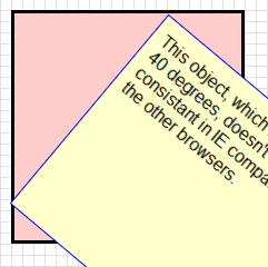
- CSS3 transforms, by default, do transformations with respect to the center of the object, while the
Matrixfilter tries to fit the transformed object in the smallest amount of space possible, as seen by the illustration below:
In order to work around this difference, the IE Transform Translator uses the width and height values to move the transformed object the same position that a CSS3 Transformation would, using theRotate using CSS Transform Rotate using IE MatrixFilter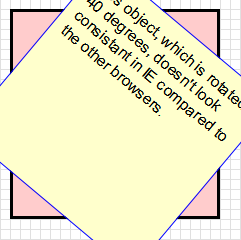
margin-leftandmargin-topproperties. -
If you want to ensure consistent positioning of the transformed
element, use IE with this tool. The other
browsers make a very good mathematical guess on the values of
margin-leftandmargin-top, while IE calculates them more accurately. However, even when using IE, you may, from time to time, find you will be off by a few pixels. This may be due to other CSS rules in your style sheet. -
If you do use a
Matrixfilter on an HTML element, and then use anotherMatrixfilter on a child node of that element, you may get unexpected results (usually, the transformed element is cropped unexpectedly). - Scaling in IE is not as good as scaling in
browsers that do native CSS3 transforms. It seems that this
is because IE's
Matrixfilter transforms a raster version of the original element, while the other browsers seem to transform a vector version (For those who are not sure what the difference is, the article An explanation of Raster vs Vector will explain). - In IE, users can select the text with a mouse inside a transformed element more easily if the element is not scaled or flipped upside down. Skewing, or performing multiple transforms on an element gives mixed results.
-
The order of the parameters of IE's
Matrixfilter must be exactly as they are in the tool, especially theSizingMethodparameter. Doing otherwise may prevent otherMatrixfilters in the same style sheet to work correctly. - If you want to set transforms using JavaScript (i.e. doing animations), it is better to use a library like cssSandpaper, because of the many quirks that happen when scripting Visual Filters (it is a real pain).
-
It is best to use IE'sUpdate: If you are transforming an object with a background that isn't a solid color, you need to add aMatrixfilter with solid backgrounds (i.e. a solid color or a image that doesn't have a transparency or alpha channel), otherwise the result will be a little pixelated.Chromafilter before you apply theMatrixfilter. - The
-ms-filterproperty must be before the correspondingfilterrule. The value in quotes must also be contained in one line. -
If combining IE's
Matrixfilter with other filters in the same CSS selector (e.g. thegradientfilter), it is important to put all the filters into one CSS rule:
#transformedObject {

   /* IE8 - must be on one line. */
   -ms-filter: "progid:DXImageTransform.Microsoft.gradient(startColorStr='#99B4B490',EndColorStr='#99B4B490') progid:DXImageTransform.Microsoft.Matrix(M11=0.9914448613738104, M12=-0.13052619222005157, M21=0.13052619222005157, M22=0.9914448613738104, SizingMethod='auto expand')";

   /* IE6,IE7 - can span multiple lines */
    filter:  progid:DXImageTransform.Microsoft.gradient(
                  startColorStr='#99B4B490',EndColorStr='#99B4B490')
             progid:DXImageTransform.Microsoft.Matrix(
                  M11=0.9914448613738104, M12=-0.13052619222005157,
                  M21=0.13052619222005157, M22=0.9914448613738104,
                  sizingMethod='auto expand');

}
Error
Step 2: Copy and paste the cross-browser CSS!
| For CSS3 Savvy Browsers | For IE |
|---|---|
|
|
|
To ensure you're transforms will look optimal in IE, please take a look at our user notes.