 @zoltandulac
 @zoltandulac
 Zoltan Hawryluk
If you’ve been using CSS3 Transforms, you have probably seen that sometimes, transformed text that is not spaced correctly, is rendered with jagged edges, and letters are placed correctly on the transformed baseline. I have seen these quirks a lot since playing CSS transforms were introduced in Firefox 3.6 was released, and they were documented on the web back then by people such as Nicolas Gallagher. If you don’t know what I am talking about, take a look at the following example in Firefox, Chrome, Safari or Opera:
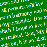
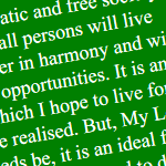
I have cherished the ideal of a democratic and free society in which all persons will live together in harmony and with equal opportunities. It is an ideal for which I hope to live for and to see realised. But, My Lord, if it needs be, it is an ideal for which I am prepared to die.
If you hover over the green block, you will see that transformed text becomes smoother when animating, but about a second after the animation stops, you’ll see it reverts back to its former jaggedy self.
As seen from the screenshots below this effect is really pronounced in Windows. It happens to a much lesser extent on OS X and Linux, and is almost unnoticable on iOS and Android mobile devices that I have tested with. (Note that this effect doesn’t seem to happen at all in Internet Explorer 9+ … Yes kids! For once, IE is doing something right for a change!)
| Firefox | Chrome / Opera | IE 9+ |
|---|---|---|
|
 |
 |
In addition, all Mac, Windows and Linux version of Firefox, Chrome and Opera, as well as OSX Safari will “flash” into a smooth font while animating, and will “flash” out of the smooth font when the animation is finished (the font’s color in Safari is also much brighter when it isn’t animating). In all cases, it’s quite distracting and really noticeable!
So how do we fix this?
Solution 1: Add Some Perspective!
For WebKit/Blink browsers (i.e. Chrome, Safari and Opera): the solution is easy — throw it on the GPU. Let’s say you are rotating am element -10°. The CSS to do would be as follows:
#rotated-element {
  -webkit-transform: rotate(-10deg);
  -moz-transform: rotate(-10deg);
  -ms-transform: rotate(-10deg);
  -o-transform: rotate(-10deg);
  transform: rotate(-10deg);
}
A lot of developers would proceed the -webkit-transform transform value with a translateZ(0) in order to force the GPU to render the element
#rotated-element {
  -webkit-transform: translateZ(0) rotate(-10deg);
  -moz-transform: rotate(-10deg);
  -ms-transform: rotate(-10deg);
  -o-transform: rotate(-10deg);
  transform: rotate(-10deg);
}
Developers have been doing this for a while to speed up animating the element (especially on mobile devices). This also seems to improve text rendering as well. Unfortunately, this does not work with Firefox, even when swapping -webkit-tranform for -moz-transform or just plain transform. Fortunately, there is a fix that will work with both Firefox and Webkit browsers: instead of using translateZ(0), use perspective(1px) (which still throws rendering of the object to the GPU). Here is the code:
#rotated-element {
  -webkit-transform: perspective(1px) rotate(-10deg);
  -moz-transform: perspective(1px) rotate(-10deg);
  -ms-transform: rotate(-10deg);
  -o-transform: rotate(-10deg);
  transform: perspective(1px) rotate(-10deg);
}
Note that I did not use the perspective(1px) fix for all the vendor prefixes, since it actually breaks IE9 and Opera 12.10 and lower (which uses the Presto layout engine), due to their lack of 3D Transform support (perspective() is used to determine the intensity of the 3D effect, but since we are using only 2D transforms, it doesn’t really have any other effect besides improving font-rendering). If you look at the example below in Safari, Chrome, Opera and Firefox, you will see the difference in typography with the first example:
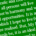
I have cherished the ideal of a democratic and free society in which all persons will live together in harmony and with equal opportunities. It is an ideal for which I hope to live for and to see realised. But, My Lord, if it needs be, it is an ideal for which I am prepared to die.
Here are a bunch of screenshots to show the rendering difference in the various browsers:
| Firefox | Chrome / Opera | IE 9+ | |
|---|---|---|---|
| Before |
|
|
|
| After | 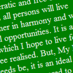
|
 |
 |
Most people would agree that IE9 and up still renders the text better than the other browsers under Windows 7, but it is better than what it was without it, and it also doesn’t trigger a sudden change of anti-aliasing when the object animates using CSS animations, transitions, or JavaScript.
Solution 2: Use an SVG filter and backface-visibility
If you take a look at the border with the perspective(1px) fix in Firefox only, you’ll see an unintended side-effect: the border is now jaggedy:
| Firefox/Win 7 | Close up |
|---|---|

|

|
After a bit of playing around, I noticed that using SVG filters on the HTML content instead of the perspective() fix smooths the font the same way and fixes our jaggedy border issue. In this instance, I chose to blur it with a blur radius of 0 — this doesn’t actually blur the element, but it does give us the desired effect. I use data URI directly in the CSS to apply the SVG filter so that I don’t have to make the browser download a separate SVG object.
The combined code looks like this:
#rotated-element {

  /* Perform the rotation */
  -webkit-transform: rotate(-10deg);
  -moz-transform: rotate(-10deg);
  -ms-transform: rotate(-10deg);
  -o-transform: rotate(-10deg);
  transform: rotate(-10deg);

  /*
   * The fix for WebKit/Blink browsers.
   */
  -webkit-backface-visibility: hidden;

  /*
   * The fix for Firefox ... yes, it has to be on one, huge line.
   */
  filter: url('data:image/svg+xml;utf8,<svg version="1.1" xmlns="http://www.w3.org/2000/svg" xmlns:xlink="http://www.w3.org/1999/xlink"><defs><filter id="gaussian_blur"><feGaussianBlur in="SourceGraphic" stdDeviation="0" /></filter></defs></svg>#gaussian_blur');
}
Yeah, the Firefox CSS is a rather large line, but it works! Take a look at the live example below. (Note that I used -webkit-backface-visibility: hidden; instead of prepending perspective(1px) in the -webkit-transform property — it is just another way of throwing rendering of a DOM element to the GPU in WebKit and Blink).
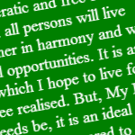
I have cherished the ideal of a democratic and free society in which all persons will live together in harmony and with equal opportunities. It is an ideal for which I hope to live for and to see realised. But, My Lord, if it needs be, it is an ideal for which I am prepared to die.
Here are some screenshots, in case you are viewing this page in something other than Firefox:
| Firefox/Win 7 | Close up | |
|---|---|---|
perspective(1x) fix |
|
|
filter fix |

|

|
An outline for another fix:
Note that you can also use the CSS outline property to fix the blocky border as well:
#rotated-element {
  -webkit-transform: perspective(1px) rotate(-10deg);
  -moz-transform: perspective(1px) rotate(-10deg);
  -ms-transform: rotate(-10deg);
  -o-transform: rotate(-10deg);
  transform: perspective(1px) rotate(-10deg);
  outline: 1px solid transparent;
}
This fix may be better if performing animations, since SVG filters in Firefox are currently pretty CPU intensive. I have, however, not done any performance testing on this yet, and will post an update to this post if I find any information either way.
Other Notes
- Fonts don't seem jaggedy as in Firefox and IE in Windows 8 without these fixes on some computers. However, there may be cases where all font rendering may look worse. For more information about Windows 8 font rendering, read ClearType takes a back seat for Windows 8 Metro by Long Zheng and Users keep reporting blurry text in Windows 8 and 8.1 by John Callaham.
- Just for completeness, I have made the demos above work in IE8 and below using Visual Filters with a little help of my IE Transforms Translator. The typography is a little thicker than IE9 under Windows 7, but decent enough. Here are some screenshots to compare:
IE8 IE 9+ 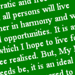
Further Reading
- New CSS2.1 and CSS3 bugs in modern browsers by Nicolas Gallagher
- MDN articles on the CSS filter, outline and perspective properties.
More Tricks and Tips For CSS 3D: Smoothing Transforms & Fixing Floated Elements by Dudley Storey
2 responses so far
1 Alan Bulpitt
// Dec 16, 2014 at 2:36 pm
Alan Bulpitt
// Dec 16, 2014 at 2:36 pm
For a CSS beginner this is a real gem of an article! It certainly saved what is left of my hair. Thank you!
2 Daniela
// Apr 16, 2015 at 4:43 pm
Daniela
// Apr 16, 2015 at 4:43 pm
Great article! My co-worker encountered this problem and he used your solution.
Give Feedback
Don't be shy! Give feedback and join the discussion.
Please Note: If you are asking for help using the information on this page or if you are reporting a bug with the code featured here, please include a URL that shows the problem you are experiencing along with the browser/version number/operating system combination where the issue manifests itself. Without this information, I may not be able to respond.