Notes:
- Before reading this article, you may want to read my previous article, which covers producing other text-shadow effects in IE.
- After reading this article, you may want to read my subsequent article, which covers using my cssSandpaper JavaScript library to produce multiple blurred and un-blurred text-shadows in IE7+
- When I first posted this article, I wrote that this solution works with IE8 as well as IE9. However, further testing has shown that IE8 produces unpredictable results. Please see the Caveats section for more information
Blurred Text-Shadow in IE9 Without JavaScript
Last week, I discussed several strategies web developers can use to simulate CSS text-shadow in IE. In that article, I mentioned that there was no way that I knew of to simulate text-shadow with a blur-radius in IE without JavaScript. Since then, I have discovered a way to simulate the CSS text-shadow effect in IE9 that does not use JavaScript and does not add extra elements to the DOM. There are some other caveats to this solution, and because of this, I have titled this article “Part 1”, since I believe more work can be done in this area to improve support for blurred text-shadows in IE.
Step by Step Text-Shadowing in IE9
This solution makes use of Paul Irish’s Conditional CSS Pattern, and I would suggest reading that article first before proceeding any further. I would also recommend reading my previous article, CSS3 Text-Shadow – Can It Be Done in IE Without JavaScript?, since this solution relies on some ideas presented in that article.
After you become familiar with the above two articles, implementing text-shadow in IE9 becomes a two-step process.
For this tutorial, let’s assume the following HTML:
<div id="intro" class="alignLeft">
  <p data-innertext="Blurred Text-Shadow in IE9 Without JavaScript">
    Blurred Text-Shadow in IE9 Without JavaScript
  </p>
</div>
(Note the data-innertext attribute in the element we want to add the text-shadow to. This must contain exactly the same text that the element itself contains. We’ll explain why we need this later on).
Let’s also assume we want a gray text-shadow with both an x- and y-offset of 3 pixels as well as a blur radius of 3 pixels:
#intro p {
     text-shadow: 3px 3px 3px #cccccc;
     width: 230px;
}
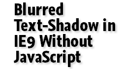
Let’s look at the result so far:
| Firefox screenshot | IE screenshot |
|---|---|
 |
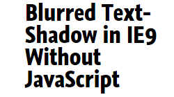 |
As one would expect, works in Firefox but not in IE9.
See the above text-shadow code in action (without any IE9 goodness)
Step 1 – IE Blur Filter
Using Paul Irish’s Conditional CSS Pattern, we make an IE9 only rule that will blur the text
#intro p {
     text-shadow: 3px 3px 3px #cccccc;
     width: 230px;
}

/* Step 1: apply the Chroma and Blur filter to the text you want the Drop Shadow on */
body.ie9 #intro p {
	zoom: 1;
	color: #cccccc;
	background-color: #ccccce;
	filter: progid:DXImageTransform.Microsoft.Chroma(color=#ccccce),
	        progid:DXImageTransform.Microsoft.Blur(pixelradius=3);
}
Note four things:
- I set the
colorto be the color of the text-shadow. - We set a background-color to be halfway between the color of the text (black) and the visual background of the text (white). In this case, I chose
#cccccesince#ccccccis already being used by as the color of the text-shadow. - We remove the background color with the
ChromaVisual Filter (this is necessary to avoid the Blur filter from being pixelated, in the same manner as the text-shadows in my previous article). - We apply the
BlurVisual Filter to have apixelradiusof 3 (which is the same as the blur radius from thetext-shadow.
| Firefox screenshot | IE screenshot |
|---|---|
 |
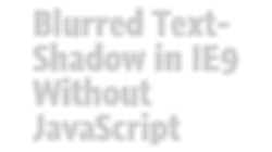 |
See the above code in action (IE9 will only show the blurred text)
So now we have the shadow in IE! But what about the solid text on top?
Step 2 – Use :before To Replace the Solid Text
We now must add one more selector in order to get our black, un-blurred text back:
/* Step 2: create a :before rule on the blurred text */
body.ie9 #intro p:before {
  /* color and width of the original text */
  color: black;
  width: 230px;


  /* This is needed to place the text directly over the shadow. */
  position: absolute;

  /* This assumes that the data-innertext is the same as the text inside the element. */
  content: attr(data-innertext);

  /* Positions the text */
  margin-top: 0px;
  margin-left: 0px;
}
The :before rule duplicates the blurred text, colors it black and places it before the blurred text. The text is then duplicated because of the content property, which uses the value of the data-innertext attribute as the generated content — now you know why we set data-innertext at the beginning of this example. It is absolutely positioned, and since the top and left properties are not set, it places the text on top of the original text. Also note that the width is the same as the original element (in this case 230px). This is very important, otherwise the shadow will not appear below the text correctly.
The only thing left to explain is the margins and how they position the text. We must use these formulas to produce the x- and y- offsets of the original text-shadow
margin-left = blur-radius – offset-x
margin-top = blur-radius – offset-y
Why do we need to do this? Because adding the Blur filter pushes the text a few pixels from down and to the right — namely, the same amount of pixels from the blur-radius. These simple formulas compensate for that, and place the shadows according to what you set for the x- and y-offsets.
| Firefox screenshot | IE screenshot |
|---|---|
 |
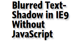 |
And now, let’s take a look at the difference close up:
| Firefox screenshot | IE screenshot |
|---|---|
 |
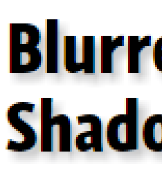 |
Note: the other browsers look about the same in Firefox, so I didn’t bother posting screen captures of them.
See the above code in action, with IE9’s blurred text-shadow workaround.
Caveats
This solution only works under certain conditions:
- You cannot have more than one type of font, font-size, font-weight or font-style with the shadowed element. This is due to the way we produce the shadow (i.e. the
data-innertextcannot contain any HTML elements to control the style). - The shadowed element cannot be an
inlineelement. It can be a block or an inline-block though. - Any background colors or background-images that you want to appear in with the text-shadow must appear in an outside element. For example, in the following HTML, you would put the
background-imageorbackground-coloron the<div>tag, not the<p>tag which would have thetext-shadow.
<div id="intro" class="alignLeft"> <p data-innertext="Blurred Text-Shadow in IE9 Without JavaScript"> Blurred Text-Shadow in IE9 Without JavaScript </p> </div> - The shadowed element must be of fixed width (i.e. widths can be measured in
px,em, etc. Percentages will not work). - As far as I know, it is impossible to have multiple text-shadows on the same block of text. If you wish to do this do glow text, you may want to look at my previous article, CSS3 Text-Shadow – Can It Be Done in IE Without JavaScript?.
- It only works in IE9. When I originally posted this article, I claimed it worked with IE8, but after further testing, when setting a font on a
:beforerule, IE8 sometimes produces unpredictable results (sometimes, the font is set to something different than the original text, and other times, the letter spacing is not correct). IE8 and lower are out of luck. :-(
An Open Challenge To Improve This Technique
Think you can do better? I challenge you! I am almost certain there has to be a better way with fewer restrictions that the solution I give here. I also know there are quite a few smart people out there who read this blog, so I am dropping the gauntlet and challenging everyone reading this article to help come up with a better solution. Post a URL with an example below, and if I like what I see, I will post a follow up article to this one with what I believe are the best solutions. Here’s your chance to solve what I think is a huge web development problem and be recognized as Someone Really Clever™.
Unless, of course, I come up with a better solution first. :-)
 @zoltandulac
 @zoltandulac
 Zoltan Hawryluk
16 responses so far
1 Kazz
// Apr 30, 2011 at 9:17 am
Hi
I’ve created JavaScript to apply CSS3 text-shadow for MSIE.
It works in MSIE7~9, maybe.
The document is written in Japanese, but you can check how it works visually.
Document and Script source : http://asamuzak.jp/html/321
Demo Page : http://asamuzak.jp/test/textshadow_test_ie
Regards
2 zoltan
// May 7, 2011 at 12:44 pm
This looks great! My Japanese is not up to technical documents, but Google Translate looks like it does a really good job here: http://bit.ly/kGGI28.
Thanks for sending this! Is this released under a free license?
3 Kazz
// May 7, 2011 at 7:57 pm
It’s free.
Just, please don’t remove the commented lines at the top (link to my web).
/*
text-shadow for MSIE
http://asamuzak.jp
*/
Google translates very very well in fluent English which I can’t understand at all :),
so I wrote a summary in English : http://asamuzak.jp/html/322
and English Demo : http://asamuzak.jp/test/textshadow_test_ie_en
4 Ben
// May 10, 2011 at 12:33 pm
there’s a much easier way to do this, similar to your april 14th post. it relies upon the fact that IE’s filters includes another kind of shadow (called just shadow, instead of dropshadow):
text-shadow: silver 14px 7px 21px; /*ff,opera,webkit*/
background-color: cornsilk; /*ie hack*/
filter: chroma(color=cornsilk) shadow(color=silver,direction=120,strength=21); /*ie hack*/
as you already know, you have to set the background color and then chroma out the background color, or else IE makes this nasty grainy black border. it took me awhile to figure that out, which your april 14 post helped me do so
you also have to use “direction” which is in degrees, rather than an X and Y offset. the 120 degrees direction i am using above is not exactly the same as the text-shadow offset i am using for other browsers, but i couldn’t be bothered to do the math
otherwise, it’s visually pretty close to the kind of text shadow you get with firefox/ opera/ webkit
ie filters reference (shadow, dropshadow, etc.):
http://msdn.microsoft.com/en-us/library/ms673539(v=VS.85).aspx
5 zoltan
// May 14, 2011 at 10:59 am
@Ben: While this method may be easier in code, I have found in the past I have found the
shadowfilter a little bit “streaky” compared to the CSS3 implementation. However, others may find it useful or “good enough” for their purposes, so thanks for pointing it out.6 Andy E
// May 20, 2011 at 10:14 am
Since you’re already increasing the markup by writing the text twice, why not increase it further and use two span elements side-by-side. Both contain the same text, one is hidden to non-IE browsers and becomes the shadow in IE6-9. Seems to work pretty well for me:
http://whattheheadsaid.com/2011/05/creating-a-nice-text-shadow-in-internet-explorer
This increases the markup slightly compared to your solution, but gives better compatibility. As an added bonus, the text can also contain HTML.
7 Werner
// Jun 3, 2011 at 1:57 pm
Hello People,
a solution with jQuery
// Text-Shadow
$(“h1:not(.no-text-shadow-ie)”, $(‘section’)).each(function(){
var h1_tx_Shadow = $(this).text();
$(this).append(“”+h1_tx_Shadow+””);
});
/* CSS */
section h1, section h2, .text-shadow-ie {
position:relative; z-index:2;
}
span.shadow_h1, span.shadow_h2, span.shadow_ele {
position:absolute; top:0px; left:0px; z-index:-1;
}
span.shadow_h1 {
filter:progid:DXImageTransform.Microsoft.Blur(PixelRadius=’1′,MakeShadow=’true’,ShadowOpacity=’0.60′);
}
8 zoltan
// Jun 5, 2011 at 9:33 am
I thought about this when I came up with my solution, but I believe that this may affect other areas (e.g. Search Engine Optimization). Doing this via JavaScript may work around these issues though, so it is something to think about.
9 Keith
// Oct 19, 2011 at 11:03 pm
Here is a really great solution to the issue….
Microsoft should stop being so arrogant and pigheaded and write IE, and an IE upgrade/update, so it IS CSS Compliant
Problem solved
11 Nathanael
// Oct 25, 2011 at 2:48 pm
Thanks for the tutorial. I used it to come up with another solution. In the HTML I created a normal text element with a .shadow class, and styled it in the css. I then use JS if the browser is IE to parse through the page looking for all elements with class .shadow, and add testtest and remove the original text. Then using the CSS you provided I style it for IE. This way I feel is more SEO friendly and progressive enhanced.
12 Nathanael
// Oct 25, 2011 at 2:51 pm
I didn’t realize your site strips the html out of comments. To clarify, I use JS if the browser is IE to add an element for the text and an element for the shadow, and use your CSS to create the blur and stack the 2 elements. This allows me to replace all text on the page with a shadow class to work in IE.
15 Luciana
// Sep 10, 2012 at 5:18 pm
gah… I’m not a fan of IE, but… There was a time like 10+ years ago, when IE was (in his own way) cooler than the rest, but due cross browser stuff, we couldn’t use “filter” to blur, bevel, gradients and such. Now everybody else does the cool things, and IE still does like 10 yrs ago.
If you want my opinion, I’m mad cross-browser, this battle will never end! ROFL.
16 Carol
// Oct 27, 2013 at 6:56 pm
Thanks for you post. It worked perfectly for me…after I saw the html included the data-innertext attribute. I was able to use a title attribute to achieve the same thing. Thanks again.
Give Feedback
Don't be shy! Give feedback and join the discussion.
Please Note: If you are asking for help using the information on this page or if you are reporting a bug with the code featured here, please include a URL that shows the problem you are experiencing along with the browser/version number/operating system combination where the issue manifests itself. Without this information, I may not be able to respond.