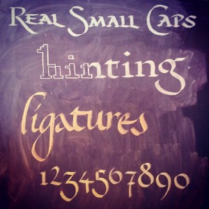
 This has been a great decade for web typography so far. 2010 saw embedded font support reach critical mass among the major major browsers and developers can finally embed whatever font they want into any web page they want (as long as the font’s licenses allows it). After playing around with the technology for the past two years, I have done research on how to improve the look and legibility of @font-face type. Faux-bolding and faux-italicizing (i.e. “obliquing”) can be easily avoided a lot more easily with new browsers (and in some cases, even older IE!). Fonts that look horrible in Windows can be improved with autohinting. And best of all, advanced features of OpenType fonts, like ligatures, alternative glyphs, and other character variations are almost in all the major browsers (Safari, the only holdout, will have it later this year). Let’s see how we can put this all into practice today.
Avoiding Faux-Bold and Italics
A pet-peeve of mine is how browsers sometimes faux-bold or faux-italic @font-face text if things are not set up correctly. For example, let’s take a look at Graublau Web, the font that is used for the headings on my blog. I have two @font-face declarations that I use to embed the font into my webpage — one to embed the regular variant, and one for the bolded one:
@font-face {
  font-family: 'GraublauWeb-Regular';
  src: url('GraublauWeb.eot?') format('eot'),
       url('GraublauWeb.otf')  format('opentype'),
       url('GraublauWeb.woff') format('woff'),
       url('GraublauWeb.ttf')  format('truetype'),
       url('GraublauWeb.svg#GraublauWeb') format('svg');
}

@font-face {
  font-family: 'GraublauWeb-Bold';
  src: url('GraublauWebBold.eot?') format('eot'),
       url('GraublauWebBold.otf')  format('opentype'),
       url('GraublauWebBold.woff') format('woff'),
       url('GraublauWebBold.ttf')  format('truetype'),
       url('GraublauWebBold.svg#GraublauWebBold') format('svg');
}
This is how the fonts should look:

However, when I first started using them in my blog years ago, I sometimes saw this happening:

See an “clean-room” HTML example page of the above faux-bolding in action.
In my opinion, this faux-bolding is uglier than me the day after last year’s company Christmas party! It looks as if someone took the regular font and outlined it with a magic marker. When saw this effect for the first time, I decided to dig into my CSS and see what was causing this. The CSS looks fine, but take a close look and you’ll see the problem:
.faux-bold {
  font-family: "GraublauWeb-Regular", "Arial Narrow", "Helvetica", sans-serif;
  font-weight: bold;
}
We are telling the web browser to bold the regular variant of the font. The browser has no idea that “GraublauWeb-Bold” is actually the bolded variant of “GraublauWeb-Regular” — from its perspective, “GraublauWeb-Regular” and “GraublauWeb-Bold” are two different fonts. This is why the faux-bolding happens. It get’s worse — some browsers will double bold a font if you try to bold a font that is already bolded:

As I have mention in a previous article, Giving Challenged @font-face Fonts The Italics Makeover, browsers will also apply faux-italics (a.k.a. obliquing) to a font if it can’t find the real italic variant itself. What’s a developer to do?
There are two ways to avoid this:
- Whenever you use an embedded font, ensure that the
font-weightandfont-styleare set tonormal:
@font-face {
    font-family: 'graublau_webregular';
    src: url('graublauweb-webfont.eot');
    src: url('graublauweb-webfont.eot?#iefix') format('embedded-opentype'),
         url('graublauweb-webfont.woff') format('woff'),
         url('graublauweb-webfont.ttf') format('truetype');
    font-weight: normal;
    font-style: normal;

}

@font-face {
    font-family: 'graublau_webbold';
    src: url('graublauwebbold-webfont.eot');
    src: url('graublauwebbold-webfont.eot?#iefix') format('embedded-opentype'),
         url('graublauwebbold-webfont.woff') format('woff'),
         url('graublauwebbold-webfont.ttf') format('truetype');
    font-weight: normal;
    font-style: normal;

}
When you want to style text that is bolded, make sure to set the element’s
font-weighttonormaland set thefont-familyto the name of the bolded variant (in this case,"graublau_webbold"strong { font-weight: normal; font-family: "graublau_webbold", "Arial", sans-serif; }This is a default hack that is used by services like Font Squirrel and my own CSS3 Font Converter shell script. The problem is, if the embedded font doesn’t load for some reason, the fallback font will not be bolded (which would be a bad thing in most circumstances).
- My preferred method is to use the more proper
@font-facesyntax that will prevent you from making this mistake when styling text:
@font-face {
  font-family: 'GraublauWeb';
  src: url('GraublauWeb.eot?') format('eot'),
       url('GraublauWeb.otf')  format('opentype'),
       url('GraublauWeb.woff') format('woff'),
       url('GraublauWeb.ttf')  format('truetype'),
       url('GraublauWeb.svg#GraublauWeb-Regular') format('svg');
  font-weight: normal;
  font-style: normal;
}

@font-face {
  font-family: 'GraublauWeb';
  src: url('GraublauWebBold.eot?') format('eot'),
       url('GraublauWebBold.otf')  format('opentype'),
       url('GraublauWebBold.woff') format('woff'),
       url('GraublauWebBold.ttf')  format('truetype'),
       url('GraublauWebBold.svg#GraublauWeb-Bold') format('svg');
  font-weight: bold;
  font-style: normal;
}
As you can see, I declare variations of the font GraublauWeb, instead of declaring one font called “GraublauWeb-Regular”, and another called “GraublauWeb-Bold”. If there was an italic variant of Graublau, I would embed it with the font-style set to italic. This is more developer-proof, since we can’t accidentally bold a font that should be bolded, or double bold an already bolded font. There is a catch (actually two):
- Older iPhones and iPads that are running iOS less than version 4.2 will crash when it comes across multiple declarations of the same font name. This can be avoided by removing the SVG version of the font in the declaration, since only iOS < 4.2 can only embed SVG fonts, which newer iOS devices can embed TrueType. This is a good trade-off, in my opinion, since David Smith and Apple themselves state that there are not too many people left who haven’t updated to a more recent version of the OS (less than 1%).
- IE8 and lower can only handle four declarations with the same name. If there are more than that, IE will ignore them.
I assume that these two reasons are why some @font-face conversion services do not use this method by default. However, since there is a way to avoid the iOS bug, and four variants should be enough for more use cases, I have decided to add support for this method in my CSS3 Font Converter script. More information about the converter can be seen on this blog post, but if you are already familiar with it, download the latest version from github and type in the following command inside the directory which contains the fonts you want to convert:
convertFonts.sh --use-font-weight *.otf
This will result in a stylesheet with font declarations like this:
/*
 * This stylesheet generated by the CSS3 @font-face generator v2.0
 * by Zoltan Hawryluk (https://www.useragentman.com).
 * Latest version of this program is available at
 * https://github.com/zoltan-dulac/css3FontConverter
 *
 * Generated with the following options:
 *
 * --use-font-weight
 */


@font-face {
  font-family: 'GraublauWeb';
  src: url('GraublauWeb.eot?') format('eot'),
       url('GraublauWeb.woff') format('woff'),
       url('GraublauWeb.otf')  format('opentype'),
       url('GraublauWeb.ttf')  format('truetype');
  font-weight: 400;
  font-style: normal;
}

@font-face {
  font-family: 'GraublauWeb';
  src: url('GraublauWebBold.eot?') format('eot'),
       url('GraublauWebBold.woff') format('woff'),
       url('GraublauWebBold.otf')  format('opentype'),
       url('GraublauWebBold.ttf')  format('truetype');
  font-weight: 700;
  font-style: normal;
}
The 400 and 700 weights correspond to normal and bold respectively. I use numeric weights instead of named ones because it allows my script to use up to nine different weights. For example, Exo is a font family that has nine weights, and the script is smart enough to take the individual font files and assign them the following CSS3 numeric weights for font-family: Exo.
| Font Name | Numeric Weight |
|---|---|
| Thin | 100 |
| Extra Light | 200 |
| Light | 300 |
| Regular, Normal, Roman | 400 |
| Medium | 500 |
| Demi Bold | 600 |
| Bold | 700 |
| Extra Bold | 800 |
| Black | 900 |
It does this by searching for the following keywords in the font name inside the font file and querying some properties inside the font tables. The CSS3 Font converter will also insert the italic font variants inside the stylesheet if there are italic fonts available. Here is an example @font-face declaration it produces:
@font-face {
  font-family: 'Exo';
  src: url('Exo-Black-Italic.eot?') format('eot'),
       url('Exo-Black-Italic.otf')  format('opentype'),
       url('Exo-Black-Italic.woff') format('woff'),
       url('Exo-Black-Italic.ttf')  format('truetype'),
       url('Exo-Black-Italic.svg#Exo-Black-Italic') format('svg');
  font-weight: 900;
  font-style: italic;
}
You can also do this with the Font Squirrel WebFont Generator, but you will have to check the “Style Link” checkbox. You may want to also ensure the SVG option is also unchecked (it is by default) so that your fonts don’t crash older iPhones. Note that this can only handle bold and italic variants of the fonts you upload — I tried uploading all the Exo fonts I listed above, and it didn’t handle all the the subtler weights (e.g. Light, Black, etc.) that my script does.
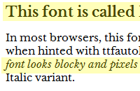
Note that Google Web Fonts do this by default. However, I have noticed that at the time of this writing, it doesn’t seem to work 100% correctly in older IE, which will faux bold and faux italic web fonts:
| Libre Baskerville, via CSS3 Font Converter | Libre Baskerville, via Google Web Fonts |
|---|---|
 |
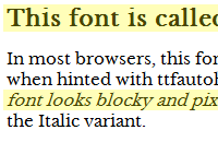 |
Note that the Bold in the Google Web Font version is faux bolded and that the italics are actually oblique (faux-italicized). I was curious to see why, so I took a look at the stylesheet that IE was grabbing from the Google Web Font CSS URL for Libre Baskerville with all weights. Turns out that the CSS was only including one weight:
@font-face {
  font-family: 'Libre Baskerville';
  font-style: normal;
  font-weight: 400;
  src: url(http://themes.googleusercontent.com/static/fonts/librebaskerville/v1/pR0sBQVcY0JZc_ciXjFsK6xjZJvo8Gk2Hy-wJqL2P8g.eot);
  src: local('Libre Baskerville'), local('LibreBaskerville-Regular'), url(http://themes.googleusercontent.com/static/fonts/librebaskerville/v1/pR0sBQVcY0JZc_ciXjFsK6xjZJvo8Gk2Hy-wJqL2P8g.eot) format('embedded-opentype'), url(http://themes.googleusercontent.com/static/fonts/librebaskerville/v1/pR0sBQVcY0JZc_ciXjFsK2vhaIAz1NJzluD_h2UBN7c.woff) format('woff');
}
Autohinting Fonts to Make them Look Better in Windows
A lot of fonts (especially a lot of free fonts) look just fine on a Mac, Linux box, or mobile phone, but look horrible on Windows. This is because Windows relies on the hinting information embedded inside a font, and these fonts may not be hinted correctly, if at all. For those who are new to typography, a font’s hinting information is a set of instructions that tells a device how to make a vector font look good on a pixel grid display. Since hinting is a very time-consuming process and takes a long time to learn how to do well, the result is a lot of ugly typography in Windows. This doesn’t happen on OSX, iOS or Android because these devices autohint the font — they ignore the hinting information inside a font and instead produce their own hints. While autohinting does not produce as good results as human-hinting, it still produces results which are way better bad hinting.
Can we force Windows to do this? Well, we can’t change Windows behavior, but we can take out a font’s hinting information and replace it with our own. There are two ways you can do this:
- The CSS3 Font Converter I mentioned earlier now has support for ttfautohint. It uses the autohinter used in Linux, FreeType, but you don’t need Linux to run it — ttfautohint runs on OSX, Windows and Linux equally well.
- Fontsquirrel’s Font Generator by default will also autohint your fonts (again, you can toggle this feature by going into the “Expert” tab again).
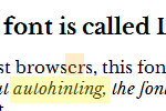
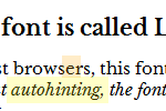
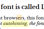
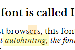
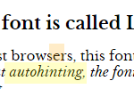
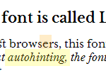
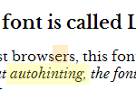
For a well-hinted font, it doesn’t matter as much. Sometimes, though, a font’s native hints may need some help due to the different anti-aliasing technologies available in the various versions of Windows in use today (XP uses GDI ClearType while Windows 7+ uses DirectWrite ClearType). Lets take a look at at what we get when we autohint a well-hinted font, Libre Baskerville and display at 15 pixels:
| Original Font | Hinted with ttfautohint |
Hinted with Font Squirrel |
|
|---|---|---|---|
| IE8 |
|
|
|
| IE9 | 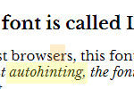
|
|
|
| Chrome | 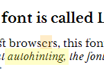
|
|
|
You can see whole groups of horizontal pixels missing in the original font in Windows XP, which is especially noticable in the the lower-case t’s cross-bar in the word “autohinting”. This is because GDI Cleartype does horizontal antialiasing but not vertical. Even in IE9, the cross-bar in the letter ‘e’ is a little off.
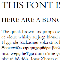
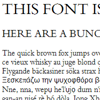
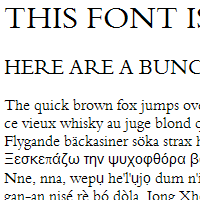
Sometimes the results are a lot more pronounced, especially in fonts that have a lot of thin lines and/or lots of small details. A good example of this is Bergamo Std. As you can see, hinting really improves it, both from an aesthetic and usability perspective:
| Bergamo Std in IE8 No Hinting |
Bergamo Std in IE8 Hinted with ttfautohint |
Bergamo Std in IE8 Hinted with Font Squirrel |
|---|---|---|
 |
 |
 |
Note that nothing compares to a professional hinting a font by hand but in a pinch, autohinting can produce some descent results. Font Squirrel and ttfautohint have their pros and cons, and it really is a matter of trying both out to see which you prefer — you may even want to mix and match these two depending on the font, size and weight of the text you need to render on a web page. Keep in mind, however, that some font licenses don’t allow you to modify the fonts themselves, so please read the license that come with the fonts you download and purchase.
Ligatures, Swashes and Other font-feature-settings
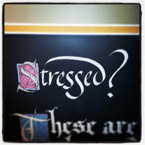 The CSS3
 font-feature-settings property gives me the flexibility with web typography that I have when I do calligraphy work. Take the example for the right. The two “S’s” in the word “Stressed” are different sizes, and the letter “d” has an ascender that stretches over all the lower case letters on the left of it (I would not normally write it this way, but it “looks good” in this context). These details make the lettering more interesting than if I decided to write letters the same way all the time. It is now possible to use font-feature-settings to create effects like these on the web, as long as the font and the browser supports it (currently, all the latest versions of the major browsers supports it, including IE10+).
What are the possible values of font-feature-settings? There can be a combination of any of the four letter font features supported by the OpenType specification. With them, you can add more variations than just bolding, italicizing and underlining can offer. These features are numerous (there are 135 of them), and typically a font will only support a few of them (if any). Let’s go through the more common ones.
Note:
At the time this article was written (September 22, 2013) it appears that the Font Squirrel Webfont Generator strips out the OpenType Feature Tables from fonts when they are converted to TTF and WOFF. It does, however, allow you to work around this issue somewhat by giving you the ability to fold some (but not all) of these features in the default rendering of a font. While this works with less complex typographic needs, I hope an update is produced to implement feature tags using this excellent service.
You can, however, use font-feature-settings with Google Fonts and fonts converted with my CSS3 Font Converter.
See live examples of all the font-feature-settings listed below and more
Ligatures
A Ligature is a glyph that takes the place of two or more glyphs. They are often used to simulate the joining and overlapping of letters that occur in handwriting and calligraphy, like the Z’s in the word “Lizzie” in this example. There are a few types of ligature feature tags available:
| Feature Tag | Long Name | Description | Screenshots | |
|---|---|---|---|---|
| With feature | Without feature | |||
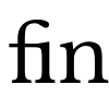
| liga | Standard Ligatures | Usually produced for groups of characters that overlap each other. Common standard ligatures are the f-ligatures: fi, fl, and sometimes ff, ffi, and ffl. The example to the right is the “fi” ligature from Libre Baskerville. | 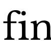 |
 |
| liga | Discretionary Ligatures | Ligatures that are decorative and to be used at the author’s discretion. For example, the ‘c’ and the ‘h’ together don’t overlap each other normally, but the Exo font has a discretionary ligature for them because it “looks cool”. |  |
 |
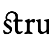
| hlig | Historical Ligatures | Ligatures that were in common use in the past, but are uncommon today. EB Garamond has a few of these that join letters like ‘s’ and ‘t’ with a curve coming out of the top of the ‘t’. | 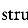 |
 |
Numeric
There are many variations of numbers and figures in fonts. You may want a different style depending on when you use them in calculations, in headings or in body copy. Here are a few examples:
| Feature Tag | Long Name | Description | Screenshots | |
|---|---|---|---|---|
| With feature | Without feature | |||
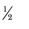
| frac | Fractional Glyphs | These are used for common fractional combinations so they don’t take up too much space on the page. The eample shown is ‘1/2’ in Libre Baskerville. Note that not all fonts that implement this feature implement all the same fractional combinations. For example, Exo implements a Fractional Glyph for 1/7, but Libre Baskerville doesn’t. |  |
 |
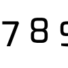
| onum | Old-Style Numbers | These numbers are designed to blend-in with lower case text by giving them ascenders and descenders (like in the calligraphy example at the top of this page as well as in this example). Note that some fonts, especially revival fonts like Libre Garamond and EB Baskerville, have this as the default style for numerals, even though Adobe and Microsoft’s documentation state that this feature should be inactive by default. The example presented here is from Exo. | 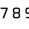 |
 |
| tnum | Tabular Figures | These numbers are set to be fixed-width so that, if digits are lined up on top of each other, they line up. The example on the right shows this features as it appears in Exo. | 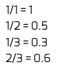 |
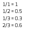 |
Alternates
There are a few tags that lets the author choose an alternate form of a single glyph.
| Feature Tag | Long Name | Description | Screenshots | |
|---|---|---|---|---|
| With feature | Without feature | |||
| swsh | Swashes | A swash is a typographical flourish on a glyph. These can include exaggerated serif, tails, mid-strokes, and so-on. The example to the right shows the difference between the regular and swash version of the capital letter “W” in EB Garamond. |  |

|
| ss00 – ss20 | Stylistic Set 1 – Stylistic Set 20 | These tags are used for certain features of a font that may not be described accurately by an existing feature tag. What these features are will vary from font to font. The example to the right shows ss01 (rounded ‘E’), ss02 (slated ‘S’) and ss03 (script like ‘y’ and ‘g’) in the font Megalopolis. |
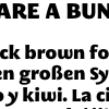
|
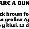
|
Small Caps
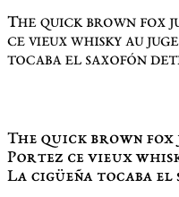
One feature tag, smcp, deserves a little more attention. Using it is similar to the CSS property font-variant:small-caps except it uses a real small-cap variant built into the font instead of having the browser synthesizing the font itself. This usually lends to better results depending on how the font is rendered. In my experience, font-variant:small-caps does not appear consistently in all browsers. In these screenshots, the ghetto font-variant:small-caps version is on the top, while the nicer smcp version is on the bottom:
| Exo | EB Garamond | |
|---|---|---|
| Firefox 24 OSX | 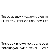 |
 |
| Chrome 29 OSX | 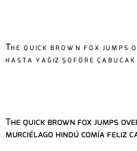 |
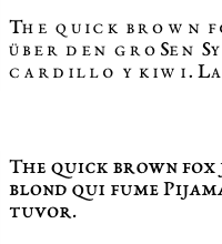 |
Note the OpenType small-caps are consistent on all browsers, while the font-variant: small-caps text looks quite different (and really bad in Chrome 29 — it looks like each small-cap-glyph is taking the width the “normal-sized” capital letters). Unfortunately, not all fonts implement the smcp feature tag (more on feature detection later), but when it is available, it usually yields better results. If you want more information on why true small caps are better than algorihmically generated ones, read Alec Julien’s Small Caps on i love typography.
Other Features
The features listed above are not a complete list. There are a complete lists available elsewhere however:
- OpenType Layout tag registry on Microsoft.com.
- OpenType Feature Tags on Adobe.com
See live examples of all the font-feature-settings listed above and more
How To Use Them
The CSS is rather simple, but you have to use a lot of vendor-prefix cruft (for now). For example, if you want to turn on Small Caps (smcp) and Standard Ligatures (liga), you should use the following CSS:
#mySelector {
      -ms-font-feature-settings:     'smcp' 1, 'liga' 1;  /* IE10 */
      -moz-font-feature-settings:    'smcp' 1, 'liga' 1;  /* Firefox */
      -webkit-font-feature-settings: 'smcp' 1, 'liga' 1;  /* Chrome, Safari, Opera */
      font-feature-settings:         'smcp' 1, 'liga' 1;  /* Future-proof! */
}
Note that 1 means on, 0 means off. Also note that some features may be active by default. For example, the OpenType documentation mentions that liga is recommended to be on by default. This doesn’t mean it always is — most have ligatures on by default, but some don’t. It is up to the creator of the font to decide what is on or off by default.
In other articles on font-feature-settings, you may see an alternate syntax for Firefox:
#mySelector {
      -moz-font-feature-settings:    'smcp=1,liga=1';  /* Firefox < 15*/
}
This syntax is only valid for Firefox 14 and below. Since most copies of Firefox have auto-updated since then, I never use it. I mention it here for completeness.
How To Tell What Feature a Font Supports
As I mentioned earlier, not all fonts support all of these features. Since it is hard to know what fonts support what feature, I put in a special routine inside the CSS3 Font Converter to give a developer a complete, human readable list. If the developer is familiar with the command line, all s/he would have to do is type in the following command in the directory the fonts are in:
convertFonts.sh --show-features *.otf
(This is assuming that the fonts are OpenType files with the .otf extension. This will also work with TrueType fonts also). Running this on the Libre Baskerville OTF fonts, we get the following:
Font: LibreBaskerville-Bold.otf
'kern' Horizontal Kerning in Latin lookup 0
'liga' Standard Ligatures in Latin lookup 0
'dlig' Discretionary Ligatures in Latin lookup 1
'frac' Diagonal Fractions in Latin lookup 2
'sinf' Scientific Inferiors in Latin lookup 3
'sups' Superscript in Latin lookup 4
'ordn' Ordinals in Latin lookup 5
Single Substitution lookup 6

Font: LibreBaskerville-Italic.otf
'kern' Horizontal Kerning in Latin lookup 0
'liga' Standard Ligatures in Latin lookup 0
'dlig' Discretionary Ligatures in Latin lookup 1
'frac' Diagonal Fractions in Latin lookup 2
'sinf' Scientific Inferiors in Latin lookup 3
'sups' Superscript in Latin lookup 4
'ordn' Ordinals in Latin lookup 5
'ss01' Style Set 1 in Latin lookup 6
Single Substitution lookup 7

Font: LibreBaskerville-Regular.otf
'kern' Horizontal Kerning in Latin lookup 0
'liga' Standard Ligatures in Latin lookup 0
'dlig' Discretionary Ligatures in Latin lookup 1
'frac' Diagonal Fractions in Latin lookup 2
'sinf' Scientific Inferiors in Latin lookup 3
'sups' Superscript in Latin lookup 4
'ordn' Ordinals in Latin lookup 5
Single Substitution lookup 6

Information on these features can be found at these URLS:
  - http://www.microsoft.com/typography/otspec/featurelist.htm
  - http://partners.adobe.com/public/developer/opentype/index_tag3.html
As mentioned before, what features are turned on or off varies from font to font (One feature tag, kern, is almost always on turned on by default, since it regulates the amount of space between pairs of characters).
How to View The Glyphs In A Feature
If you want to know how glyphs for the different features look, it’s simple with FontForge (if you don’t have it, there are instructions on how to install it on OSX and Linux on the FontForge site. I have also written a step-by-step how-to on installing it on Windows as well). Let’s walk you through showing the aalt glyphs inside Megopolis Extra:
- Open up the font:
- Go to View → Display Substitutions:
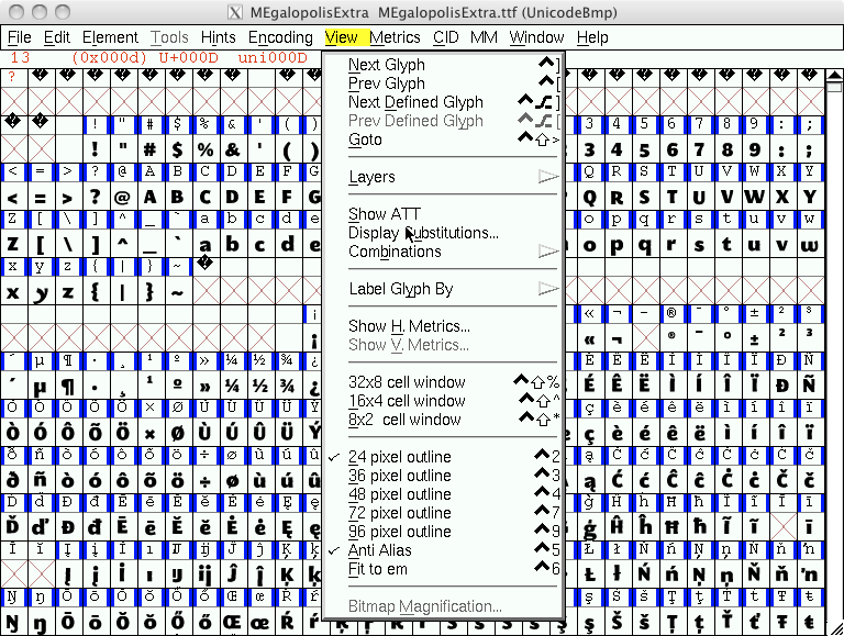
(Isn’t it ironic that the UI for FontForge on Mac OSX has fonts that aren’t anti-aliased?)
- In the resulting dialogue, choose which tag/substitution you wish to see and click OK:
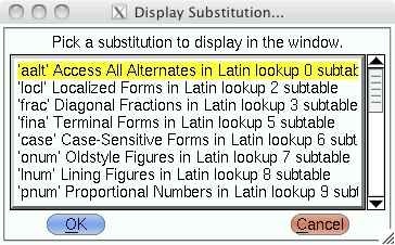
- You will now only see the glphys in the tag/substitution you chose:
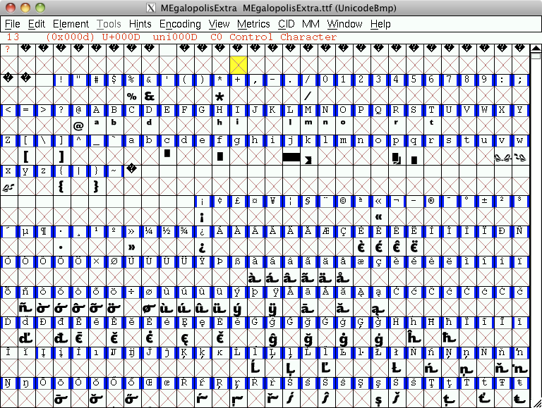
- If you want to go back, just click View → Display Substitutions again.
This makes it easier to play around with different font features without having to guess which ones are supported by the font you are using. I have spent way too many hours hacking around with them — now you can too. A couple of things to keep in mind, though:
- If you want to use some of these features using Google Web Fonts, you may need to ensure you choose an extended character set besides just Latin. For example, for EB Garamond, I chose both Latin (latin) and Latin Extended (latin-ext) character sets.
font-feature-settingsdoesn’t work currently with fonts converted with the Font Squirrel generator. It does, however, allow you to fold some (but not all) of these features in the default rendering of a font.
Further Reading
- TypeTalk: Standard and Discretionary Ligatures from Creative Pro
- Ligatures in OpenType: Discretionary vs. Standard on the Typophile Disussion Board
- Better web typography with OpenType features by Ralf Herrmann via his blog (uses old Firefox syntax, but it is still a great article).
 @zoltandulac
 @zoltandulac
 Zoltan Hawryluk
2 responses so far
1 Shehi
// May 26, 2015 at 6:58 am
WOW, WOW and pure WOW! :) What I see here is: we technically can bring all embedded font features we see in Adobe Photoshop (or other professional image processor) to the web. I am shocked. Thanks for such an AWESOME info Zoltan!
2 zoltan
// May 27, 2015 at 7:59 am
@Shehi: Exactly. I’m surprised more people aren’t as excited as we are. It is pretty awesome that we now have so much control of type on the web.
Give Feedback
Don't be shy! Give feedback and join the discussion.
Please Note: If you are asking for help using the information on this page or if you are reporting a bug with the code featured here, please include a URL that shows the problem you are experiencing along with the browser/version number/operating system combination where the issue manifests itself. Without this information, I may not be able to respond.