 @zoltandulac
 @zoltandulac
 Zoltan Hawryluk
For the longest time I assumed that one couldn’t use CSS Transitions or animations to move DOM objects in anything but a straight path. Sure, a developer could use multiple keyframes to create a list of straight paths to simulate a curve, but I didn’t think one could just define a curve with just two keyframes, or a simple CSS transition. I was wrong:

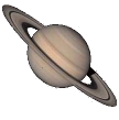
The above example is animated using just two (2) CSS3 Animation keyframes! Even though you could use jQuery.animate() or requestAnimationFrame to do this, it is better to use CSS3 instead of JavaScript — the resultant animation is always guaranteed to be smoother (especially on mobile devices) plus it can save on battery power. This article will give the CSS recipe for implementing this in all CSS3 Animation enabled browsers with a walk-through on the math involved, as well as a fallback for older versions of IE that don’t support CSS3 Animations.
Give Me The CSS!
The only reason why the CSS is this long is because of the repetive vendor-prefix code:
.saturn {

    /*
     * Make the initial position to be the center of the circle you want this
     * object follow.
     */
    position: absolute;
    left: 315px;
    top: 143px;

    /*
     * Sets up the animation duration, timing-function (or easing)
     * and iteration-count. Ensure you use the appropriate vendor-specific
     * prefixes as well as the official syntax for now. Remember, tools like
     * CSS Please are your friends!
     */
    -webkit-animation: myOrbit 4s linear infinite; /* Chrome, Safari 5 */
       -moz-animation: myOrbit 4s linear infinite; /* Firefox 5-15 */
         -o-animation: myOrbit 4s linear infinite; /* Opera 12+ */
            animation: myOrbit 4s linear infinite; /* Chrome, Firefox 16+,
                                                      IE 10+, Safari 5 */


}

/*
 * Set up the keyframes to actually describe the begining and end states of
 * the animation.  The browser will interpolate all the frames between these
 * points.  Again, remember your vendor-specific prefixes for now!
 */
@-webkit-keyframes myOrbit {
    from { -webkit-transform: rotate(0deg) translateX(150px) rotate(0deg); }
    to   { -webkit-transform: rotate(360deg) translateX(150px) rotate(-360deg); }
}

@-moz-keyframes myOrbit {
    from { -moz-transform: rotate(0deg) translateX(150px) rotate(0deg); }
    to   { -moz-transform: rotate(360deg) translateX(150px) rotate(-360deg); }
}

@-o-keyframes myOrbit {
    from { -o-transform: rotate(0deg) translateX(150px) rotate(0deg); }
    to   { -o-transform: rotate(360deg) translateX(150px) rotate(-360deg); }
}

@keyframes myOrbit {
    from { transform: rotate(0deg) translateX(150px) rotate(0deg); }
    to   { transform: rotate(360deg) translateX(150px) rotate(-360deg); }
}
The really interesting bit is the keyframe code at the bottom. The translateX() value must be equal to the radius of the circle (i.e. the diameter divided by two). The rotate() functions in the from and to rules must be set to the start and end angles of the animation. Note that there are two rotate() calls — the second has to be the negative of the first.
How On Earth Does This Work?
To understand why this works, let me walk you step by step behind the math which generates the frame where Saturn has rotated 45 degrees around the sun. From there we will show how this applies to the full animation.
Step 1: Position the Object to the Center
Position he object you want to move to the center of the circular path. In the example above, the sun (which is just an animated GIF) is in the center, so let’s move Saturn to be right on top of it:
.saturn {
    left: 315px;
    position: absolute;
    top: 143px;
}
Step 2: Use translateX() To Define the Radius of the Circle
Next we need to move the object to the edge of the circle. For this example, let’s say the circle’s diameter is 300px. We set CSS3 transform property to transformX(150px) (150px being half of 300px).
.saturn {
    left: 315px;
    position: absolute;
    top: 143px;

    /* Note: I have omitted the vendor prefix code for sake of brevity */
    transform: translateX(150px);
}
Step 3: Insert A rotate() Or Two Into The Mix.
If we insert a rotate() into the transform property before the translateX(), we can use it to control the circular path. To show this, let’s insert one of 45deg:
.saturn {
    left: 315px;
    position: absolute;
    top: 143px;

    /* Note: I have omitted the vendor prefix code for sake of brevity */
    transform: rotate(45deg) translateX(150px);
}
The problem is that in the animation above Saturn shouldn’t spin around on it’s axis. So we must add a rotate(-45deg) after the translateX() to rotate Saturn back to its “upright” position:
.saturn {
    left: 315px;
    position: absolute;
    top: 143px;

    /* Note: I have omitted the vendor prefix code for sake of brevity */
    transform: rotate(45deg) translateX(150px) rotate(-45deg);
}
Step 4: Apply The Animation Code
Now let’s apply the animation styles to finish our work. We want to have saturn rotate around the sun in 2 seconds, so we add the appropriate CSS to define the speed, length and easing of our animation:
#saturn {
    left: 315px;
    position: absolute;
    top: 143px;

    /*
     * CSS Please is your friend for ensuring cross browser syntax
     */
    -webkit-animation: orbit2 4s linear infinite; /* Chrome, Safari 5 */
       -moz-animation: orbit2 4s linear infinite; /* Firefox 5-15 */
         -o-animation: orbit2 4s linear infinite; /* Opera 12+ */
            animation: orbit2 4s linear infinite; /* Chrome, Firefox 16+,
                                                     IE 10+, Safari 5 */


}
Then we add the keyframes to the CSS to tell the browser that the animation must rotate around the sun (i.e. from 0 to 360 degrees):
@-webkit-keyframes orbit2 {
	from { 	-webkit-transform: rotate(0deg) translateX(150px) rotate(0deg); }
	to   {  -webkit-transform: rotate(360deg) translateX(150px) rotate(-360deg); }
}

@-moz-keyframes orbit2 {
	from { 	-moz-transform: rotate(0deg) translateX(150px) rotate(0deg); }
	to   {  -moz-transform: rotate(360deg) translateX(150px) rotate(-360deg); }
}

@-o-keyframes orbit2 {
	from { 	-o-transform: rotate(0deg) translateX(150px) rotate(0deg); }
	to   {  -o-transform: rotate(360deg) translateX(150px) rotate(-360deg); }
}

@keyframes orbit2 {
	from { 	transform: rotate(0deg) translateX(150px) rotate(0deg); }
	to   {  transform: rotate(360deg) translateX(150px) rotate(-360deg); }
}
Et Voila! We are done. Pour yourself a martini — you deserve it!
Take a look at a “clean-room” example of the above code in action
What About IE?
IE10 is the only flavour of Internet Explorer that supports CSS3 Animations. Since IE7 and 8 are still being used in the wild, it would be nice to have some sort of fallback. Using conditional comments, you could include an IE-only JavaScript that can do this for you, using jQuery.aniamte() or Paul Irish’s requestAnimationFrame() shim. Since most devs are probably using jQuery anyway, the above “clean-room” example uses this code to do the animation in IE. It does this by including the JS code for IE only:
 <!DOCTYPE html>
<html lang="en">
    <head>
        <title>Example of Using CSS3 Animations and Circular Paths.</title>
        <meta charset="utf-8" />
        <!-- Always force latest IE rendering engine (even in intranet) & Chrome Frame
        Remove this if you use the .htaccess -->
        <link rel="stylesheet" href="https://www.useragentman.com/shared/css/useragentmanExample.css" />
        <link rel="stylesheet" href="css/transition-circle-keyframes.css" />

        <!-- IE doesn't do CSS3 Animations, so let's put in some JS code to fix. -->

        <!--[if lte IE 9 ]>
        <script type="text/javascript" src="/shared/js/jquery-1.7.2.min.js"></script>
        <script type="text/javascript" src="js/transition-circle-ie.js"></script>
        <![endif]-->
    </head>
</html>
(Note the IE9-and-under conditional comments!) The transition-circle-ie.js contains this code which does the animation using jquery.animate():
var ieRotate = new function () {
    var me = this,
        $saturn,
        initialPosition,
        radius = 150;

    /*
     * Initialize the animation here.
     */
    me.init = function () {

        // Caches the jQuery object for performance reasons.
        $saturn = $('#saturn');

        // Stores the initial position of Saturn.  Used later when calculating
        // the orbit animation.
        initialPosition = {
            x: parseInt($saturn.css('left')),
            y: parseInt($saturn.css('top'))
        };

        // starts the aniamtion.
        rotateOnce();
    }

    function rotateOnce() {

        /*
         * jQuery.animate() was designed to animate DOM objects by tweening
         * numeric CSS property values.  This is fine when moving these DOM
         * objects in straight lines, but not so good when trying to move an
         * object in a circular path.  This will show you how you can work
         * around this limitation.
         */

        // Step 1: Set a dummy property to the angle of the initial position
        //         of Saturn.  We use text-indent, since it doesn't do anything
        //         on an image.
        $saturn.css('text-indent', 0);

        // Step 2: We set up jQuery.animate() to do the animation by ....
        $saturn.animate(
            // ... first setting the final value of text-indent to be 2*π
            // radians, which is the same as 360 degrees ...
            {
                'text-indent': 2*Math.PI
            }, {

                /*
                 * ... next we set up a step function that will generate the
                 * frame when the angle stored in the text-indent property
                 * at this particular part of the animation.  The formulas used
                 * for the x and y coordinates are derived using the
                 * polar equation of a circle.  For those that are unfamiliar
                 * with polar equations, take a look at
                 * http://sites.csn.edu/istewart/mathweb/math127/polar_equ/polar_equ.htm
                 */
                step: function (now) {
                    $saturn.css('left', initialPosition.x + radius * Math.cos(now))
                           .css('top', initialPosition.y + radius * Math.sin(now))
                },

                // This makes the animation last 4000milliseconds (= 4 seconds)
                duration: 4000,

                // The easing property is analogeous to the CSS3
                // animation-timing-funciton
                easing: 'linear',

                // Once the animation finishes, we call rotateOnce() again so
                // that the animation is repeated.
                complete: rotateOnce
            }
        );
    }
}

$(document).ready(ieRotate.init);
Look at the comments for details on how the code works. JavaScript uses radians instead of degrees when calculating sin() and cos() values — if you are not familar with radians, PurpleMath has an article that can help you. If you are not familiar with polar equations, Dr. Ingrid Stewart from the College of Southern Nevada has a great article called Polar Equarions and Their Graphs which I think does a good job explaining how the step() function works above.
Take a look at a “clean-room” example of the above code in action
Variations Of This Technique
How let’s say that instead of a planet, you wanted a spaceship circling around the sun instead. Here’s a “classic” example:

Note that the ship is always facing the way it is flying. You could do this with the same CSS as above, except you would remove the second rotate() in the transform property:
/*
 * Vendor prefix code removed for sake of brevity.
 */
#saturn {
    left: 315px;
    position: absolute;
    top: 143px;

    /* Set up the animation */
    animation: orbit 20s linear infinite;
}

/* Note that the second rotate in each of the transforms below has been removed */
@keyframes orbit {
	from { 	transform: rotate(0deg) translateX(150px); }
	to   {  transform: rotate(360deg) translateX(150px); }
}
The JavaScript for IE would have to be changed — since the ship actually rotates, I used cssSandpaper to do the heavy-lifting here.
/*
 * Replacement function for the one in the previous example where the
 * Enterprise always faces the way it is travelling.
 */
function rotateOnce() {

    $enterprise.css('text-indent', 0);


    $enterprise.animate(
        {
            'text-indent': 2*Math.PI
        }, {
            step: function (now) {

                /*
                 * Unlike the other example, we need to have the object
                 * (in this case the Enterprise) rotate while it is
                 * travelling around the sun, so we use cssSandpaper to
                 * do this work.
                 */
                cssSandpaper.setTransform($enterprise[0],
                    'rotate(' + now + 'rad) translateX(400px)');
            },

            duration: 20000,

            easing: 'linear',

            complete: rotateOnce
        }
    );
}
Take a look at a “clean room” version of the above example
Pseudo 3D?
We can also have a psuedo-3D animation of a planet plummeting into the sun. I leave it as an exercise to the reader to look at the CSS and IE specific JavaScript to figure out how it works (if you understand the above examples, you should be able to figure it out).
Future Research?
Right after I wrote this article, I came across Smashing Magazine’s excellent article “The” Guide To CSS Animation: Principles and Examples by Tom Waterhouse. It has some other excellent examples involving advanced CSS3 Animations, combining the animation of two nested DOM objects to produce a bouncing ball effect. I am sure there are way more interesting techniques that can be done with them, and I will definitely the doing more research on CSS3 Animations in the future. If you have any more such articles to share below, I (and, I am sure, others who are reading this article) would love to hear from you.
Acknowledgements
The assets I used in these demos came from these sources:
- Image of the starship from Flickr user drtel
- Animated GIF of the sun was taken from the The Solar & Heliospheric Observatory’s website.
- The photos of Jupiter and Saturn were taken from the Wikimedia Commons.
I would also like to apologize to Jasper Palfree, who is going to cringe if and when he reads this article for two very good reasons:
- Placing planets so close to the sun would cause them to burn. Do not try this at home.
- I must have been smoking something when I thought that a spaceship could be as big as a planet.
Dammit Jim — I am a web developer, not an astrophysics major!
15 responses so far
1 Chris Ruppel
// Mar 7, 2013 at 12:25 pm
Chris Ruppel
// Mar 7, 2013 at 12:25 pm
Hey Zoltan, this is a great writeup!
Readers who are new to CSS animations and transforms will be delighted to hear that Transforms are no different than other CSS properties in that they inherit from their parent element. This means a rudimentary solar system is trivial to create using all of the principles outlined in this blog post. Just nest your moon inside your planet, and nest the planet inside the sun, and so forth.
I created a short intro to CSS 3D Transforms, and one of the examples is a simple solar system using the exact techniques described here. Check it out!
http://rupl.github.com/unfold/
3 Ana
// Mar 14, 2013 at 8:11 am
Ana
// Mar 14, 2013 at 8:11 am
I actually did a planetary system using this method last summer. Also used skew to make the orbits look elliptical. And I also did a version with Jupiter and four of its moons (this made me want a bigger screen – I can’t even see it all, I was zooming out all the time while doing it).
4 zoltan
// Mar 14, 2013 at 9:32 am
zoltan
// Mar 14, 2013 at 9:32 am
@Ana: Really great work! Do you have a write-up for your demos? I think the community would love to see how this was done in detail (there is quite a bit going on, and it would be interesting to have a walk-through the CSS in detail.
One thing I thought was really interesting in your demos is what I believe is an unexpected but quite interesting bug in Firefox’s rendering engine. If you look at this screenshot, you can see that Firefox 19 is rendering some of your animations outside of the browser viewport and onto the browser’s chrome (where the top nav, location bar, etc are). Any idea how this is happening? Fascinating!
5 Ana
// Mar 14, 2013 at 11:28 am
Ana
// Mar 14, 2013 at 11:28 am
No, not yet. I should start writing a few articles explaining transforms and some of my demos that are using them (the 2D and 3D shapes first of all, then other stuff, like this kind of circular motion & its derivatives, circular/ wavy menus, pie charts). I hope I’ll start doing that before this month is over.
I have no idea what causes that in Firefox (and I cannot see it in Firefox 19.0.2 on Windows 7), but it looks really cool in that screenshot.
6 zoltan
// Mar 14, 2013 at 3:31 pm
zoltan
// Mar 14, 2013 at 3:31 pm
@Ana: I hope you do! Please let me know when you write your first article. Looking forward to it!
7 DrClue
// Apr 13, 2013 at 7:48 pm
DrClue
// Apr 13, 2013 at 7:48 pm
I would have to agree that vendor prefixing is a pain, even though I understand the motivations behind it. Luckily it frustrated me enough that I don’t worry about it anymore. Now I just write standards based CSS in my projects and some code I scribbled up smaller than the vendor prefixing transparently accounts for prefixing. Others might want to consider doing likewise for themselves
8 Nishanthi
// May 27, 2013 at 12:11 am
Nishanthi
// May 27, 2013 at 12:11 am
How to control speed of the moving object in the above example?
9 zoltan
// May 27, 2013 at 9:53 am
zoltan
// May 27, 2013 at 9:53 am
@Nishanthi: In the first example, you will see this CSS code:
The 4s is the speed of the animation in seconds. More information about the syntax used for CSS animations can be seen at the Keyframe Animation Syntax page on CSS Tricks.
For the older-IE fallback, I do the same thing with jQuery’s
animate()method using thedurationproperty. It is set to the duration of the animation in milliseconds. More information is available at the method’s documentation page.10 Alice
// Oct 8, 2014 at 7:33 am
Alice
// Oct 8, 2014 at 7:33 am
Great thanks!
11 Abhas
// Apr 28, 2015 at 2:00 am
Abhas
// Apr 28, 2015 at 2:00 am
Hey zoltan !
I have given a lot of time since the last few months over the topic of animating an element along a circular path.
Your article was a great help in laying down the foundations. But as I continued to give more and more time over the topic I found that I could improve the “algorithm” & the smoothness of the animation(targeted to 60 fps).
1) I started with you method, used a wrapper for the rotating element. Changed the transform-origin accordingly, rotated the main element & rotated the wrapper by an opposite angle.
2) My main aim was to rotate multiple elements. Suppose I had 6 elements – so I had to perform 12 animations. I thought I could improve on this.
3) In the next version I decided to move from CSS Animations to CSS Transitions. CSS transitions are more suited for this as circular motion is basically transition of an element from one state to another. Plus the no of lines of codes was reduced by a good amount.
4) To reduce the no of animations I changed the algorithm – rotate the main circle by a certain angle and rotate the main element by an opposite angle. In this case you don’t even need the wrapper element. In case of 6 elements, animations got reduced to 6 + 1 = 7 [reduced by 5]
5) I was still not satisfied with the smoothness. I googled and found that Javascript animations using requestAnimationFrame were much smoother as compared to CSS animations. I implemented that – and yes animations were a lot lot smoother. The overall user experience was a lot better in this case.
Check out the demo : http://vaynelabs.com/feature-presenter/demo.php
It is basically a jQuery plugin that presents a list of features as a circular animation.
Features are placed along a circular path. When a user clicks on a feature, the feature is rotated along the circle and shown to the user along with the feature description.
Initially when I was searching for circular animation on Google, I found only 2-3 relevant results. One of them was yours. Thanks a lot for this article !
12 Hafid Pratama
// May 4, 2015 at 10:51 pm
Hafid Pratama
// May 4, 2015 at 10:51 pm
Very very insterested and awesome, thnks for sharing !
13 zoltan
// May 9, 2015 at 2:43 pm
zoltan
// May 9, 2015 at 2:43 pm
@Adhas: Thanks for sharing your demo. It’s great work! Glad I could point you in the right direction. :-)
15 UA
// Jan 18, 2017 at 4:58 am
UA
// Jan 18, 2017 at 4:58 am
With the new CSS Motion Offset or Offset Path, it has become easier to move an element over a circular path. I’ve written a tutorial over it : http://usefulangle.com/post/32/moving-an-element-in-circular-path-with-css
Give Feedback
Don't be shy! Give feedback and join the discussion.
Please Note: If you are asking for help using the information on this page or if you are reporting a bug with the code featured here, please include a URL that shows the problem you are experiencing along with the browser/version number/operating system combination where the issue manifests itself. Without this information, I may not be able to respond.