 @zoltandulac
 @zoltandulac
 Zoltan Hawryluk
-

-
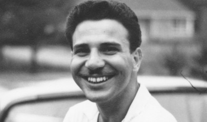
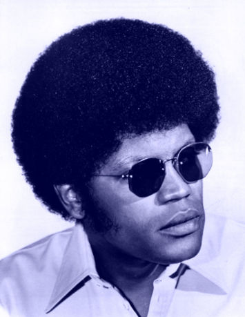
Move your mouse over (or slide your finger on) the image horizontally to see an example use-case of animated masking. Photos used by kind permission of my father (and good sport) Jean Hawryluk.
I first created polyClip.js so I could combine the lossy compression algorithm of JPEGs with the ability to have a transparent area that PNGs allow. The result works well in all browsers (including IE8 and below), but the creative people I work with wanted to be able to animate the clipping area to create some interesting visual effects. Would polyClip.js be fast enough to change the clipping area on-the-fly and even animate it at reasonably fast speeds? Could you even do CSS3-style transformations on the clipping areas (e.g. rotate and scale an existing clipping path)? The answer is a resounding yes and it is really fast even in older IE as well, as you can see with the example on the left. This article will discuss in detail how you can do this with polyClip and a related library, Silk.js (includes with polyClip) to do battery friendly and CPU efficient HTML5 animations.
Since this article talks about improvements and enhancements to my JavaScript library polyClip.js, you may first want to read my previous blog post, Clipping JPEG Images Into Non-Rectangular Polygons Using polyClip.js. All examples here are available for download at the polyClip github repository.
Download the latest version of polyClip.js and Silk.js from github.
Clipping Images Dynamically With JavaScript
Using polyClip.js 2.1, you can dynamically change the clip path of the image you are clipping by either changing the value of the data-polyclip attribute or by applying a transform to the existing clipping path. It does this using HTML5 Canvas. In the above example, the clipping path of the colour image changes depending on the mouse pointer position.
How is this done? First we must include the following <script> tags at the bottom of the <body>:
<script src="js/libs/jquery-1.8.3.min.js"></script>

<!-- Canvas and HTML5 polyfills Needed for IE 8 and under -->
<!--[if lt IE 9 ]>
	<script src="js/libs/excanvas.compiled.js"></script>
	<script src="js/libs/html5.js"></script>
<![endif]-->

<!-- Needed to do transforms -->
<script src="js/libs/sylvester.js"></script>

<script src="js/polyclip-p.js"></script>
Next, we create two <img> tags: one regular one and one clipped to a small, angled strip of the original image.
<div id="example1" class="clipParent">
    <img id="dad1960"
         src="/tests/polyClip-2.1/images/dad-circa-1960.jpg"
         alt="Dad circa 1960" />
    <img id="dad2012"
         src="/tests/polyClip-2.1/images/dad-2012.jpg"
         alt="Dad 2012"
         data-polyclip="0,0, 100,0, 50,273, -50,273" />
</div>
Next, using jQuery, we bind mouseover, touchmove and click events to translate the clipping path to be underneath the event fired. Let’s first look at a simple way of doing this in just a few lines of JavaScript:
var $dad2012;

function init() {
	// cache jQuery object of the clipped image
	$dad2012 = $('#dad2012');

	/*
	 * Setup mouse and touch events to translate the clipping path to be
	 * underneath the event fired.  Note that we use the click event as
	 * well -- although iOS Safari can keep up with the touchmove event,
	 * Android Chrome and "Browser" cannot, so use the click event as a
	 * type of fallback.
	 */
	$clipParent.bind({
		mousemove: mouseoverEvent,
		touchmove: mouseoverEvent,
		    click: mouseoverEvent
	});
}

function mouseoverEvent(e) {
	var pos = $clipParent.position();
	var x =  e.pageX - mouseOffset - $clipParent.get(0).offsetLeft;

	polyClip.transformClip($dad2012, 'translateX(' + x + 'px)');
}

polyClip.addCallback(init);
Note that we call init after polyClip.js is initialized using polyClip.addCallback(). Also note that polyClip.transformClip() takes two parameters. The first is the jQuery object or a DOM object that you want to clip. The second is a transform expression (in CSS3 transform syntax), that says where you want 2D transformations you want performed on the clipping region. You can use any valid CSS3 2D transform function (or combination thereof), so you can skew, rotate and translate to your hearts content.
This is good, but we can make it even better! For the example above, I used requestAnimationFrame() to make the animation even smoother. I used Erik Möller’s requestAnimationFrame() shim so that I didn’t have to “prefix-the-crap” out of my code. Here is the refactored version of the code:
var $dad2012,
    frameReq,
    hasGranularRequestAnimationFrame =
        window.requestAnimationFrame &&
        requestAnimationFrame !== window.webkitRequestAnimationFrame &&
        requestAnimationFrame.toString().indexOf('[native code]') > -1;;

function init() {
	// cache jQuery object of the clipped image
	$dad2012 = $('#dad2012');

	// set up mousemove event on that object
	$dad2012.mousemove(mouseoverEvent);
}

function mouseoverEvent(e) {

	/*
	 * We use requestAnimationFrame() here to make the animation
	 * smoother, if:
	 *
	 * a) a native implementation (i.e. non-polyfill) is available.
	 * b) it is not WebkitRequestAnimationFrame.
	 *
	 * Both the polyfill and WebkitRequestAnimationFrame slow down
	 * the animation of the mouseover.
	 *
	 */


	if (hasGranularRequestAnimationFrame) {
		if (frameReq) {
			cancelAnimationFrame(frameReq);
		}
		frameReq = requestAnimationFrame(
			function() {
				animateClipRegion(e)
			});
	} else {
		animateClipRegion(e);
	}
}

/*
 * This is the function that is used by the mouseoverEvent()
 * function to generate the clipping region underneath the
 * mouse pointer.
 */
function animateClipRegion(e) {

	var pos = $clipParent.position();
	var x =  e.pageX - mouseOffset - $clipParent.get(0).offsetLeft;

	polyClip.transformClip($dad2012, 'translateX(' + x + 'px)');


}

polyClip.addCallback(init);
As the code’s comments state: I only use requestAnimationFrame() if the browser has a native one available and the browser is not a WebKit based oen. This is because at the time of this writing (Dec. 27th, 2012) both the polyfill and Webkit implementations of requestAnimationFrame() seems to make the animation lag behind the mouse a fair bit (with the polyfill, the effect is quite more pronounced). This is probably because the animation is too granular for both implementations — definitely something I will be doing more research into.
(Note: if you look at the “clean room” view-source friendly code, you will see that I use a some extra housecleaning code to take into account the document structure of this blog. I leave it out for sake of clarity).
See a “clean room”, view-source friendly version with the above example.
More General Animations With requestAnimationFrame() Using Silk.js
Let’s take a look at the next example below. Click on the “next” button below and see the transition between the two photos.

Then we add the photos for the gallery with this HTML:<script src="js/libs/jquery-1.8.3.min.js"></script> <!-- Needed for easing formulas to finesse the animation --> <script src="js/libs/jquery.easing.1.3.js"></script> <!-- Canvas and HTML5 polyfills Needed for IE 8 and under --> <!--[if lt IE 9 ]> <script src="js/libs/excanvas.compiled.js"></script> <script src="js/libs/html5.js"></script> <![endif]--> <!-- Needed to do transforms --> <script src="js/libs/sylvester.js"></script> <!-- Needed for Silk.js --> <script src="js/libs/jshashtable-2.1.js"></script> <!-- Needed for smooth animation --> <script src="js/Silk.js"></script> <script src="js/polyclip-p.js"></script>
<div id="example2" class="clipParent">
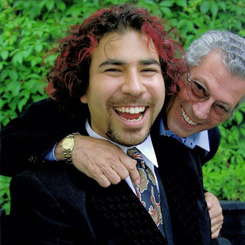
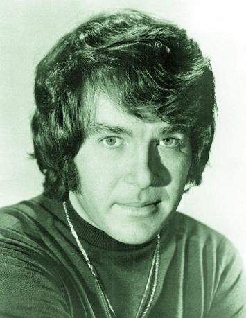
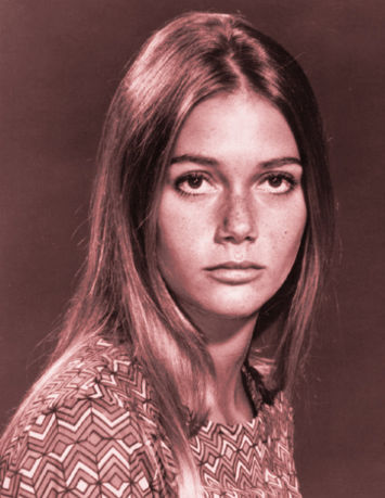
<img id="zoltan2012" src="images/zoltan-2012.jpg" alt="Me, 2012" />
<img id="zoltan2000" src="images/zoltan-circa-2000.jpg"
alt="Me at Doug's Wedding, circa 2000"
data-polyclip="-500,-150, 0,-150, 0,350, -500,350"
data-polyclip-transformorigin="0, 350" />
<button id="next">Next</button>
</div>
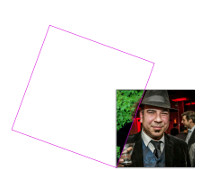
Just like the first example, we have two <img> tags. The bottom one (with has the photo of the very good looking fellow in the hat taken by Dan Van Brunt) is a regular image. The other one (the photo of the dude with the great head of hair by Brian Tao) is an image clipped with polyClip.js. As you can see from the second images’s data-polyclip attribute, the image is clipped outside of the image’s visible area:
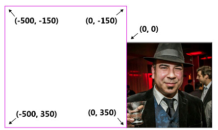
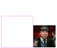
The initial state of the animation. Note that the clipping path of second image (outlined in purple) is outside the viewport of the image, which is why you don’t see the clipped image before the “Next” button is clicked.
This is why you cannot see “dude with the hair” image initially. Note that we also set the data-polyclip-transformorigin attribute to 0, 350, so that the clipping area rotates with respect to this point.
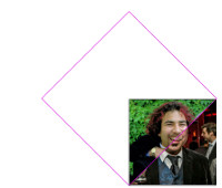
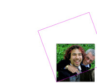
Now we want to rotate the clipping area so that we get the desired effect. The slides below show what will happen when clipping area of the second image is rotated:
| rotate(0deg) | rotate(20deg) | rotate(45deg) | rotate(70deg) |
|---|---|---|---|
 |
 |
 |
 |
All we have to do is set up a little JavaScript to make this magic action. I use my own animation library, Silk.js to do the heavy lifting. I could have used jQuery’s animate() method, but it doesn’t use requestAnimtionFrame to perform the animation, which does result in some noticable jitter (for more information on this, please read my earlier article, Cross Browser GPU Acceleration and requestAnimationFrame in Depth) . I made the API for Silk.js to closely resemble jQuery’s animate() method, so it should be fairly easy to follow what is going on in the code below.
var example2 = new function () {
   var me = this,
      $zoltan2000,
      mouseOffset = 20,
      visibleImage,
      animationDone = true;

   /*
    * Initialize the animation.  Cache jQuery objects
    * and set up click event.
    */
   me.init = function () {
      $zoltan2000 = $('#zoltan2000');

      $next = $('#next');
      visibleImage = 'zoltan2012';

      $next.click(clickEvent);

   }


   function clickEvent(e) {

      // If there is an animation running, don't do anything.
      if (!animationDone) {
         return;
      }

      animationDone = false;

      // Disable the next button.
      $next.attr('disabled', true)

      /*
       * set up the start and end angle of the animation,
       * depending on the state of the animation.
       */
      var beginAngle, endAngle;
      if (visibleImage == 'zoltan2012') {
         beginAngle = 0;
         endAngle = 90;
      } else {
         beginAngle = 90;
         endAngle = 180;
      }

      /*
       * Call Silk.js to do the animation.  Let's go
       * through this step by step.
       */
      var animation = new Silk(null, null, {

         // start and index of the animation
         stepStart: beginAngle,
         stepEnd: endAngle,

         // How long the animation is to run.
         duration: 1000,

         // What to do when the animation completes.
         complete: function () {

            animationDone = true;
            $next.attr('disabled', false)

            if (visibleImage == 'zoltan2012') {
               visibleImage = 'zoltan2000';
            } else {
               visibleImage = 'zoltan2012';
            }
         },

         // What easing function to use
         easing: 'easeInOutCubic',

         /*
          * What to do at each step of the animation.
          * Note that 'now' will be set to a number
          * between 'stepStart' and 'stepEnd', depending
          * where we are in the animation.
          */
         step: function (now) {
            polyClip.transformClip($zoltan2000, 'rotate(' + now + 'deg)');
         }
      });

   }

}

/*
 * Use this call instead of $(document).ready to initialize
 * to ensure that polyClip has initialized before you
 * start the animation routines.
 */
polyClip.addCallback(example2.init);
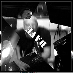
The ability to use any shape as a clipping area and transforming it dynamically can really spice up the cliché slideshow. Below is an example that I used to promote a show for my band Conflicting Plaid:
Animating Clipping Paths Without Transforms
If you don’t want to deal with transforms, or your use-case doesn’t call for them, you can just manipulate the clipping area of the resultant canvas tag instead using polyClip.clipImage(). Take a look at this example I used for my previous blog post, Cross Browser GPU Acceleration and requestAnimationFrame in Depth:
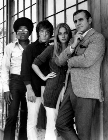
Mod Squad
TUESDAYS 8PM / 7 Central 
Play Demo Again
When I coded these animations, I used polyClip.clipImage() to change the clipping region over time:
var $title = $('#title');

$title.css({
	top: 596
});

animation = new Silk($title, {
	top: -160
}, {
	stepStart: 719,
	stepEnd: -35,
	duration: 3000,
	complete: function () {
		complete();
	},
	easing: 'easeInOutCubic',
	step: function (now, fx) {

		$jNode = polyClip.clipImage($jNode,
		            "0, " + now + ", 355, " + (now - 206) + "355, 459, 0, 0, 0");
	}
})
Note the first two parameters are not set to null as in the previous example. This is because we are animating the HTML <div id="title">MOD SQUAD</div> to move at the same rate as the animation clipping is moving, starting at top: 596 and ending at top: -160. I will be writing more about the full functionality of Silk.js in a future blog post. Obviously, the above animation manipulates several images — for more details, please view-source the clean-room, view-source friendly version of the page below:
See a “clean room”, view-source friendly version with the above example.
Clipping Images Using Canvas or SVG.
As mentioned earlier, polyClip.js uses HTML5 Canvas to produce the clipped images. Sometimes, however, it may be desirable to use SVG instead. As of polyClip.js 2.0, you can now set the optional data-polyclip-clippreference attribute to tell the browser to use SVG whenever possible:
<img src="image.jpg" data-polyclip="487, 4, 500, 239, 19, 239, 43, 195"
      data-polyclip-clippreference="SVG"  />
Note that I say “whenever possible”.. This is because, at the time of this writing, there is a bug in iOS that will not correctly fill a SVG shape with an image correctly. As I had mentioned in a previous blog post, all current iOS devices I tested with (iPhone and iPad) have a severe bug when filling an SVG polygon with an image. In order to fix this, I do a browser sniff to work around this iOS defect (I wish there was a way to detect this some other way, but I haven’t found one). When this issue is fixed in iOS, I will change polyClip.js to only do this in the versions of iOS affected. IE8 and below will, of course, always use excanvas.js and VML to draw the clipped images, due to their lack of support of SVG.
I recommend using Canvas by default. I have found animating with SVG much slower and in some cases, can affect animations that appear elsewhere in the document. I will post more information about that in another post.
In Conclusion
I have been using polyClip a lot in client work recently, and it works really well. Combined with Silk.js, it makes for some interesting animations that look great even on an iPad and other mobile devices. There are some more features about this library that I haven’t touched on yet which will be covered in future blog posts, so please stay tuned.
Download the latest version of polyClip.js and Silk.js from github.
0 responses so far
Give Feedback
Don't be shy! Give feedback and join the discussion.
Please Note: If you are asking for help using the information on this page or if you are reporting a bug with the code featured here, please include a URL that shows the problem you are experiencing along with the browser/version number/operating system combination where the issue manifests itself. Without this information, I may not be able to respond.