 @zoltandulac
 @zoltandulac
 Zoltan Hawryluk
Note:  denotes a required field.
An example HTML5 Form with validation. Interact with it, and you will see the form will detect when the user has put in valid information as he types. You will also note that if the form is submitted when some of the data is invalid, it will show friendly error messages.
HTML5 Forms is probably the most practical and, I believe, will be the most commonly used module of the HTML5 spec. With it, you can create great looking, easy-to-use forms that can validate each field as a user types. Try the example on the left to see how this validation works. Then try to submit the form when it contains errors — you will see a nice, friendly error message beneath your first mistake. Nice, isn’t it? Many of the modern browsers (i.e. Firefox 4.x+, Chrome 17+1, Opera 10.x+, IE 10+) support the HTML5 Forms spec natively, and it is possible to add support to the other browsers (Safari1 and IE 9.0-) using HTML5Forms.js, the updated version of my HTML5Widgets package I published in 2010. It includes a modified build of Weston Ruter’s webforms2 that mimics the behavior of the newer native implementations of the HTML5 Forms specification. After you read this article, I would suggest first reading my initial blog post, Creating Cross Browser HTML5 Forms Now, Using modernizr, webforms2 and html5Widgets (updated, of course, to be in sync with the new features of the new HTML5Forms.js package) so that you can become familiar with the other parts of the HTML5 Forms specification.
Before Getting Started
You will need to download the HTML5Forms.js JavaScript library to add support for older browsers that don’t support HTML5 Forms natively. When you download the package, all you need to do is add the following tags to the head of your document:
 <script type="text/javascript"
      src="/path/to/shared/js/modernizr.com/Modernizr-2.5.3.forms.js">
 </script>

 <script type="text/javascript"
          data-webforms2-support="validation"
          src="/path/to/html5Forms/shared/js/html5Forms.js" >

 </script>
HTML5Forms.js includes a custom build of Modernizr that includes only the Form element detection routines. If you want, you can include the full blown version of Modernizr or your own custom build of it instead, as long as it has HTML5 Forms support. Note that the script tag that includes html5Forms has a data-webforms2-support attribute. This is used to tell the script the parts of the specification that need to be supported. If the browser doesn’t support that part of the spec, load the additional scripts needed to add support. In this case, data-webforms2-support is set to "validation" which tells html5Forms to load webforms2 polyfill to add support for older browsers, which is included with HTML5Forms.js. For more information about the other values that can be added to data-webforms2-support, please read my previous article of HTML5Widgets.
So… now that we got the polyfill out of the way, let’s see what HTMl5 Forms can do.
Styling Validation Messages
Let’s say you have a form field that is supposed be used to input a North American Phone Number:
<input type="text" name="phonenum" value="" />
Now let’s say you want to validate the form element on the client side. In HTML5, all you need to do is insert the following HTML into your <input> element:
<input type="tel" name="phonenum" value=""
          pattern="[0-9]{3}-?[0-9]{3}-?[0-9]{4}"
          required placeholder="e.g. 416-769-7093" />
The required attribute forces the user to fill out this form field. The pattern attribute ensures the form will be submitted when the text inside the form field matches the a North American phone number using the attribute’s regular expression (if you aren’t familar with regular expressions, take a look at Regex Tutorial). The placeholder attribute is there to give the user an idea about how the data should be formatted (presented in English, since most people can’t resolve regular expressions inside their head. My brother can, but then again, he really isn’t like most people).
To see how this works in practice, try entering in valid and valid phone numbers into the form field below to see what happens when you try to submit:
See the nice and friendly “cartoon bubble” that appears when the phone number is not formatted correctly? This is HTML5 Form Validation in action. Pretty cool, but you will see the browsers don’t style them in exactly the same way:
| Windows | Mac | Linux | |
|---|---|---|---|
| Firefox 4.0+ (native support) |
 |
 |
 |
| Safari 5.x- (polyfill) |
 |
 |
Not Applicable |
| Chrome 17+ (native support) |
 |
 |
 |
| Opera (native support) |
 |
 |
 |
| IE8 (polyfill) |
 |
Not Applicable | |
| IE10 (native support) |
 |
||
I especially found it interesting that Firefox changes the look of the bubbles to match the underlying operating system. I can imagine that the graphic-designers out there reading this will probably want to control the look and feel of these bubbles. It is possible to change the native style in Chrome using some Webkit-only CSS pseudo-classes, but currently it doesn’t look like we can style them in the other browsers that natively support HTML5 Forms (i.e. Firefox, Opera and IE10). While I’m sure that these browsers will allow CSS styling of the bubbles in the near future, you can do it now by forcing webforms2 to render the bubbles instead of the native browser routines by setting data-webforms2-force-js-validation="true" on the form tag (and the script tag that loads html5Forms.js). Here is the code:
<!DOCTYPE html>
<html xmlns="http://www.w3.org/1999/xhtml">
<head>

  <script type="text/javascript" src="/path/to/shared/js/modernizr.com/Modernizr-2.5.3.forms.js">
  </script>

  <script data-webforms2-force-js-validation="true"
          data-webforms2-support="validation"
          src="/path/to/html5Forms/shared/js/html5Forms.js"
          type="text/javascript">
  </script>
</head>

<body>
  <form data-webforms2-force-js-validation="true"
           id="styleBubbleExample"
           name="styleBubbleExample">
    <table class="formTable">
      <tr>
        <th>Full Name :</th>

        <td><input type="text" name="fullName" value="" required=
        "required" placeholder="Required information" /></td>
      </tr>

      <tr>
        <th>Company Name :</th>

        <td><input type="text" name="companyName" required=
        "required" value="" placeholder=
        "Required information" /></td>
      </tr>

      <tr>
        <td></td>

        <td><input type="submit" value="Submit Information" /></td>
      </tr>
    </table>
  </form>
</body>
</html>
Let’s say we wanted to change the balloons to be white with green text. Here is the CSS:
/*
 *  STEP 1: change the bubble so background is white and text is green.
 */

/* Webkit */
input::-webkit-validation-bubble-message {
	color: green !important;
	background: white;
	border: 1px solid black;
	padding: 18px;

}

/* Polyfill styles to do the same as above */
.wf2_errorMsg {
	color: green !important;
	background: white;
}

/* Removes the icon that appears in Webkit browsers by default */
input::-webkit-validation-bubble-icon {
	display: none;
}

/* Needed for IE to get rid of gradient background, or to replace it with another gradient */
.wf2_errorMsg {
	filter: none !important;
}


/*
 * Step 2: The arrow
 */

input::-webkit-validation-bubble-arrow {
    background: white;
    border: solid black 1px;
}

/* Polyfill */
.wf2_errorMsg:before {
    /* By default, the image is 29x15, but you can change it and position it with CSS */
    background: url('whiteValidationPointer.png') !important;
}
And here is the result:
Note that you could go even further and style the validation bubbles of individual form elements as well. For example, let’s say you had two formfields, fullName and companyName and you wanted the error message for fullName to be green with a white background, and companyName to be have yellow text. You could do so with the following CSS:
/*
 * Styling the "Full Name" error message.
 */

/*
 *  The background color of the main box
 */

/* Webkit */
input[name="fullName"]::-webkit-validation-bubble-message {
	color: green !important;
	background: white;
	border: 1px solid black;
	padding: 18px;

}

input[name="fullName"]::-webkit-validation-bubble-icon {
	display: none;
}

/* Polyfill */
#fullName_wf2_errorMsg {
	color: green !important;
	background: white;
}

/* Needed for IE to get rid of gradient background, or to replace it with another gradient */
#fullName_wf2_errorMsg .wf2_errorMsgContainer {
	filter: none !important;
}


/*
 * Step 2: The arrow
 */

[name="fullName"]::-webkit-validation-bubble-arrow {
	background: white;
    border: solid black 1px;
}

/* Polyfill */
#fullName_wf2_errorMsg:before {
	/* By default, the image is 29x15, but you can change it and position it with CSS */
	background: url('images/whiteValidationPointer.png');
}

#companyName_wf2_errorMsg {
	color: yellow !important;
}
Using CSS to Show the Validity of Form Fields As The User Types
One of the coolest things you can do with CSS and HTML5 forms is to show the user the validity state of a form element as a user is typing. Fill out the following form to see what I mean:
When the user focuses in on a particular form field, the required icon () changes to an invalid icon ( ) until the user enters in a valid value, when the valid icon appears (
 ). This helps the user fill in the form correctly even before the submit button is pressed and will speed up form completion.
Here is the fully commented CSS that will show how we can implement this in all browsers (including the ones that use the webforms2 polyfill).
/*
 * STEP 1: Show the user when a form field is required with an orange star.
 */

/* Browsers that implement HTML5 Forms Natively */
input:required, textarea:required{
	background:url("/blog/wp-content/uploads/2012/04/asterisk_orange.png") no-repeat right top;
}

/* Polyfill */
input[required] {
	background:url("/blog/wp-content/uploads/2012/04/asterisk_orange.png") no-repeat right top;
}


/*
 * STEP 2: Show the user when a form field has valid data in it with a green checkmark.
 */

/* Browsers that implement HTML5 Forms Natively */
input[required]:valid, textarea[required]:valid {
	/* Make this important if you want IE10 to work right. */
	background:url("/blog/wp-content/uploads/2012/04/tick.png") no-repeat right top !important;
}

/* Polyfill */
input[required].wf2_valid {
	background:url("/blog/wp-content/uploads/2012/04/tick.png") no-repeat right top;
}


/*
 * STEP 3: Show the user when a form field has invalid data in it with a red 'X'.
 */

/* Browsers that implement HTML5 Forms Natively */
input:focus:invalid, textarea:focus:invalid {
	background:url("/blog/wp-content/uploads/2012/04/cancel.png") no-repeat right top;
}

/* Polyfill */
input.wf2_invalid:focus {
	background:url("/blog/wp-content/uploads/2012/04/cancel.png") no-repeat right top;
}
Customizing the Error Messages
Note that the default error messages may vary from browser to browser:
| Opera Mac | Firefox Mac |
|---|---|
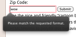 |
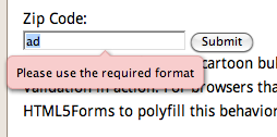 |
This may not be a big deal the majority of time, but there will be some cases where you want have more control over the error messages. Although this can be done via JavaScript using a form element’s setCustomValidity() method, Firefox has an attribute, x-moz-errormessage which can be used to set custom error messages easily. I really liked this idea, so I thought it would be cool to implement a dataset attribute for HTML5Forms.js, data-errormessage, that would do the same thing:
<input type="text" name="zipc" required="required" pattern="[0-9]{5}(-?[0-9]{4})?"
        placeholder="Required information"
        data-errormessage="You must enter a valid Zip Code (e.g. 90210)" />
Below is a great example of this attribute in action:
Conclusion
Validation support for HTML5 Forms in the various browsers is still spotty, but HTML5Forms.js can help if you want to do it now. I have used it myself in a few professional projects and I hope you find out of use too.
Footnotes
^ 1 Note that Safari and some older versions of Chrome natively support the validation CSS part of the HTML5 Forms specification, but don’t display the error message bubbles. I believe that this is due to the version of Webkit that is being used for these browsers (v. 533 and lower). With HTML5Forms.js, though, allows you not to worry about such problems. :-)
11 responses so far
1 David Anastasi
// May 18, 2012 at 3:30 am
David Anastasi
// May 18, 2012 at 3:30 am
Great Stuff, thanks Zoltan.
Was there a reason for not using type=”number” for the phone number field?
Dave Anastasi
2 zoltan
// May 18, 2012 at 7:22 am
zoltan
// May 18, 2012 at 7:22 am
Thanks @David! Phone numbers are not quite a number due to the formatting (i.e. dashes), so
numberwouldn’t be quite appropriate. However,telwould be, and it was something that I totally overlooked, so I changed the example on this page — thanks for bringing this up.Although it doesn’t make a difference in desktop browsers, it does matter for mobile ones — tapping a
telornumberfield will bring up a virtual numeric keypad instead of the full alpha keyboard that atextfield would.3 Alex Coady
// Jun 4, 2012 at 8:49 am
Alex Coady
// Jun 4, 2012 at 8:49 am
Great tutorial, thank you. Will be moving to using HTML5 forms from using jQuery.validate() very soon.
4 Gunnar Bittersmann
// Jun 4, 2012 at 3:55 pm
Gunnar Bittersmann
// Jun 4, 2012 at 3:55 pm
Restricting phone numbers to some format (given length, dashes only at given places) doesn’t seem a good idea to me. The Web is word-wide! International users should be allowed to enter their phone number.
And how about vanity numbers, i.e. letters?
input type=”email” is still wrong implemented in browsers as it falsely rejects email addresses with non-ASCII characters, e.g. IDNs as wünschdirwas.de or россия.рф.
Use with care.
5 zoltan
// Jun 4, 2012 at 11:52 pm
zoltan
// Jun 4, 2012 at 11:52 pm
@Gunnar: It is quite true that the web is international and, in practice, a developer should know the audience and cater to that. I chose North American phone numbers in my example for simplicity sake — it wouldn’t be hard to change this regex to fit international numbers. I do, however, leave this as an exercise for the reader :-)
While I believe the vanity phone number an edge-case, your email address comment is quite valid. As of 2010, the domain part of an email address can have non-Latin characters, and it seems that email addresses like example@wünschdirwas.de and example@россия.рф do not validate correctly in most of the native HTML5 Forms implementations (the exception being Opera, which is not surprising as it is made by a Norwegian company).
I will be updating the webforms2 portion of HTML5Forms to handle this correctly in all browsers when developers use the
data-webforms2-force-js-validation="true"in thescriptandformtags. Thanks for pointing this out.6 Gunnar Bittersmann
// Jun 5, 2012 at 4:48 am
Gunnar Bittersmann
// Jun 5, 2012 at 4:48 am
@zoltan: A pattern for all phone formats that users might enter should be harder to find than it first seems. You should allow for spaces and periods as separators as well, for + at the beginning of an international number, and also for parentheses around the area code. (That makes validation more complicated: you need to check the order of opening and closing pairs; parentheses should not be nested.) There might be other common characters in other cultures. In the end, you might end up with no validation at all.
I wasn’t aware that Opera already supports non-ASCII characters in input type=”email” now. It had not done so when I gave a talk on that subject at the W3C Multilingual Web Workshop in April 2011. http://www.multilingualweb.eu/en/documents/pisa-workshop/program Thanks for letting me know.
7 zoltan
// Jun 5, 2012 at 8:31 am
zoltan
// Jun 5, 2012 at 8:31 am
@Gunner: You bring up some very interesting points about international phone numbers. Would it be sufficient to allow a user to just enter numbers, dashes and spaces and guide the user when the enter other possibly valid ones with an error message… or is it better just to not allow validation at all? (As far as I can see, the native browser implentations don’t validate
telby default. However, iOS does popup a virtual keypad with a phone keypad to aid the user entering the phone number easily). This is a harder question that it first appears and does warrent further investigation. Thanks for that.8 c.
// Aug 15, 2012 at 5:05 pm
c.
// Aug 15, 2012 at 5:05 pm
I just wanted to thank you for taking the time to write this library without depending on jQuery and the like. I cannot express how frustrating it is that so many projects these days require an extra library just to save themselves a handful of keystrokes.
9 zoltan
// Aug 24, 2012 at 4:21 pm
zoltan
// Aug 24, 2012 at 4:21 pm
@c: jQuery does make development faster, but I like to use plain JavaScript when I can. Thanks for the feedback.
10 Abby
// Sep 7, 2012 at 3:49 pm
Abby
// Sep 7, 2012 at 3:49 pm
I haven’t tried this tutorial yet, but I bookmarked it. I have been searching for ways to do form validation. This seems very thorough, Thanks!
11 Rasel Ahmed
// May 10, 2013 at 10:11 am
Rasel Ahmed
// May 10, 2013 at 10:11 am
Very nice tips. Thank you.
Give Feedback
Don't be shy! Give feedback and join the discussion.
Please Note: If you are asking for help using the information on this page or if you are reporting a bug with the code featured here, please include a URL that shows the problem you are experiencing along with the browser/version number/operating system combination where the issue manifests itself. Without this information, I may not be able to respond.