 @zoltandulac
 @zoltandulac
 Zoltan Hawryluk
Accessible modals aren’t hard to make, and you can make your modal dialogs accessible if you keep in mind the following requirements:
- Markup: You should use the correct HTML5 tags and ARIA roles inside the modal to ensure it works well with screen readers.
- Applying Focus On Modal Open: When an interactive element (like a button) opens a modal, keyboard focus should go to the first element in the modal (usually the modal’s close button). The modal should also announce that a modal opened along with the modal’s title.
- Applying Focus On Modal Close: When the user closes the modal, keyboard focus should go back to the interactive element that opened up the element in step 1.
- Restricting Focus To The Open Modal: When the modal is open, users should only be able to access elements within that modal. This means that keyboard users should not be able to tab into elements behind the modal, and that mobile users should not be able to swipe beneath the modal.
Below is a video demonstrating of all of these features in action, on both a desktop and mobile device:
Unfortunately, some “accessible” modal JavaScript libraries work well for keyboard users, but not for mobile ones. This article will discuss why and how to work around the issues that mobile creates.
In order to keep this tutorial simple, we will be using the HTML5 <dialog> polyfill. We will be adding code to make not only the polyfill accessible, but also improve the accessibility of native implementations (which, at the time of this writing, is only Blink-based browsers like Chrome and Opera).
If you want to just download the example code used in this article, you can download it from the demo’s github repo and start playing with it right away.
Download the demo code from github
Go to a cleanroom page of the demo
Basic Markup
Creating a dialog is simple.
<button id="updateDetails">
    Open Modal
</button>

.
.
.

<!-- Simple pop-up dialog box, containing a form -->
<dialog
    id="favDialog"
    aria-labelledby="favDialog__label"
    aria-describedby="favDialog__description">
    <div role="document">

        <!--
            The cancel button should be the first in the DOM.
            Note it should be a button, not a link, since it
            doesn't go to another page.
        -->
        <button
            id="cancel"
            class="a11y-modal__button--close"
        >
            <img
                class="a11y-modal__button--close-image"
                src="images/close-window.svg"
                alt="close this dialog">
        </button>

        <!--
            This is the title of the dialog.  Since it is
            set as the dialog's `aria-labelledby`, it will
            be read when it is opened
        -->
        <h2 id="favDialog__label">Login</h2>

        <!--
            This should a more detailed description of the
            purpose of the dialog.  Since it is set as the
            dialog's `aria-describedby`, it will be read
            when the dialog is opened.
        -->
        <p id="favDialog__description">
           In order to continue, please log into the application
        </p>

        <!--
            Rest of dialog here
        -->

        ...
    </div>
</dialog>

.
.
.

<script src="js/shared/dialog-polyfill.js"></script>
In order for the button to actually open the modal, we will need a little bit of Javascript:
(function() {
    // Button that opens the dialog
    const updateButton = document.getElementById('updateDetails');

    // Clicking this button opens the dialog
    updateButton.addEventListener('click', function() {
      favDialog.showModal();
    });

    // The modal's cancel button
    const cancelButton = document.getElementById('cancel');

    // Clicking the cancel button will close the dialog
    cancelButton.addEventListener('click', function() {
      favDialog.close();
    });

    // The <dialog> element itself
    const favDialog = document.getElementById('favDialog');

    // If we are using the polyfill, then initialize it
    if (window.dialogPolyfill) {
      dialogPolyfill.registerDialog(favDialog);
    }

  })();
A few accessibility notes here:
- Using the
<dialog>tag, screen readers will report the element as a dialog. The polyfill will insert arole="dialog"inside the dialog tag for browsers that don’t support<dialog>natively. If you decide to not to use the HTML5<dialog>tag to create the modal, you must add therole="dialog"attribute yourself in order to maintain this accessibility feature. - The
<div role="document">(that is contained in the<dialog>code above lets screen readers know the dialog contains a separate document inside of it and will read things appropriately to the user. More inforamation can be found on Mozilla’s documentation on the document role.
Applying Focus on Modal Open
The WAI-ARIA spec states that “When first opened, focus should be set to the first focusable element within the dialog”. In a lot of cases, this would be the close button, which is usually an X at the top right of the modal itself, since it is the top-most element (which is nice, since if a user opens the modal by accident, they can easily close it immediately by pressing Enter on the keyboard).
Native implementations of the HTML5 <dialog> element (as well the polyfill) will do this for free. If you are using any other implementation, you must implement this yourself using the JavaScript focus() method.
Applying Focus On Modal Close
Best practice states that when a modal dialog is closed, focus should go back the element that opened it. This is something that doesn’t happen in both the current native implementations of <dialog>, nor in the polyfill. However, this gist adds this functionality to both, so I added it to my version of the code.
Limiting Focus To An Open Modal
Native implementations of the HTML5 <dialog> element will do this for free, due to it being part of the spec. The polyfill partially implements this, so I have included notes on where it fails and how to fix the issues.
In many cases, developers will implement focus state management for desktop devices, but not for mobile ones. You’d think you wouldn’t need to worry about two different ways to do this, but its the way the world is at the moment, so let’s talk about how to deal with it.
Desktop
For desktop devices, keyboard focus must never go outside the modal. Native HTML5 <dialog> implementations, as well as the polyfill, do this for free.
If you are using some other modal dialog framework, you must implement this yourself if the framework doesn’t. One way to do this is using my own accessibility.js library’s setKeepFocusInside(). More information is available on the accessibility.js GitHub repo.
It is also possible to do this with the proposed HTML5 inert attribute. As of this writing, no browser supports this attribute, but there is a inert polyfill made by Google as well as one by WICG. I have not used either of these yet, so YMMV (Your mileage may vary).
Mobile
This is the part that usually trips a lot of developers. As a matter of fact, many commonly used modal frameworks, like Bootstrap’s Modal Dialog, limit focus correctly on dekstop devices but not on mobile ones. This is because blur and focus events, which are commonly used to limiting focus to the modal on desktop, don’t fire on mobile devices when using a screen-reader like iOS’s Voiceover or Android’s Talkback. Mobile screenreaders have an idea of accessibility focus, which is not the same as keyboard focus. Keyboard focus (on desktop computers) allows focus to occur on interactive elements (links, buttons, form elements, and DOM elements with `tabindex` that is anything other than -1. Accessible focus on mobile devices, on the other hand, allows “focus” on any element on a page, including those which have a tabindex of -1.
So what is a user to do? Rahul Kumar mentions in his Medium article Focus Trapping for Accessibility (A11Y) that developers can ensure accessibility focus will not be applied on elements outside the modal by setting their aria-hidden attribute to "true". Since he handwaves how how this should work in a general sense, I had to work out this pseudo-code to do this:
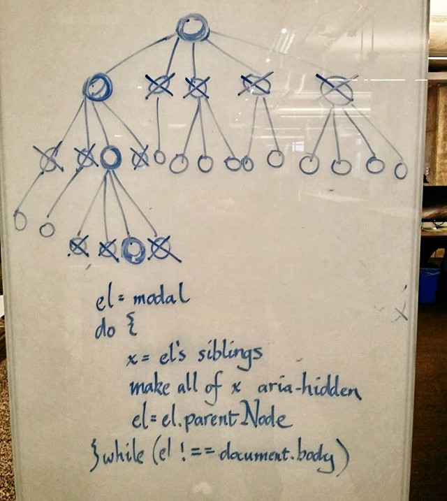
My sketch of the algorithm that is needed to ensure focus stays in modals in mobile devices.
I then translated this into JavaScript
/**
 * This ensures that a mobile devices "accessibilityFocus"
 * (which is independant from a browser focus) cannot
 * go outside an element, by ensuring
 * the least amount of nodes outside the modal are
 * marked with aria-hidden="true".
 *
 * @param {HTMLElement} el - the element that will have the loop.
 */
function setMobileFocusLoop(el) {
  const { body } = document;
  let currentEl = el;

  do {
    // for every sibling of currentElement, we mark with
    // aria-hidden="true".
    const siblings = currentEl.parentNode.childNodes;
    for (let i = 0; i < siblings.length; i++) {
      const sibling = siblings[i];
      if (sibling !== currentEl && sibling.setAttribute) {
        sibling.setAttribute('data-old-aria-hidden', sibling.ariaHidden || 'null');
        sibling.setAttribute('aria-hidden', 'true');
      }
    }

    // we then set the currentEl to be the parent node
    // and repeat (unless the currentNode is the body tag).
    currentEl = currentEl.parentNode;
  } while (currentEl !== body);
}
Note that I set the data-old-aria-hidden attribute to the previous value of the aria-hidden attribute (just in case it was set to something before this function was executed). This data- attribute is also used when undoing all of this when the modal is closed:
/**
 * reset all the nodes that have been marked as aria-hidden="true"
 * in the setMobileFocusLoop() method back to their original
 * aria-hidden values.
 */
function removeMobileFocusLoop() {
  const elsToReset = document.querySelectorAll('["data-old-aria-hidden"]');

  for (let i = 0; i < elsToReset.length; i++) {
    const el = elsToReset[i];
    const ariaHiddenVal = el.getAttribute('data-old-aria-hidden');
    if (ariaHiddenVal === 'null') {
      el.removeAttribute('aria-hidden');
    } else {
      el.setAttribute('aria-hidden', ariaHiddenVal);
    }
    el.removeAttribute('data-old-aria-hidden');
  }
}
Note that there is a (much easier) alternative to doing this: if you set aria-modal="true" on the dialog element, user agents are supposed to restrict focus to the it. Unfortunately, support for aria-modal is spotty (if supported at all), so for now, it is important to use the above solution until support reaches critical mass.
What Can I Use To Make My Existing Modal Dialog Code Accessible
Even though I made only one particular modal library accessible, the thought process of how to do so is written here, you just have to implement it in the one you are using! A lot of the heavy lifting for my solution was incorporated in accessibility.js, so feel free to use it, or just steal the parts of the code you need from it.
If you have made a modal library accessible using the information here, please feel free to share your work in the comments below. I would love to see if this blog post has helped anyone.
Acknowledgments
- The image used in the demo at the top of this post: English Fairy Tales, Jacobs, J., 1895 New York : Grosset & Dunlap (2nd edition?) Boston Public Lib., obtained from Wikimedia Commons.
- The original
<dialog>polyfill was coded by GitHub user “GoogleChrome” (I assume this is an account owned by Google, although I’m not really sure to be honest). I added extra code from this Gist by Sam Thorogood which returns focus the button that opened the dialog after the modal dialog is closed. I also added the mobile specific code to this gist and published the result as a fork of the original polyfill.
0 responses so far
Give Feedback
Don't be shy! Give feedback and join the discussion.
Please Note: If you are asking for help using the information on this page or if you are reporting a bug with the code featured here, please include a URL that shows the problem you are experiencing along with the browser/version number/operating system combination where the issue manifests itself. Without this information, I may not be able to respond.