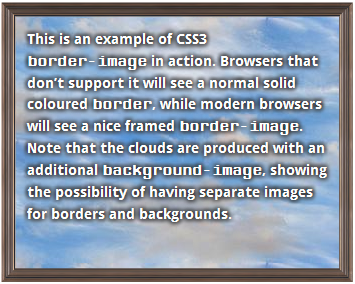
This is an example of CSS3 border-image in action. Browsers that don’t support it will see a normal solid coloured border, while modern browsers will see a nice framed border-image. Note that the clouds are produced with an additional background-image, showing the possibility of having separate images for borders and backgrounds.
The border-image property is something I’ve been wanting for a long time. For years, I have been cutting up images into several pieces in order to emulate this effect (the most recent example of this was used in this demo of the CSS3 Font Converter). The difference is that CSS3’s border-image property uses only one image and two lines of CSS (well … 6 if you include the vendor-specific properties and the fallback for browsers that don’t support it).
Since it is newly implemented in most web browsers, there are a few gotchas that developers should be aware of before implementing border-image. This article will cover these caveats, a tool that you can use to help generate border-images effectively, and a few things you should keep in mind so that pages don’t look funny in browsers that don’t support border-radius.
Let’s Look At An Example
This is an example of a block level element that uses the border-image property. The border-image is viewable in all major browsers except for IE (more on that later). It uses only one image to produce the border — no images were cut-up into pieces or harmed in any other way. The code to generate this border is fairly straight-forward once you know how it works:
#object {

   /*
    * These border widths must match the border-image numbers.
    */
    border-width: 23px 22px 22px 26px;

   /*
    * Note that all browsers use their respective vendor prefix.  Also
    * note that, unlike the border-width values, the widths in the
    * border-image property don't have the 'px' unit at the end.
    */
   -moz-border-image:    url('image.png') 23 22 22 26 round round;
   -webkit-border-image: url('image.png') 23 22 22 26 round round;
   -o-border-image:      url('image.png') 23 22 22 26 round round;
   border-image:         url('image.png') 23 22 22 26 round round;

   /*
    * You should include a border-color and border-style as a fallback
    * for browsers that don't support border-image (and to prevent
    * this known issue that happens in certain versions of Firefox:
    * https://bugzilla.mozilla.org/show_bug.cgi?id=748253 (thanks to
    * Lith for pointing this out).
    */
    border-color: #cccccc;
    border-style: solid;
 }

It is an edited version of an image produced by Free Printable Borders.
Note that the image repeats to the size of the block it borders. When you design a border-image, the border should tile in a similar way that a background-image does. There are some major differences though, so let’s show in depth how border-image is used, and introduce you to the tool that will help even the laziest developer in the world (i.e. me) create them quickly.
Basic Syntax
Note that the basic CSS is quite easy if you know how border-width works:
#selector {

  border-width: <top-width>px <right-width>px <bottom-width>px <left-width>px;

  border-image: url(<image-url>) <top-width> <right-width> <bottom-width> <left-width>

                <horizontal-effect> <vertical-effect>;

}
Note that if you are measuring your widths in pixels, then you must put the px unit inside the border-width declaration, but you must leave it out in the border-image one. I know it doesn’t seem logical, but it’s just the way it is.
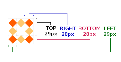
To illustrate the all of the border-image parameters, let’s take this image:

First we must grab the border widths in the right order:
(Note that the order of the border-image widths is consistent with the order that margin and padding uses).
Now, let us apply effects on our image.
Pure CSS Example (will be visible if your browser supports border-image |
Firefox Screenshot (Opera and Webkit are similar, except for the round effect, which Chrome and Safari currently don’t support.) |
|---|---|
|
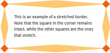
This is an example of a stretched border. Note that the square in the corner remains intact, while the other squares are the ones that stretch.
|
|
|
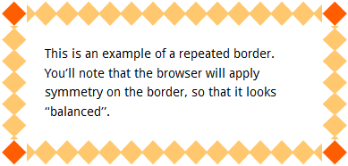
This is an example of a repeated border. You’ll note that the browser will apply symmetry on the border, so that it looks “balanced”.
|
|
|
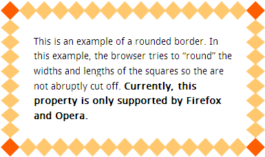
This is an example of a rounded border. In this example, the browser tries to “round” the widths and lengths of the squares so they are not abruptly cut off. Currently, this property is only supported by Firefox and Opera.
|
|
But I Hate Counting Pixels!
If you are the laziest developer in the world (i.e. me), you don’t want to crack open your graphics editor, open up a image file and count the pixels by hand – you want a tool that will generate the CSS for you. After all, don’t we use computers so that they will do things for us? At least, until they take over the world?
I was in the middle of creating my own tool, but I noticed that Kevin Decker beat me to it with his excellent Border Image Generator. You can take any image, from the web or your desktop, drag a few sliders around, and voilá!, you have your code, vendor-prefixes and all. You should definitely check it out if you are as lazy as I am.
Percentage Widths
The border-image property can also take percentage values, which correspond to the image’s width in height. For example, let’s take this 81×81 image:

As you recall, we used the following pixel dimensions:
border-image: url('/border-image/images/borders/chain.png') 23 22 22 26 round;
If you wanted to convert the pixel widths to percentages, you must take each value and divide it by either the entire width of the border-image (for the left and right widths) or by the height of the border-image (for the top and bottom widths). In the above case:
- The top border width percentage = (top border width in pixels) / (
border-imageheight) = 23 / 81 = 0.283… = 28% - The right border width percentage = (right border width in pixels) / (
border-imagewidth) = 22 / 81 = 0.271… = 27% - The bottom border width percentage = (bottom border width in pixels) / (
border-imageheight) = 22 / 81 = 0.271 = 27% - The left border width percentage = (left border width in pixels) / (
border-imagewidth) = 26 / 81 = 0.320 = 32%
Note that these percentages can only be used in the border-image property. The border-width property must continue to use the pixel values:
   /*
    * These border widths must match the border-image numbers
    */
    border-width: 23px 22px 22px 26px;
 	border-color: black;
   /*
    * Note that all browsers use their respective vendor prefix.
    */
   -moz-border-image:    url('chain.png') 28% 27% 27% 32% round;
   -webkit-border-image: url('chain.png') 28% 27% 27% 32% round;
   -o-border-image:      url('chain.png') 28% 27% 27% 32% round;
   border-image:         url('chain.png') 28% 27% 27% 32% round;
Now, why on earth would you want to use percentages, since pixels are probably more accurate? I don’t see there being any need for bitmap images, but Webkit browsers (i.e. Safari and Chrome) can use SVG vector images as a border-image as well. Since SVG images are resolution independent, I would assume it is more accurate to use percentages. It would be worth looking into percentage widths more when SVG border-image support reaches critical mass, since the other browser manufacturers may handle SVG support differently than Webkit.
Degrading Gracefully and Progressive Enhancement
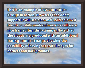
It is important that developers ensure their designs degrade gracefully so that pages not only look decent in browsers that don’t support border-image, but also look nice when a compliant browser is loading the images, especially when loading a high-bandwidth page or a page on a slow connection. Not only should you ensure the border-color and border-style are set, but it is a good idea to ensure that the look of the fallback border is as close as possible to border-image as possible. Let’s take a look at the “framed border” we used at the top of this page:
| Firefox | IE9 |
|---|
You can also be fancy and use modernizr to do some extra progressive enhancement styling by using the html.no-borderimage selector. I have done this using the comments section of my blog posts.
| Firefox | IE9 |
|---|
Using With Background Images
If you are using a border-image without a transparent colour or alpha channel, the center of your border-image will hide any background-image the object may have. If you want to have a separate background-image, you must “cut-out” the middle of the border-image using your graphics editor with a transparent colour. For instance, the example at the top of the page with the picture frame border-image has a photo of clouds as a background-image. This allows developers to create more graphically rich block-level elements.
Hey! What about IE?
Unfortunately, IE doesn’t support border-image natively. I may have a workaround for this using cssSandpaper, but it needs a lot more testing to see if it is a truly viable polyfill for this effect. If I am successful, I will post whether that solution as an addendum to this blog post.
Conclusion
border-image can be used today to make some very interesting effects that can be degraded gracefully in browsers that don’t support it. It can speed up design time considerably since you don’t have to use your graphics editor to cut up images. And I’m sure it will waste a lot of your time while you play and see how it can be used effectively.
 @zoltandulac
 @zoltandulac
 Zoltan Hawryluk


15 responses so far
1 Travis Northcutt
// Mar 29, 2011 at 8:25 am
You mentioned that “(Opera and Webkit are similar, except for the stretch, which Chrome and Safari currently don’t support.)” – but Chrome does support stretch, as far as I can tell (I’m viewing this page in Chrome 12.0.712.0 and the stretch example looks identical to your Firefox screenshot. However, as you mention later, Chrome doesn’t support the rounded method.
Regardless, thanks for explaining all of this and taking the time to show the various implementations.
2 zoltan
// Mar 29, 2011 at 9:03 am
@Travis: Oops .. thanks for pointing out the typo. I meant to say that Safari and Chrome don’t support the round effect. Stretch is fully supported on Webkit browsers. I have made the correction.
I have yet to release a post where I don’t have any editing mistakes. I should make a “Where’s Waldo” game out of it. But I don’t know what the prize would be. :)
3 Divya
// Mar 29, 2011 at 11:17 am
I was just looking at it yesterday with Lea Verou and border-image also is supposed to work with gradients. The biggest blocker for me is that there is no way to punch out the middle so borders actually remain borders and not become pseudo background images too (consider a case where you want a border image on a transparent element but the image used for border-image is in itself not transparent inside the border pattern like in the case of gradients).
4 Divya
// Mar 29, 2011 at 11:54 am
Ooops, I spoke too soon, apparently it is possible (webkit only for now): http://jsfiddle.net/nimbu/fbw2q/ (technique via Nicolas Gallagher
5 zoltan
// Mar 29, 2011 at 1:02 pm
@Divya: Thanks for mentioning this! Cool stuff. Hopefully the other browsers will also be able to do this soon.
6 Dan Owen
// Apr 29, 2011 at 1:57 pm
I love this property. Appeals to the front-end designers big-time.
Currently though Safari and Chrome use an improper beginning position for the side images when ’rounding’.
Example at:
http://ensightful.com/walrus-ivory-tusk-with-animals
7 Dan Owen
// Apr 29, 2011 at 2:20 pm
Oh and FF and Opera are pixel perfect.
8 zoltan
// Apr 29, 2011 at 2:29 pm
@Dan: It is a known issue that
rounddoesn’t work in webkit browsers. Hopefully this will be fixed soon —roundis quite useful, especially if you don’t want to crack open a graphics editor to get yourborder-imagepixel perfect.9 Dan Owen
// Apr 29, 2011 at 2:35 pm
Another issue came to mind when I looked at (http://jsfiddle.net/nimbu/fbw2q/). I added border-radius and box-shadow. It looks correct at the bottom where it is totally transparent. Unfortunately at the top the border covers both the border-radius and box-shadow.
When using border-image it is easy to make the image have the same combination of radii as the border-radius, so I’m sticking with image over gradient for the time being.
10 Dan Owen
// Apr 29, 2011 at 2:38 pm
You mean round works, but not correctly?
11 Thomas Hamrick
// Sep 18, 2011 at 10:08 am
@Divya Or the image you use for you border can have a transparent center. That is what I did on my site.
12 Lith
// Aug 30, 2012 at 4:13 pm
The borders here in this site work perfectly for me (firefox 15.0), as well as some other random ones, but they simply won’t work other times, even in the editor, or the w3schools site (here http://www.w3schools.com/cssref/tryit.asp?filename=trycss3_border-image).
I simply don’t get what is wrong. The fill works and shows, but no border at all. Any help with this?
Other browsers show just fine, just firefox that refuses to do so… (and on a different computer too).
13 Lith
// Aug 30, 2012 at 4:19 pm
Nevermind, the solution was adding a “border-style” with anything in it… Makes no sense, but fixes it.
14 zoltan
// Aug 31, 2012 at 2:55 pm
@Lith: I think you came across this bug that occurs in Firefox. It is important to always set
border-styleto something anyways, since it is a fallback for browsers that haven’t implementedborder-image. Thanks for mentioning it — I am sure this is something other readers would come across, and I have updated the article to mention this behavior.15 Lith
// Oct 2, 2012 at 1:45 am
Hope it helps someone else too, or at least, they will know of the issue :)
Another Firefox bug (sigh… firefox is getting so disappointing lately, most of the issues I find are always there) is that if the page is too long and you are using the round value, after some time it will stop repeating and leave a blank space. I haven’t found a solution for this yet, however. If I do I’ll post it here.
Give Feedback
Don't be shy! Give feedback and join the discussion.
Please Note: If you are asking for help using the information on this page or if you are reporting a bug with the code featured here, please include a URL that shows the problem you are experiencing along with the browser/version number/operating system combination where the issue manifests itself. Without this information, I may not be able to respond.