 @zoltandulac
 @zoltandulac
 Zoltan Hawryluk
Update: April 24, 2011
Since writing this article, I have also discovered a way to implement blurred text-shadows in IE9+.
Update: July 13, 2011
You may want to read my subsequent article, which covers using my cssSandpaper JavaScript library to produce multiple blurred and un-blurred text-shadows in IE7+.
CSS3 + IE
When IE9 was released, I was really happy to see all the great CSS3 features it supported. 2D Transforms, advanced selectors, border-radius, rgba/hsla colors, WOFF fonts … the list goes on. And no polyfills required! I was, however, disappointed that IE9 doesn’t support two of my favorite CSS3 effects: border-image and text-shadow. I’m sure that I will notice other CSS3 effects missing over time, but these are two features that I currently find incredibly useful. This article will deal with text-shadow: how it works in browsers that support it, and strategies we can use today to emulate some of its functionality in IE. Although the solutions I present here are based on IE’s Visual Filters, and that some articles like this one by Neil Crosby have looked into it as a solution, I present here some new information – how to make them work correctly with Windows Standard and ClearType font-smoothing and how to write the final CSS that won’t break any browser.
How does CSS3 text-shadow Work?
Before we go on about IE, let’s have a quick overview of how the CSS3 specification works. In all the other browsers (i.e. Firefox 3.0+, Safari 4.0+, Opera 10.0+ and Chrome 4.0+) text-shadow has pretty solid support. Its basic syntax is:
#obj {
   text-shadow: <x-offset> <y-offset> <blur-radius> <color>;
}
The x-offset and y-offset state how many pixels horizontally and vertically the shadow is positioned with respect to the original text, while the blur-radius is used to express how much the shadow is blurred (the higher the value, the more blurry it is). All of these values can be expressed using any CSS unit of measure (e.g. px, em, etc). The color can be any CSS color value, representing the color of the text.
Here are some examples:
Pure CSS Example (will be visible if your browser supports text-shadow |
Firefox Screenshot (similar in other browsers except IE) |
|---|---|
| text:shadow: 5px 5px 0px black; | 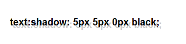 |
| text:shadow: 5px 5px 5px black; |  |
| text:shadow: 1px 0px 0px white; | 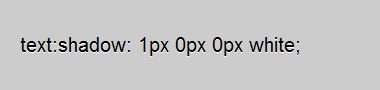 |
You are not restricted to just one shadow. You can have multiple shadows, separated by commas. For example:
#obj {
	text-shadow:
		 1px -1px 5px rgba(0, 0, 0, 0.2),
		-1px  1px 5px rgba(0, 0, 0, 0.2),
		 1px  1px 5px rgba(0, 0, 0, 0.2),
		-1px -1px 5px rgba(0, 0, 0, 0.2),
		 0px  1px 5px rgba(0, 0, 0, 0.2),
		 0px -1px 5px rgba(0, 0, 0, 0.2),
		 1px  0px 5px rgba(0, 0, 0, 0.2),
		-1px  0px 5px rgba(0, 0, 0, 0.2);
}
renders white text legibly on a white background:
Pure CSS Example (will be visible if your browser supports text-shadow |
Firefox Screenshot (similar in other browsers except IE) |
|---|---|
| This is white text on a white background |  |
Well … What About IE?
Currently, no version of Internet Explorer natively understands the CSS3 Syntax for text-shadow. However, IE 4.0+ can do text-shadow-like effects using Microsoft’s proprietary Visual Filters — unfortunately, if the user’s computer has any type of font-smoothing technology enabled, the DropShadow Visual Filter effect is quite messy and ugly. Since ClearType is enabled by default in modern versions of the Windows operating system (i.e. Vista, Windows 7) and is very difficult to disable it in Internet Explorer 9, this is a show-stopper. Don’t dispair, there is a workaround. Let’s see how DropShadow is supposed to work, and see how we can “clean-up” the result to look much nicer in modern versions of Windows.
Basic Text-Shadow
Let’s first take a look at a basic text-shadow without any blurring of the shadow:
#basicTextShadow {
	background-color: white;
}

#basicTextShadow p {
	text-shadow: 3px 3px 0px #99cc99;
}
The equivalent Visual Filter syntax is:
#basicTextShadow {
	background-color: white;
}

#basicTextShadow p {
	zoom: 1;
	filter: progid:DXImageTransform.Microsoft.DropShadow(OffX=3, OffY=3, Color=#99cc99);
}
Note that the zoom line — it is here since it forces IE to recognize that the object “has layout”. Visual Filters do not work unless a node “has layout”.
The problem is that when ClearType is turned on, many Visual Filters, including DropShadow don’t render text very well:
IE DropShadow without ClearType |
IE DropShadow with ClearType |
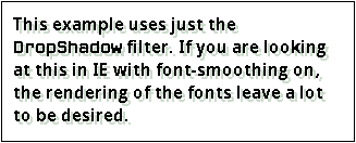
|
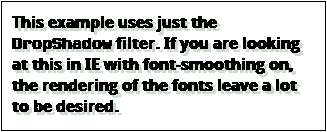
|
|---|
The text renders much better when you have a background-color.
#basicTextShadow p {
	zoom: 1;
	background-color: white;
	filter: progid:DXImageTransform.Microsoft.DropShadow(OffX=3, OffY=3, Color=#99cc99);
}

IE using the DropShadow Visual Filter with a background-color.
However, this will cause DropShadow to behave more like the CSS3 box-shadow property.
How can we have the font render well without the background-color. All we have to do is cut-out the background-color using the Chroma filter:
#basicTextShadow p {
	zoom: 1;
	background-color: white;
	filter: progid:DXImageTransform.Microsoft.Chroma(Color=white)
		progid:DXImageTransform.Microsoft.DropShadow(OffX=3, OffY=3, Color=#99cc99);
}
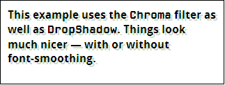
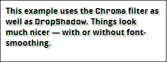
Firefox using CSS3 text-shadow |
IE with Chroma and DropShadow Filters Applied |
|
|
|---|
The Chroma filter allows us to remove a specific color from the rendered element. In this case, we are removing white, which is also the background-color. As a result the font renders smoothly, and the DropShadow filter behaves almost like a true text-shadow. This is similar to the method I describe in a previous article I wrote, How to Make ClearType, @font-face Fonts and CSS Visual Filters Play Nicely Together. To sum-up: regardless of whether you use @font-face or not, you can make Visual Filters render text correctly by creating a background for the element, and then removing that background with the Chroma filter.
Here is some actual HTML that is styled so that all browsers, including IE, will render a text-shadow correctly:
This is an example of a basic text-shadow. Note that is looks almost the same in browsers that understand CSS3 text-shadow as well as Internet Explorer, which doesn’t.
Here is the CSS for “compliant” web-browsers:
#basicTextShadow p {
	text-shadow: 3px 3px 0px #99cc99;
}
And here is the CSS for IE (using Paul Irish’s Conditional CSS Pattern):
body.ie6 #basicTextShadow p,
body.ie7 #basicTextShadow p,
body.ie8 #basicTextShadow p,
body.ie9 #basicTextShadow p {
	zoom: 1;
	background-color: #cccccc;
	filter: progid:DXImageTransform.Microsoft.Chroma(Color=#cccccc)
	        progid:DXImageTransform.Microsoft.DropShadow(OffX=3, OffY=3, Color=#99cc99);
}
There are some things that you should keep in mind with this solution:
- Since we are using the
Chromafilter to remove thebackground-colorof the object, any background image or color that you want to appear in the document must be placed in the containing tag. In this example, the background-image is styled on a<div>tag, while the text-shadow appears in a<p>tag inside it. - Unlike CSS3, it is impossible to use multiple shadows using Visual Filters (to be more accurate: it is syntactically possible, but it doesn’t look good or behave as one would expect).
- According to Microsoft’s documentation, IE8+ is required to have an extra line containing an
-ms-filterproperty which is identical to thefilterone except the property’s value is contained on one line within a set of quotation marks.
body.ie6 #basicTextShadow p,
body.ie7 #basicTextShadow p,
body.ie8 #basicTextShadow p,
body.ie9 #basicTextShadow p {
	zoom: 1;
	background-color: #cccccc;
	-ms-filter: "progid:DXImageTransform.Microsoft.Chroma(Color=#cccccc) progid:DXImageTransform.Microsoft.DropShadow(Color=#99cc99, OffX=3, OffY=3)";
	filter: progid:DXImageTransform.Microsoft.Chroma(Color=#cccccc)
	        progid:DXImageTransform.Microsoft.DropShadow(OffX=3, OffY=3, Color=#99cc99);
}
I have, however, noticed that the CSS works in IE9 standards mode without this additional line.
Text Glowing
Text glowing is a term to describe a shadow that “envelopes” some text in a glow of color to make it more legible. Let’s take the following example of black text on a dark background:
This is dark text on a dark background.
Hard to read, isn’t it? We could change the color of the text to white, but you could also put a white glow around the text to keep it black and maintain the dark atmosphere of the image:
This is dark text on a dark background.
Using the CSS3 text-shadow property, this is just a case of creating a set of eight shadows around the text in question:
#sky.textShadowTest p {
	text-shadow:
		 0px -1px 5px #eeeeee,     /* north      */
		 0px  1px 5px #eeeeee,     /* south      */
		-1px  0px 5px #eeeeee,     /* west       */
		 1px  0px 5px #eeeeee,     /* east       */
		-1px -1px 5px #eeeeee,     /* north-west */
		-1px  1px 5px #eeeeee,     /* north-east */
		 1px -1px 5px #eeeeee,     /* south-west */
		 1px  1px 5px #eeeeee;     /* south-east */
}
It basically creates a text-shadow in all eight directions and blurs them together, giving us a glow effect. Pretty neat, but it doesn’t work in Internet Explorer. However adding this CSS code will give IE something roughly equivalent:
/* Use Paul Irish’s Conditional CSS Pattern to isolate the rule for Internet Explorer */
body.ie6 #sky.textShadowTest p,
body.ie7 #sky.textShadowTest p,
body.ie8 #sky.textShadowTest p,
body.ie9 #sky.textShadowTest p {
	background-color: #cccccc;
	filter: progid:DXImageTransform.Microsoft.Chroma(Color=#cccccc)
		progid:DXImageTransform.Microsoft.Glow(Strength=5, Color=#eeeeee);
}
Firefox using CSS3text-shadow
| IE using the Chromaand Glow Visual Filter. |

|

|
|---|
Note a few things about this solution:
- The results aren’t exactly the same. Doing a side by side comparison reveals that the CSS3 version looks a little smoother. Here are the above examples blown up 300% to show detail:
Firefox using CSS3 text-shadowIE using the Chroma
andGlowVisual Filter.

- The
Strengthin theGlowfilter is the same amount of pixels in the blur-factor in the CSS3text-shadowcode. - You’ll notice that
background-colorI removed with theChromafilter in this case is not blue, but gray, a color halfway between the color of the text (black) and the color or the glowing text (white). This is so that the smoothness obtained by ClearType is somewhat preserved. Choosing black would make the text look to “thick”, while choosing white would make the text look too “thin”. - You’ll notice the IE glowing text is “pushed” a little down and to the right. That’s because IE treats the
Glowas part of the width and height of the element. This can be fixed by relatively positioning the object and setting thetopandleftproperties to the negative value ofGlow‘sStrengthvalue to compensate:
body.ie6 #sky.textShadowTest p,
body.ie7 #sky.textShadowTest p,
body.ie8 #sky.textShadowTest p,
body.ie9 #sky.textShadowTest p {
	zoom: 1;
	background-color: #cccccc;
	filter: progid:DXImageTransform.Microsoft.Chroma(Color=#cccccc)
		progid:DXImageTransform.Microsoft.Glow(Color=#eeeeee, Strength=3);
	position: relative;
	top: -3px;
	left: -3px;
}
The results are subtle, but will help to make the result a little more pixel perfect.
Firefox using CSS3 text-shadowIE using the modified
version of theChroma
fix.IE using the both
positioning and modifiedChroma
fix.

If you don’t like using relatively positioning the text, you can also use negative left and top margins to achieve the same effect, or you can leave it the way it is — after all, what are a few pixels between friends? ;-)
I have used this method in my previous blog post about CSS3 border-image:
| Firefox | IE9 |  |
 |
|---|
Here is the CSS that I used to produce it:
#introExample p, #introExample code {
   color: white;
   text-shadow:   2px  2px 3px #333333,
                 -2px -2px 3px #333333,
                 -2px  2px 3px #333333,
                  2px -2px 3px #333333;
}

/*
 * The "poor man's" version of text-shadow for IE's Visual filters.
 */
body.ie6 #introExample p,
body.ie7 #introExample p,
body.ie8 #introExample p,
body.ie9 #introExample p {
	zoom: 1;
	background: #000003;
	filter: progid:DXImageTransform.Microsoft.Chroma(Color=#000003)
		progid:DXImageTransform.Microsoft.Glow(Color=#3e3e3e, Strength=4);

}
The values of the Visual Filter code doesn’t match exactly with the text-shadow. This is in part that I only used four directions in the text-shadow code (i.e. south-east, north-west, north-east and south-west). I don’t believe this conversion is an exact science … it is worth your time to experiment with these values, using the examples in this article as a guide.
But How About Other Types Of Shadows?
The short answer for now is that you are out of luck. There are no Visual Filters, as far as I know, that will allow you to do other types of shadowing, like a Basic Text-Shadow with blurring: Update April 24, 2011: Since writing this article, I have a discovered a way to implement blurred text-shadows in IE9+. I have left the rest of the information here since it is still relevant, interesting and influenced my own work.
There is no way that I know to do this in IE without JavaScript or without affecting the DOM
Kilian Valkhob also has a solution for this which involves making a copy of the desired text and blurring it with the Blur filter. While I think the results look pretty good, I hesitate using this method since search engines may see the text repeated in the document and index that text higher than it should be rated (or they might penalize the document because the search engine thinks the author is trying to do some unethical hack of the page ranking algorithm it uses). Vilkhob has, however, also created a text-shadowing JavaScript library that automates this process, and since the repeated text isn’t actually in the document, it may be a solution to the search engine concern. This solution is something i am currently looking into adding to cssSandpaper, but I want to do more research into this before I implement it in a public version of my library. For example, how would screen readers handle this JavaScript generated “double text”?
Conclusion
CSS3 text-shadow is a great effect in a web developer’s toolkit. Hopefully IE will natively support it soon, but in the meantime, at least there are some use cases you can use Visual Filters to do some of eye-candy it supports.
15 responses so far
2 Piero Di Carlo Dalla-Bona
// Jul 20, 2011 at 10:49 pm
Piero Di Carlo Dalla-Bona
// Jul 20, 2011 at 10:49 pm
This is a SIMPLE THE BEST SOLUTIONS for IE Filter hacks for using in CSS!
Thank you very much!
I ♥ U!
Piero.
3 Anirudh
// Jul 22, 2011 at 9:42 pm
Anirudh
// Jul 22, 2011 at 9:42 pm
thanks for the solution…nice content
4 Kenseiden
// Aug 3, 2011 at 6:58 pm
Kenseiden
// Aug 3, 2011 at 6:58 pm
This one has helped me a lot thank you :)
5 Mathias Bynens
// Sep 27, 2011 at 5:35 am
Mathias Bynens
// Sep 27, 2011 at 5:35 am
You may want to point out that IE10 will support
text-shadow: http://msdn.microsoft.com/en-us/ie/hh272902.aspx#_CSSTextShadow6 Alex Tsao
// Oct 14, 2011 at 1:14 pm
Alex Tsao
// Oct 14, 2011 at 1:14 pm
Very good tutorial, do u have any idea how to display a text shadow inside a shadow box? in ie7 parent element filter will inherited by child element filter, that is suck.
7 zoltan
// Oct 14, 2011 at 6:23 pm
zoltan
// Oct 14, 2011 at 6:23 pm
@Alex: you have to have a separate container (like a <div>) for your box-shadow and a separate one inside (like a <span>) for your text-shadow. If you have an example that you can post to jsfiddle, I can give you a pointer if you’d like.
8 Lauren
// Nov 9, 2011 at 4:04 pm
Lauren
// Nov 9, 2011 at 4:04 pm
Thanks! Really helpful i.e. filter info. I just tinkered a little to make it compatible with our users most popular browsers. Looks like it works so far :)
9 Matt
// Feb 1, 2012 at 3:32 am
Matt
// Feb 1, 2012 at 3:32 am
Why can’t you simply post the complete code CSS and html from starting to ending with text, instead of a lengthy explanation from steps A-Z??? Some people don’t need a step by step teaching lesson. Just the code so we can customize and make modifications by trial and error within the complete script.
This Code does not work. I have tried it in FF, Chrome, IE 8-9, Safari. I have tried the demo source code as well. Simply doesn’t work. It would be more helpful to have the entire code posted and let the user edit it accordingly.
10 zoltan
// Feb 1, 2012 at 10:43 am
zoltan
// Feb 1, 2012 at 10:43 am
@Matt: Good question! The reason why I explain these solution step by step is because IE Visual Filters are very quirky and do a lot of unexpected things, especially with ClearType. If you want to use text-shadows in IE and modern browsers, (and have them look decent) it is necessary to know how this solution works in detail. If you are stuck for time, can’t read the whole article and you have never done this before, I would suggest not implementing text-shadows in IE and just have the text-shadow degrade gracefully in older browsers. Visual Filters sometimes a little trial and error in order for them to work properly if you are new to them it is something to keep in mind.
11 Heather Tausch
// Mar 4, 2012 at 4:22 pm
Heather Tausch
// Mar 4, 2012 at 4:22 pm
Any idea how to remove the progid:DXImageTransform.Microsoft.DropShadow from an element? I want it on everything but an element inside with a particular span class. I can do it by adding text-shadow: 0 0px 0 #E69340 (same color as text);
but doing the same for the ie version doesn’t remove it (or at least hide it)
12 zoltan
// Mar 13, 2012 at 10:17 pm
zoltan
// Mar 13, 2012 at 10:17 pm
@Heather: Visual Filters are unusual in CSS, due to the way they were implemented by Microsoft way back when. As far as I’m aware, if you use one on a parent element, you cannot remove it from a child (I’m pretty sure this is the case — I have done a lot of research on them over the years). Sadly, it is just the way they work.
13 Ilina
// Aug 9, 2012 at 2:17 am
Ilina
// Aug 9, 2012 at 2:17 am
Thank You so much!!!
14 Garrett
// Aug 24, 2012 at 2:43 pm
Garrett
// Aug 24, 2012 at 2:43 pm
Hey thanks for taking the time to explain this.
15 Tom
// Nov 19, 2013 at 9:02 pm
Tom
// Nov 19, 2013 at 9:02 pm
Mate you rock!!!!
A big thank to you after hours of searching!
Give Feedback
Don't be shy! Give feedback and join the discussion.
Please Note: If you are asking for help using the information on this page or if you are reporting a bug with the code featured here, please include a URL that shows the problem you are experiencing along with the browser/version number/operating system combination where the issue manifests itself. Without this information, I may not be able to respond.