 @zoltandulac
 @zoltandulac
 Zoltan Hawryluk
box-shadow in IE6-8 is possible!
CSS3 Box-Shadows are a great to quickly decorate the outside of block-level elements. There are many CSS box-shadow recipes you can use to produce a variety of effects, including simple, glowing and blurred shadows. And, unlike CSS3 text-shadows, box-shadows are natively supported by the latest version of IE. However, if you want them to appear in older versions of IE (i.e. 6 through 8), you will want to learn how to use a variety of Visual Filters to simulate them. This article will cover a few CSS3 box-shadow effects, the equivalent Visual Filter recipes for IE 6-8, and the differences between them. It will also cover the differences in the CSS3 implementations in all the modern browsers. Box-shadows like the example on the left is possible in all commonly used browsers.
First off, what is a box-shadow?
A box-shadow is equivalent to a CSS3 text-shadow except it is applied to the box of the block-level element instead of the actual text. Just like text-shadows, you can have one shadow:
#box {
  box-shadow: <x-offset> <y-offset> <blur-radius> <color>;
}
… three shadows:
#box {
  box-shadow: <x-offset1> <y-offset1> <blur-radius1>, <color1>,
              <x-offset2> <y-offset2> <blur-radius2>, <color2>,
              <x-offset3> <y-offset3> <blur-radius3>, <color3>;
}
… or as many as you want. The x- and y-offsets measure the position of the horizontal and vertical shadow respectively, and the blur-radius measures the amount of blur in the shadow. Let’s take a look at a simple example:
#box {
  box-shadow: 5px 5px 0px #ff0000;
}
| Live HTML result | Firefox 4.0 Screenshot (for browsers like IE6-8 that can’t see the Live result) |
|---|---|
|
This is an example of a simple box-shadow without blurring
|
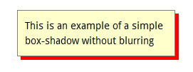
|
Note that although box-shadow is the official property name, one must use the vendor-specific prefixes in order to use it in Webkit browsers (i.e. Chrome and Safari) as well as older versions of Firefox:
#box {
  box-shadow: 5px 5px 0px #ff0000,          /* Firefox 4.0+, Opera, IE 9 */
  -webkit-box-shadow: 5px 5px 0px #ff0000,  /* Chrome and Safari         */
  -moz-box-shadow: 5px 5px 0px #ff0000;     /* Firefox 3.6               */
}
Furthermore, there are two optional parameters, the spread (which allows you to determine the size of the shadow) as well as the inset parameter that can allow you to put the shadow inside the box instead of outside of the box. I direct readers to Mozilla.org’s great reference for box-shadow to read more on these properties, since they are not, as far as I can tell, reproducible in IE 8 or lower.
What about IE?
IE9 has no problem showing box-shadow except when shadowing a box within a table-cell (If the CSS of the table has its border-collapse property set to collapse then the box-shadow is not applied. Hopefully this is fixed in a future release).
As mentioned earlier, IE6-8 requires Visual Filters to simulate CSS3 box-shadows without JavaScript. In order to illustrate this, I will show several different types of box-shadows below and show both the CSS3 syntax and the equivalent Visual Filter CSS recipe. Some of these recipes produce almost identical results, while others are rough equivalents. Note that all these examples use a variation of Paul Irish’s Conditional CSS Pattern in order to create the IE-only rules. This involves replacing the <body> tag of the document with this HTML:
   <!-- Extra white-space below is just to make it easier to read. :-) -->

   <!--[if lt IE 7 ]>   <body class="ie6">          <![endif]-->
   <!--[if IE 7 ]>      <body class="ie7">          <![endif]-->
   <!--[if IE 8 ]>      <body class="ie8">          <![endif]-->
   <!--[if IE 9 ]>      <body class="ie9">          <![endif]-->
   <!--[if (gt IE 9) ]> <body class="modern">       <![endif]-->
   <!--[!(IE)]><!-->    <body class="notIE modern"> <!--<![endif]-->
We can then apply CSS specific to a version of IE. For example:
body.ie7 #box {
   /* insert IE7 specific CSS here */
}
(Note: Paul Irish’s technique officially has the conditional comments around the html tag, not the body tag. You can use either for these techniques to work. I just prefer using the latter.)
All these Visual Filter recipes depend on the box “having layout”. If you have any difficulty with the Visual Filters activating, set zoom: 1 or a static width inside the IE6-8 specific CSS to force the block to have layout.
Type #1: Simple, Unblurred Shadows
In order to simulate simple, unblurred box-shadows in IE, we use IE’s DropShadow Visual filter:
#box {
  /* CSS for all browsers. */
  border: solid 1px #808080;
  background: #ffffcc;
  margin: 10px;
  padding: 10px;

  /* CSS3 Box-shadow code: */
  box-shadow: 5px 5px 0px #ff0000;
  -webkit-box-shadow: 5px 5px 0px #ff0000;
  -moz-box-shadow: 5px 5px 0px #ff0000;
}

/* IE6-8 Specific Code */
body.ie6 #box,
body.ie7 #box,
body.ie8 #box {
   zoom: 1;
   filter: progid:DXImageTransform.Microsoft.DropShadow(OffX=5, OffY=5, Color=#ff0000);
}
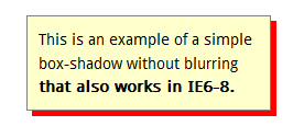
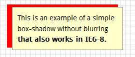
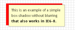
| Live HTML result | Firefox Screenshot | IE7 Screenshot |
|---|---|---|
|
This is an example of a simple box-shadow without blurring that also works in IE6-8.
|
|
|
There are two exceptions to this solution. The first deals with when the block has a transparent background, and the other has to do with negative box-shadow offsets.
Type #1a: Blocks With Transparent Backgrounds
Let’s say you use the above CSS, but omit the background property:
#box {
  /* CSS for all browsers.  Note there is no background-color, so box will be transparent */
  border: solid 1px #808080;
  margin: 10px;
  padding: 10px;

  /* CSS3 Box-shadow code: */
  box-shadow: 5px 5px 0px #ff0000;
  -webkit-box-shadow: 5px 5px 0px #ff0000;
  -moz-box-shadow: 5px 5px 0px #ff0000;
}

/* IE6-8 Specific Code */
body.ie6 #box,
body.ie7 #box,
body.ie8 #box {
   zoom: 1;
   filter: progid:DXImageTransform.Microsoft.DropShadow(OffX=5, OffY=5, Color=#ff0000);
}
Doing this will results in some unexpected results in IE6-8:
| Live HTML result | Firefox Screenshot | IE7 Screenshot |
|---|---|---|
|
This is an example of a box with a transparent background and simple box-shadow without blurring. IE6-8 is having a hard time dealing with the transparent background.
|
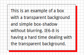
|
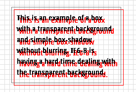
|
The results in IE7 are as hideous and unreadable as the average YTMND page! In order to fix this issue in elderly IE, one must add a background color in IE6-8 only and remove it with the Chroma filter (more information on this technique can be found on my previous blog post, How to Make ClearType, @font-face Fonts and CSS Visual Filters Play Nicely Together).
#box {
  border: solid 1px #808080;
  margin: 10px;
  padding: 10px;

  /* Box-shadow code: */
  box-shadow: 5px 5px 0px #ff0000;
  -webkit-box-shadow: 5px 5px 0px #ff0000;
  -moz-box-shadow: 5px 5px 0px #ff0000;
}

body.ie6 #box,
body.ie7 #box,
body.ie8 #box {
   background-color: #ffffff;
   zoom: 1;
   filter: progid:DXImageTransform.Microsoft.DropShadow(OffX=5, OffY=5, Color=#ff0000),
           progid:DXImageTransform.Microsoft.Chroma(Color='#ffffff');
}
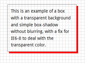
As you can see below, adding this CSS logic produces much better results:
| Live HTML result | Firefox Screenshot | IE7 Screenshot |
|---|---|---|
|
This is an example of a box
with a transparent background and simple box-shadow without blurring, with a fix for IE6-8 to deal with the transparent color. |
|
|
Note: All the other types of box-shadow recipes that follow should also use this Chroma filter method when it is desirable to have a transparent background in the box itself.
Type 1b: Negative Shadow Offsets
If there are negative shadow offsets, you will see a small difference with the position of the box being shadowed:
#box {
  /* CSS for all browsers. */
  border: solid 1px #808080;
  background: #ffffcc;
  margin: 10px;
  padding: 10px;

  /* CSS3 Box-shadow code: */
  box-shadow: -10px -5px 0px #ff0000;
  -webkit-box-shadow: -10px -5px 0px #ff0000;
  -moz-box-shadow: -10px -5px 0px #ff0000;
}

/* IE6-8 Specific Code */
body.ie6 #box,
body.ie7 #box,
body.ie8 #box {
   zoom: 1;
   filter: progid:DXImageTransform.Microsoft.DropShadow(OffX=-10, OffY=-5, Color=#ff0000);
}
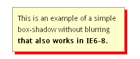
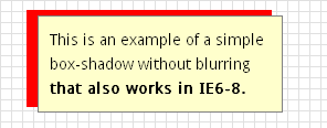
| Live HTML result | Firefox Screenshot | IE7 Screenshot |
|---|---|---|
|
This is an example of a simple box-shadow without blurring that also works in IE6-8.
|
|
|
You will note that the offsets in IE push the box down and to the right. This is because IE’s Visual Filters believes that the box-shadow as part of the box itself, while CSS3 believes that it should be outside of the box. As a result, negative box-shadows shift the box in IE6-8. In order to compensate for this, one can use margin-top and margin-bottom to move the shadow to where CSS3 thinks it should be:
#box {
  /* CSS3 Box-shadow code: */
  box-shadow: -10px -5px 0px #ff0000;
  -webkit-box-shadow: -10px -5px 0px #ff0000;
  -moz-box-shadow: -10px -5px 0px #ff0000;
}

/* IE6-8 Specific Code */
body.ie6 #box,
body.ie7 #box,
body.ie8 #box {
   zoom: 1;
   filter: progid:DXImageTransform.Microsoft.DropShadow(OffX=-10, OffY=-5, Color=#ff0000);
   margin-top: 10px;
   margin-left: 5px;
}
| Live HTML result | Firefox Screenshot | IE7 Screenshot |
|---|---|---|
|
This is an example of a simple box-shadow without blurring that also works in IE6-8.
|
|
|
Note that one could also make use relative positioning and use the CSS top and left properties to do the same thing in IE. I leave it up to readers to decide which method would be more appropriate for the situation they find themselves in.
Type #2: Glowing box-shadow
The second box-shadow I use a lot is what I call the “glowing box” effect. This happens when a shadow with a large blur radius is put directly behind a box (i.e. the x- and y-offsets are set to 0, and the blur-radius is a non-zero number). It is possible to simulate this effect in IE using the Shadow filter. This filter must be applied four times (north, south, east and west of the box) in order to simulate the CSS3 effect. Here is the CSS recipe:
#box {
   box-shadow: 0 0 5px #666666;
   -webkit-box-shadow: 0 0 5px #666666;
   -moz-box-shadow: 0 0 5px #666666;
}

body.ie6 #box,
body.ie7 #box,
body.ie8 #box {
   zoom: 1;
   filter: progid:DXImageTransform.Microsoft.Shadow(Color=#cccccc, Strength=5, Direction=0),
         progid:DXImageTransform.Microsoft.Shadow(Color=#cccccc, Strength=5, Direction=90),
         progid:DXImageTransform.Microsoft.Shadow(Color=#cccccc, Strength=5, Direction=180),
         progid:DXImageTransform.Microsoft.Shadow(Color=#cccccc, Strength=5, Direction=270);
}
… and here are the results as rendered in Firefox 4 and IE7:
| Live HTML result | Firefox Screenshot | IE7 Screenshot |
|---|---|---|
|
This is an example of a box that has short blurred shadows horizontally and vertically on all sides.
|
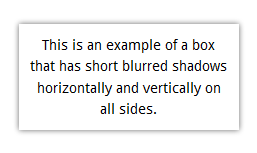
|
|
Note that the color in the Visual Filter syntax is lighter than the CSS3 one. In order to get the equivalent IE color, I take a screenshot of the CSS3 box-shadow, open the image in The GIMP or Photoshop, and find the color that is just outside of the box. This is the color I use in the IE syntax. If you don’t want to go through all this trouble, you can also guess, which is what I do if I’m lazy. Which is a lot of the time.
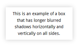
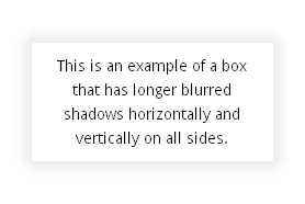
You can increase the blur radius/strength to produce larger glows as well:
#box {
    box-shadow: 0 0 15px #cccccc;
   -webkit-box-shadow: 0 0 15px #cccccc;
   -moz-box-shadow: 0 0 15px #cccccc;
}

body.ie6 #box,
body.ie7 #box,
body.ie8 #box {
   zoom: 1;
   filter: progid:DXImageTransform.Microsoft.Shadow(Color=#eeeeee, Strength=15, Direction=0),
           progid:DXImageTransform.Microsoft.Shadow(Color=#eeeeee, Strength=15, Direction=90),
           progid:DXImageTransform.Microsoft.Shadow(Color=#eeeeee, Strength=15, Direction=180),
           progid:DXImageTransform.Microsoft.Shadow(Color=#eeeeee, Strength=15, Direction=270);
}
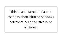
| Live HTML result | Firefox Screenshot | IE7 Screenshot |
|---|---|---|
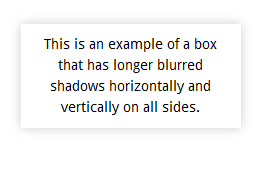
|
This is an example of a box that has longer blurred shadows horizontally and vertically on all sides.
|
|
|
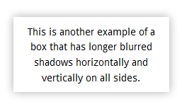
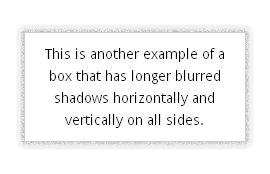
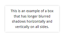
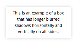
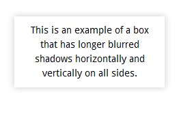
You can also use this alternate recipe I have used one or twice if you want a darker color closer to the box, with it becoming dramatically lighter father away:
| Live HTML result | Firefox Screenshot | IE7 Screenshot |
|---|---|---|
|
This is another example of a box that has longer blurred shadows horizontally and vertically on all sides.
|
|
|
Sure, the IE7 screenshot looks slightly different from the Firefox one, but let’s take a look at what all the modern browsers look with exactly the same CSS code:
| Opera | IE 9 |
|---|---|
|
|
| Safari 5 | Chrome 13 |
|
|
They are all slightly different. It is almost impossible to be pixel perfect with blurred box-shadows unless you give different rules to the different browsers using vendor-specific prefixes.
Two important caveats about the Visual Filter rules:
- As mentioned before, the CSS for IE6-8 uses a lighter color for the shadow. This is due to the way the
Shadowfilter behaves: it requires a lighter shade to simulate the same effect. - Note that the Visual Filters examples are pushed down and to the right compared to the CSS3 example. This is for the same reasons as stated in Type 1b, and a developer would again have to use margins or positioning to get the box in exactly the same place as it is in IE6-8:
#box {
   box-shadow: 0 0 5px #666666;
   -webkit-box-shadow: 0 0 5px #666666;
   -moz-box-shadow: 0 0 5px #666666;
}

body.ie6 #box,
body.ie7 #box,
body.ie8 #box {
   margin-left: -5px;
   margin-top: -5px;
   zoom: 1;
   filter: progid:DXImageTransform.Microsoft.Shadow(Color=#cccccc, Strength=5, Direction=0),
         progid:DXImageTransform.Microsoft.Shadow(Color=#cccccc, Strength=5, Direction=90),
         progid:DXImageTransform.Microsoft.Shadow(Color=#cccccc, Strength=5, Direction=180),
         progid:DXImageTransform.Microsoft.Shadow(Color=#cccccc, Strength=5, Direction=270);
}
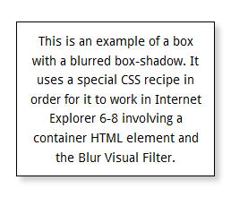
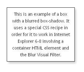
Type #3: Blurred box-shadow
Up until a few days ago, I thought this last type of text-shadow could not be simulated in IE using just CSS. I then came across an interesting recipe from CSS-Tricks and this demo by Christian ”Schepp” Schaefer. These CSS recipes came close, but was not able to control the color of the shadow itself (it assumed grey shadows only) or the exact location of the shadow. I decided to take this work to the next level and add full control of the text-shadow, with some nice results:
| Live HTML result | Firefox Screenshot | IE7 Screenshot |
|---|---|---|
|
This is an example of a box with a blurred box-shadow. It uses a special CSS recipe in order for it to work in Internet Explorer 6-8 involving a container HTML element and the Blur Visual Filter.
|
|
|
Here is the HTML:
<div id="box">
        <div class="content">
                This is an example of a box with a blurred box-shadow.
                It uses a special CSS recipe in order for it to work in
                Internet Explorer 6-8 involving a container HTML element
                and the Blur Visual Filter.
        </div>
</div>
and here is the CSS:
#box {
        /* CSS3 syntax */
	box-shadow: 5px 5px 5px #cccccc;
	-webkit-box-shadow: 5px 5px 5px #cccccc;
	-moz-box-shadow: 5px 5px 5px #cccccc;

        /* Place any other shared CSS properties here, except for those in the next rule */
        margin: 20px auto;
	text-align: center;
}

#box,
body.ie6 #box .content,
body.ie7 #box .content,
body.ie8 #box .content {
        /*
         * Any width, height, padding, border and background information goes here, so it is
         * shared between the CSS3 and legacy-IE solutions
         */
	width: 200px;
	padding: 10px;
	background: white;
	border: solid 1px black;
}

body.ie6 #box,
body.ie7 #box,
body.ie8 #box {
        /* This contains the color of the shadow in the CSS3 syntax */
	background: #cccccc;

        /* This contains the blur-radius in the CSS3 syntax */
	zoom: 1;
	filter: progid:DXImageTransform.Microsoft.Blur(PixelRadius=5);

        /* You must remove the border in IE, since it will be replaced in the next rule */
	border: none;
}

body.ie6 #box .content,
body.ie7 #box .content,
body.ie8 #box .content {
	position: relative;

        /*
         * Margins must be added here to place the box above the shadow correctly.
         * The margin-left and margin-right properties should be -2 times the CSS3 x-offset.
         * The margin-top and margin-bottom properties should be -2 times the CSS3 y-offset.
        /
	margin-top: -10px;
	margin-left: -10px;
	margin-bottom: -10px;
        margin-right: -10px;
}
Yes, the Legacy-IE Specific CSS as long and as painful like a meeting with your accountant, but it gets the job done.
Conclusion
These Visual Filters CSS recipes can come handy when you want IE6-8 to have similar box-shadow effects that modern web browsers have. There are probably other types of box-shadows that can be handled using them, and if you are interested I encourage those with time and patience to check out Microsoft’s reference to Visual Filters and start playing with them. Although Visual Filter support will probably be taken out of IE10, developers won’t need worry since IE9 already has box-shadow support — these experiments should only be used to add box-shadow support in older versions of IE.
Further Reading
- Mozilla.org’s
box-shadowreference page - CSS Box Shadow from CSS Tricks
- CSS3 Box-Shadow for Legacy IEs from Christian ”Schepp” Schaefer
- Drop shadow with CSS for all web browsers by Robert Nyman. Note his article includes an alternate simpler solution for a blurred
box-shadowthat involves theShadowfilter:
Live HTML result Firefox Screenshot IE7 Screenshot This is an example of a box with a blurred box-shadow. It uses theShadowfilter for Internet Explorer 6 through 8.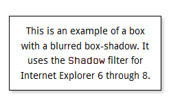
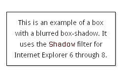
but does not as similar when dealing with large shadows:
Live HTML result Firefox Screenshot IE7 Screenshot This is an example of a box with a blurred box-shadow. It uses theShadowfilter for Internet Explorer 6 through 8.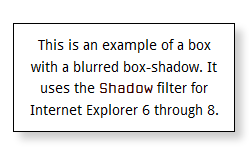
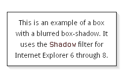
This difference may or may not be important to you, and again, I leave it up to the reader to decide what the right solution would be according to the situation.
35 responses so far
1 Jason
// Aug 25, 2011 at 12:34 pm
Jason
// Aug 25, 2011 at 12:34 pm
I had to give up on this trick because the box shadow transform had odd side effects. I can’t remember if it was IE 7 or 8, but hover effects caused bizarre font problems on any text contained in the box. It also changes the size of the component. So for instance if you try to put a shadow on jQuery dialog boxes, it gets very confused and causes repaint/resize issues.
2 zoltan
// Aug 26, 2011 at 1:15 am
zoltan
// Aug 26, 2011 at 1:15 am
@Jason: I have never seen the side effects you encountered, but would love to see an example of one. Would you happen to have one you can post or put in jsbin?
3 Balu (Web Designer)
// Aug 30, 2011 at 4:16 am
Balu (Web Designer)
// Aug 30, 2011 at 4:16 am
Hello,
it’s wonderful…..
4 Neil
// Aug 30, 2011 at 5:08 pm
Neil
// Aug 30, 2011 at 5:08 pm
Great work zoltan, just great work. This is by far the best workaround I’ve found for IE. Thanks for sharing! Have you tested it, or do you think it would have any issues working with your cssSandpaper rotation and scale transformation effects? I’m trying to get this demo to work in IE using your workarounds.
5 zoltan
// Aug 30, 2011 at 10:44 pm
zoltan
// Aug 30, 2011 at 10:44 pm
@Neil: Thanks for the kudos. Out of sheer coincidence, I am working on something similar for a client, and produced a proof of concept which has a similar look, and it works in IE. Note that currently this is implemented with two nested div tags: the first has the rotation, and the second has the box-shadow (as well as the rest of the style of the polaroid). This is necessary for the time being until I fix cssSandpaper to handle both in one block-level element. In order to do what you are doing with the random looking rotations with the
:nth-childpseudo-selector, I would suggest using selectivizr to use them in IE.Thanks for writing in and sharing your demo.
6 chech
// Sep 1, 2011 at 3:34 pm
chech
// Sep 1, 2011 at 3:34 pm
I only wanted to thank you for the great recopilation you did there!
I had already given up making shadows for IE’s different versions when I gave it one last chance and came up with this wonderful post :)
Thanks, have a nice day!
7 Neil
// Sep 2, 2011 at 1:00 pm
Neil
// Sep 2, 2011 at 1:00 pm
No problem. A little of topic, but I’d love to see your solutions to the radius transform effect for IE.
8 El garch
// Nov 5, 2011 at 8:10 am
El garch
// Nov 5, 2011 at 8:10 am
Thanks a lot, you saved my day
9 Beben Koben
// Jan 25, 2012 at 11:07 pm
Beben Koben
// Jan 25, 2012 at 11:07 pm
i like this blog…yihaaaa \m/
10 dieuw
// Mar 30, 2012 at 5:43 pm
dieuw
// Mar 30, 2012 at 5:43 pm
I can’t get it to work with rgba, my css looks like this:
-webkit-box-shadow: 0 0 5px rgba(0,0,0,0.2);
-moz-box-shadow: 0 0 5px rgba(0,0,0,0.2);
box-shadow: 0 0 5px rgba(0,0,0,0.2);
so how exactly should my ie8 fix look like, when inluding rgba in stead of hex?
11 zoltan
// Apr 3, 2012 at 8:59 am
zoltan
// Apr 3, 2012 at 8:59 am
@diew: Unfortunately, you cannot use RGBA colors using the filter syntax. You may have to play around with color settings to simulate it. It is the limitation of using the shadow filters.
12 Beehand
// Jun 3, 2012 at 2:21 am
Beehand
// Jun 3, 2012 at 2:21 am
Good trick & hack! Thanks for sharing! Good job!
13 Oz
// Jun 9, 2012 at 12:19 am
Oz
// Jun 9, 2012 at 12:19 am
I think this could be integrated into cssSandpaper to make it easier, right?
14 Skweekah
// Jun 13, 2012 at 3:00 am
Skweekah
// Jun 13, 2012 at 3:00 am
Can you do inset for IE7?
15 Jaideep
// Jun 28, 2012 at 7:10 am
Jaideep
// Jun 28, 2012 at 7:10 am
I,m using Your technique for box shadow ie,Thanks ,But it is giving a problem,inside text is losing sharpness in ie and is getting blurred i have posted my question here ,http://stackoverflow.com/questions/11242154/ie-filter-shadow-property-making-inside-text-ugly
any solution?
16 zoltan
// Jul 2, 2012 at 10:48 am
zoltan
// Jul 2, 2012 at 10:48 am
@Jaideep: You may want to look at my previous blog post How to Make ClearType, @font-face Fonts and CSS Visual Filters Play Nicely Together. It covers techniques to work around the text sharpness issue.
17 zoltan
// Aug 12, 2012 at 10:58 am
zoltan
// Aug 12, 2012 at 10:58 am
@Skweekah: Unfortunately, I don’t know of any way to implement inset in IE. :-(
18 zoltan
// Aug 12, 2012 at 11:11 am
zoltan
// Aug 12, 2012 at 11:11 am
@Oz: Unfortunately, there is a lot of fiddling that is needed with the Visual Filters involved and it is not an exact science, which is why I have left it out of cssSandpaper. Would be nice if it could be though.
19 Abell Smith
// Aug 13, 2012 at 4:03 pm
Abell Smith
// Aug 13, 2012 at 4:03 pm
I’m having the same problem as Jason was earlier in the discussion… the shadow effect on the left side of my container is knocking the positioning of my jQuery plugins off by the same amount:
http://216.162.206.192/wsga/
…oddly, in IE8 ONLY… IE7 and earlier seem fine.
Any ideas?
20 Rubix
// Aug 14, 2012 at 3:57 am
Rubix
// Aug 14, 2012 at 3:57 am
This is the best solution I have seen so far! Thanks a lot for sharing! The only culprit of using IE filters is that they omit anti-aliasing of text and objects inside the container to which the filter was applied to. But for regular-sized text, this is not that much of a problem.
21 zoltan
// Aug 24, 2012 at 4:29 pm
zoltan
// Aug 24, 2012 at 4:29 pm
@Rubix: The anti-aliasing text issue may be solved by the techniques used in my previous blog post How to Make ClearType, @font-face Fonts and CSS Visual Filters Play Nicely Together. Although the title does mention @font-face, this technique will work with any fonts, embedded or not.
22 zoltan
// Aug 24, 2012 at 4:32 pm
zoltan
// Aug 24, 2012 at 4:32 pm
@Abell: take a look at the example in the “Type 1b: Negative Shadow Offsets” section above. If it only is messing up in IE8 only, then just use an IE8 rule (although I am surprised that this is the case).
23 pao
// Oct 18, 2012 at 11:20 am
pao
// Oct 18, 2012 at 11:20 am
How to make a shadow inset fo iE7 / iE8 ?
Thanks for you answer.
24 Gabriel
// Oct 24, 2012 at 5:07 pm
Gabriel
// Oct 24, 2012 at 5:07 pm
Great post
Are you familiar with any tricks that places the shadow to the inside similar to the effects of
box-shadow: inset 0 0 20px #597e22;
Thank you
25 zoltan
// Oct 28, 2012 at 10:35 pm
zoltan
// Oct 28, 2012 at 10:35 pm
@Gabriel, @pao: To my knowledge, it is not possible to do anything like this with Visual Filters. I was going to suggest the excellent CSS3 Pie polyfill library, but it doesn’t seam to support inset yet (according to the documentation, it is scheduled to be implemented in a future version).
26 Jona
// Nov 7, 2012 at 8:24 pm
Jona
// Nov 7, 2012 at 8:24 pm
Hello, I have used the code for the Glowing box-shadow and it works good with ie8, but it also replaces the normal box-shadow for ie9 and doesn’t show the top border. How can I fix this?, Thank you.
27 zoltan
// Nov 10, 2012 at 3:19 pm
zoltan
// Nov 10, 2012 at 3:19 pm
@Jona: You may want to ensure you are only applying the styles to IE 8 and lower by using the conditional comments strategy given in the What About IE section of the article.
28 prashant
// Dec 14, 2012 at 2:59 am
prashant
// Dec 14, 2012 at 2:59 am
Hello,
I have used the code for the Glowing box-shadow and it works good with ie8.Thank You:)
Its Great :)
29 Muhammad Hussain
// Mar 13, 2013 at 7:16 am
Muhammad Hussain
// Mar 13, 2013 at 7:16 am
Thank you very much for such a wonderful piece of craft work. I was wondering to have a shadow box on ie-8. And I found after reading and trying bunch of codes and blogs and at last I found this nice art work here. You are the man who has made developer/designer life much easier.
Thanks,
Muhammad Hussain
30 Hani
// Jun 8, 2013 at 4:40 am
Hani
// Jun 8, 2013 at 4:40 am
Great article! Add some examples like this
http://studentwebhosting.com/tutorials/amazing-css3-box-shadow-examples/
31 austin
// Jun 10, 2013 at 11:58 pm
austin
// Jun 10, 2013 at 11:58 pm
thanks!
32 Anuj Mangal
// Sep 13, 2013 at 7:35 am
Anuj Mangal
// Sep 13, 2013 at 7:35 am
Hi Zoltan,
Awesome Tutorial.. Thanks for the information. I am able to create a box shadow in IE7 and IE8 using the technique that you have illustrated. The only problem that I am facing is the filter gets attached to all the child elements of the parent div which makes all the child elements “Shadow-ed” as the parent element.
I have tried different styles “filter:none;” for the child elements but that doesn’t work for me ..
Any alternative so that the shadowing filter
filter: progid:DXImageTransform.Microsoft.Shadow(Color=#ffffff, Strength=-1, Direction=0)
can be applied to Parent Element only and all the child elements DOES NOT get affected by them..
Any pointers will be highly appreciated :)
Thanks,
33 zoltan
// Sep 13, 2013 at 5:30 pm
zoltan
// Sep 13, 2013 at 5:30 pm
@Anuj: I think I know what what the issue is … are you trying to do a box-shadow on a block that has no background? If this is the case, then in older IE, what you describe will happen unless you put in a fake background and then remove it with the Chroma filter, like this:
I have an example of this here:
http://www.useragentman.com/tests/boxShadow/crossBrowser.html
You can also do this with the
Shadowfilter as well.I hope this helps somewhat.
34 Aying
// Nov 21, 2013 at 9:57 pm
Aying
// Nov 21, 2013 at 9:57 pm
Thanks for sharing!
It’s helpful for me.
35 Tinu Mathai
// Apr 15, 2020 at 12:55 am
Tinu Mathai
// Apr 15, 2020 at 12:55 am
IE would not support a negative number, but I need to use it in a box-shadow. Could you anyone help me?
box-shadow: 0 3px 6px -5px #000000ed;
Give Feedback
Don't be shy! Give feedback and join the discussion.
Please Note: If you are asking for help using the information on this page or if you are reporting a bug with the code featured here, please include a URL that shows the problem you are experiencing along with the browser/version number/operating system combination where the issue manifests itself. Without this information, I may not be able to respond.